How to create a bottom drawer with Tailwind CSS and Alpinejs
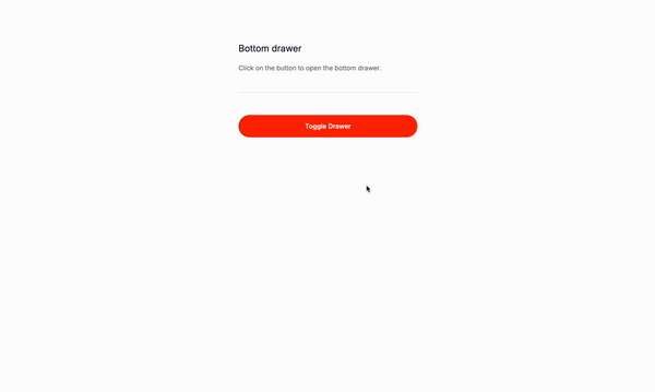
Let’s create a bottom drawer with Tailwind CSS and Alpinejs.
What is a bottom drawer?
A bottom drawer is a type of drawer that is positioned at the bottom of the screen. It is typically used to display additional information or options that are not relevant to the main content of the page. The bottom drawer can be used to display information about the current page, such as a navigation menu, a list of recent items, or a set of settings.
Use Cases:
-
Navigation Menus: Bottom drawers serve as a convenient solution for mobile or tablet applications seeking to optimize screen real estate while providing easy access to navigation options. By positioning the navigation menu at the bottom of the screen within a drawer, users can effortlessly navigate through various sections or pages without cluttering the interface.
-
Settings Panels: In applications where users frequently adjust preferences or configurations, bottom drawers offer an intuitive location for housing settings panels. By placing settings within a drawer at the bottom of the screen, users can access and modify their preferences without disrupting their workflow. This design choice promotes a seamless user experience and ensures that settings are readily accessible when needed.
-
Sidebar Menus: Bottom drawers can be utilized as an alternative approach to traditional sidebar menus, especially in scenarios where vertical space is limited. By positioning the sidebar menu at the bottom of the screen within a drawer, users can access important navigation links or categories while maintaining focus on the main content. This layout variation enhances usability and accommodates diverse screen sizes and orientations.
-
Pop-ups: When presenting contextual information or actionable prompts, bottom drawers provide an unobtrusive yet effective way to engage users. By displaying pop-ups within a drawer positioned at the bottom of the screen, developers can convey messages or requests without interrupting the user’s current task. This approach ensures that important information is communicated clearly while minimizing disruption to the user experience.
-
Modals: Bottom drawers offer a modern and accessible solution for displaying modal dialogs within an application. By positioning modals at the bottom of the screen within a drawer, developers can maintain consistency in design and interaction patterns. Users can interact with the modal content without losing context or visual continuity, enhancing overall usability and accessibility.
-
Tooltips: Leveraging bottom drawers for tooltips provides an elegant solution for presenting supplementary information or contextual guidance. By positioning tooltips within a drawer at the bottom of the screen, developers can ensure that additional details are easily accessible without obstructing the user’s view. This approach enhances user understanding and facilitates seamless navigation, contributing to a more intuitive and user-friendly experience.
Let’s get started
This is the structure of the project: Understanding the code:
The button
x-data="{ isOpen: false }": This is the data that will be used to store the state of the bottom drawer.@click="isOpen = !isOpen": This is the event listener that will toggle the state of the bottom drawer when the button is clicked.
The bottom drawer container
x-show="isOpen": This is the condition that will be checked when the bottom drawer is open.@click.away="isOpen = false": This is the event listener that will close the bottom drawer when the user clicks outside of it.x-transition:enter="transition ease-out duration-300": This is the transition that will be used when the bottom drawer is opened.x-transition:enter-start="transform opacity-0 translate-y-full": This is the transition start value for the enter transition.x-transition:enter-end="transform opacity-100 translate-y-0": This is the transition end value for the enter transition.x-transition:leave="transition ease-in duration-300": This is the transition that will be used when the bottom drawer is closed.x-transition:leave-start="transform opacity-100 translate-y-0": This is the transition start value for the leave transition.x-transition:leave-end="transform opacity-0 translate-y-full": This is the transition end value for the leave transition.
The reject button
@click="isOpen = false": This is the event listener that will close the bottom drawer when the reject button is clicked.
<!-- Button to toggle the bottom drawer -->
<button
  @click="isOpen = !isOpen"
  aria-expanded="false">
  Toggle Cookie Settings
</button>

<!-- Bottom drawer container with transition -->
<div
  x-show="isOpen"
  @click.away="isOpen = false">
  <div
    x-transition:enter="transition ease-out duration-300"
    x-transition:enter-start="transform opacity-0 translate-y-full"
    x-transition:enter-end="transform opacity-100 translate-y-0"
    x-transition:leave="transition ease-in duration-300"
    x-transition:leave-start="transform opacity-100 translate-y-0"
    x-transition:leave-end="transform opacity-0 translate-y-full">
    <!-- Drawer content -->
    <p >
      <!-- Text goes here -->
      <span>
        See our <a
          href="#"
          >cookie policy</a
        >.
      </span>
    </p>
    <div>
      <button
        type="button">
        Accept all
    </button>
      <button
        type="button"
        @click="isOpen = false"
        >Reject all
     </button>
    </div>
  </div>
</div>
Conclusion
This is a simple bottom drawer that can be used for any type of content, such as a cookie policy, navigation menu, or settings panel, you name it. The code is easy to understand and the structure is clear. The use of Tailwind CSS and Alpine.js makes it easy to style the bottom drawer and add interactivity. Remeber to make it as accessible as possible, and you’re good to go!
Hope you enjoyed this tutorial and have a great day!