Zeroindex — $99
ZeroIndex is a modern documentation template built for clarity and speed. It features a minimal UI with light/dark mode, keyboard navigation, integrated components like tabs and accordions, and a developer-first layout ideal for product guides, APIs, and technical docs.
Pages:
26
- 08.23
- 06.25
- V5
- V4
- Performance: 98
- Accessibility:100
- Best Practices: 100
- SEO:100
- Edge
- Safari
- Firefox
- Chrome
- Astro RSS
- Astro SEO
- Astro Sitemap
- Tailwind/Vite
- Tailwindcss Forms
- Tailwind Prose
Categories
Released
Updated
Astro
Tailwind CSS
PageSpeed Score
Scores are based on demo content and may vary with your hosting, assets, browser, or third-party scripts.
Compatibility
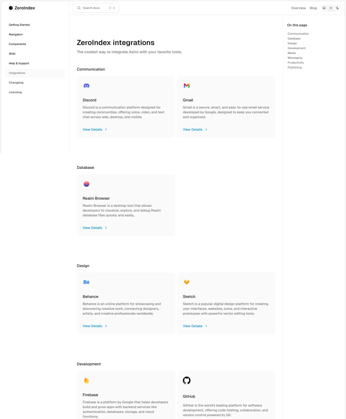
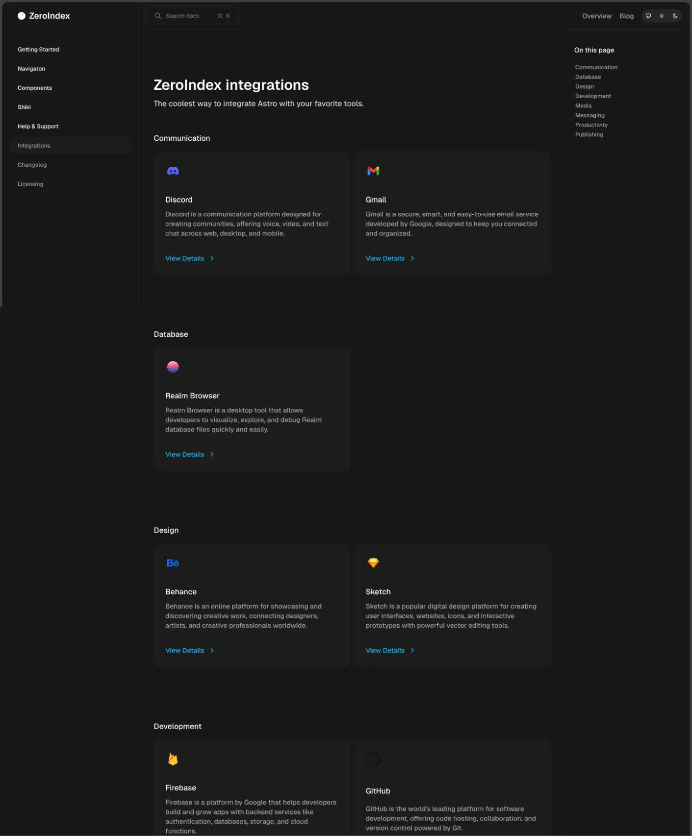
Integrations
Landing Pages
- Home page
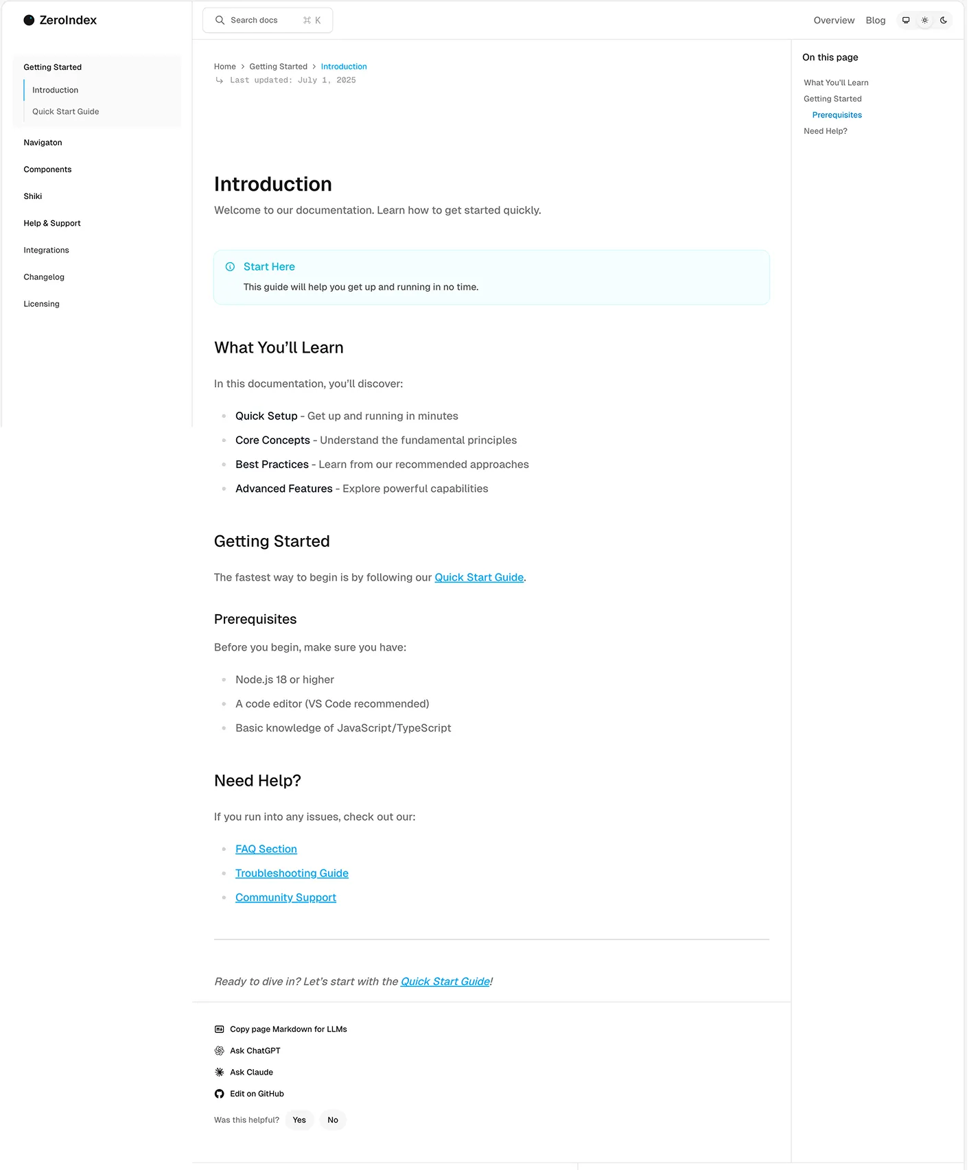
- Getting Started
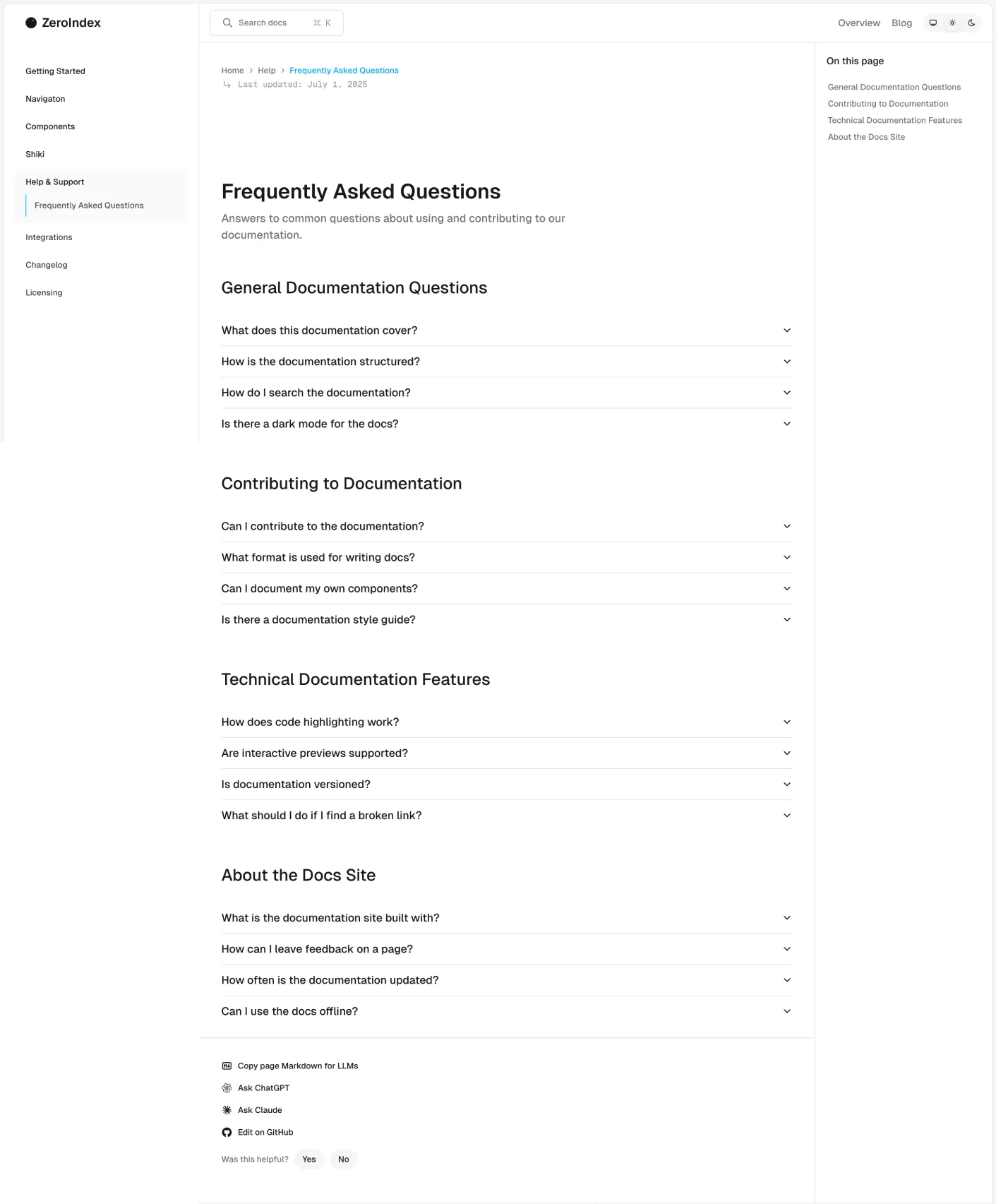
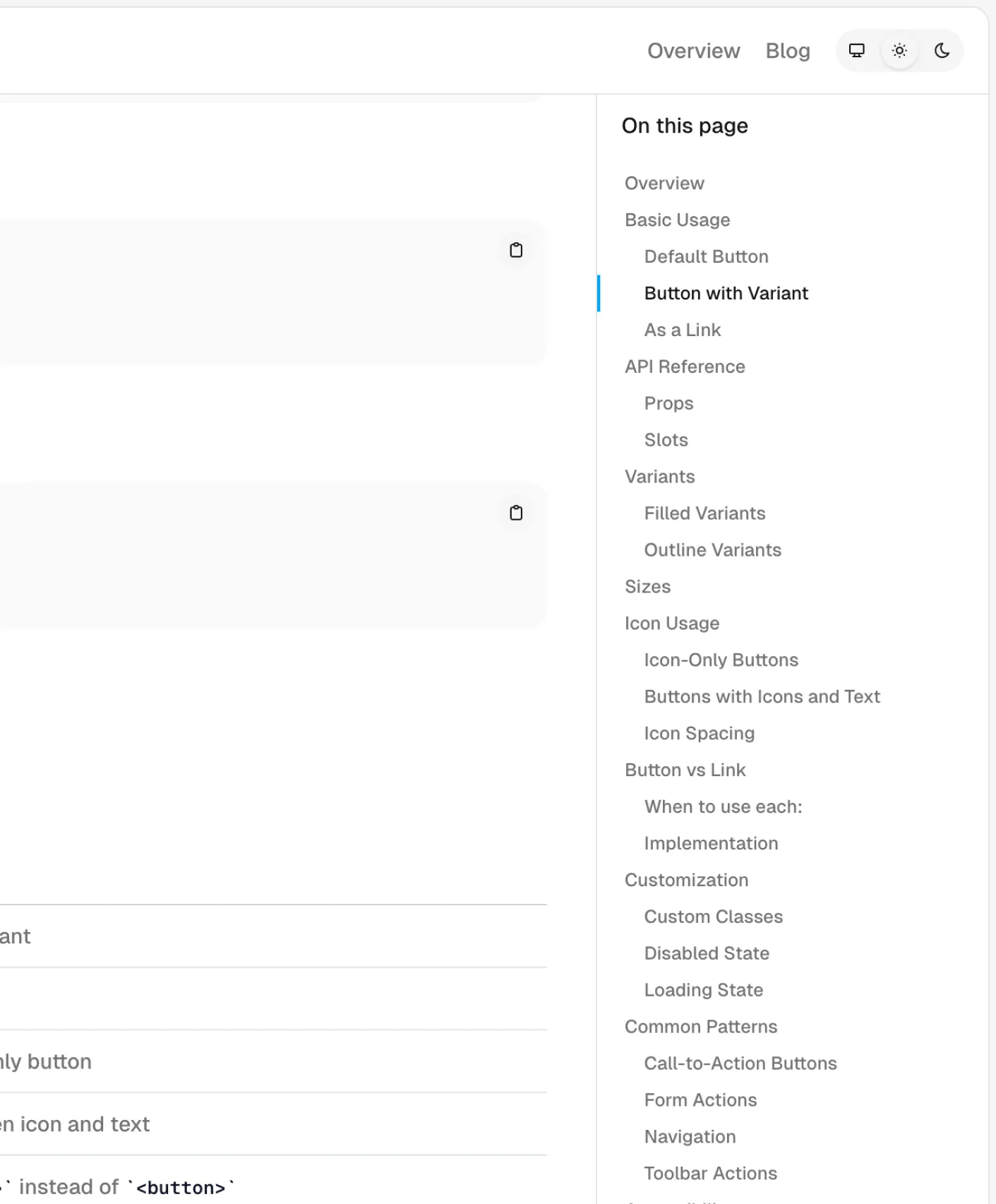
- Documentation pages
- Search functionality
- Export Code to Markdown
- Open page with ChatGPT
- Open page with Claude
- 404
Blog Pages
- Home
- Posts
- Tag index
- Tag category
- RSS
Forms
- Sign in
- Sign up
Team
- Home
- Details
Changelog
- Home
- Details
Integrations
- Home
- Details
Info Pages
- Terms
- Privacy
- Licensing
- Terms Of Use
- Privacy Policy
- Acceptable Use Policy
- Api usage Policy
System Pages
- Overview
- Links
- Buttons
- Buttons
- Typography
- Color guide
Typography — A flexible and semantic text component that supports multiple tag types and size variants—from body copy to massive display headlines.
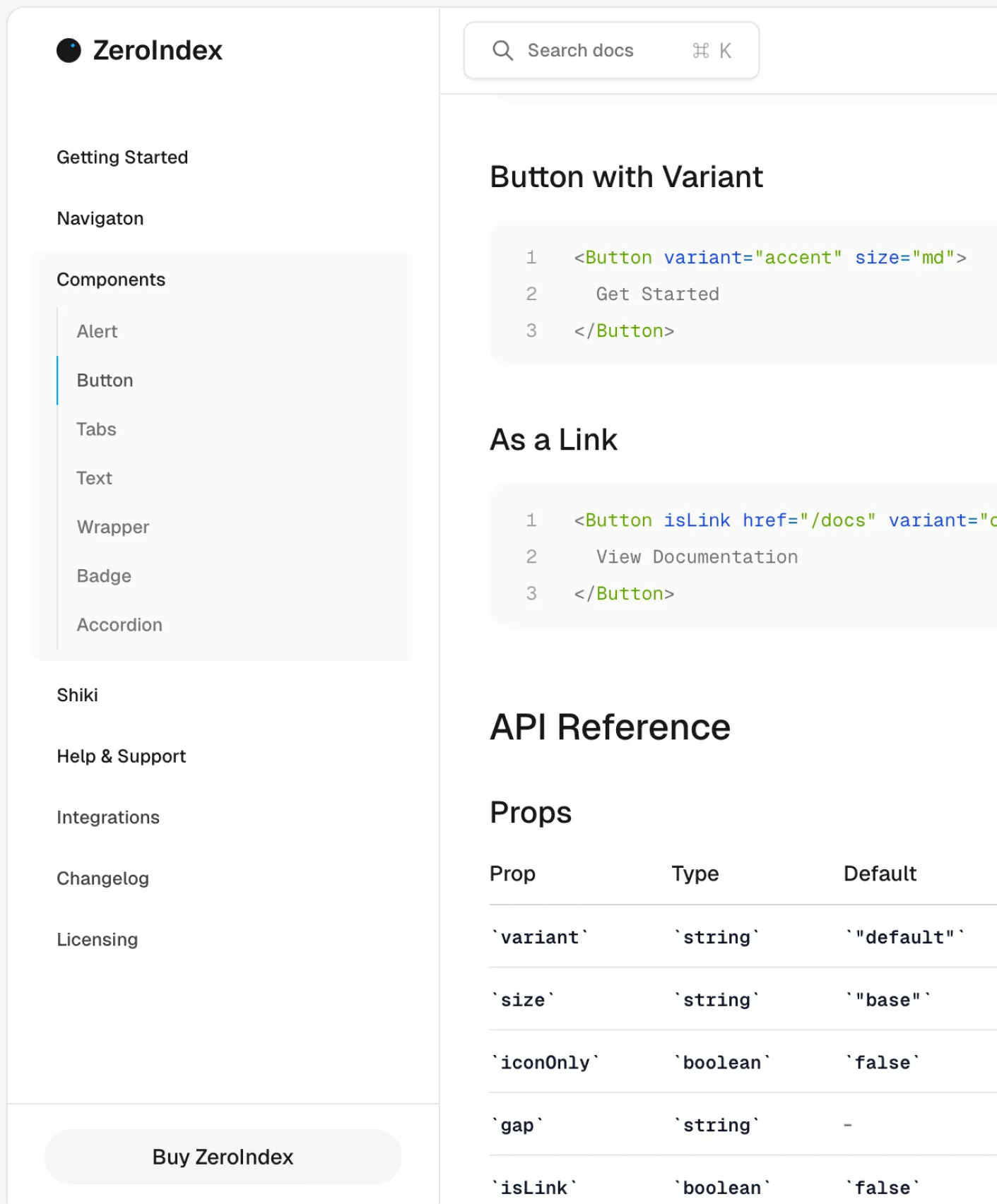
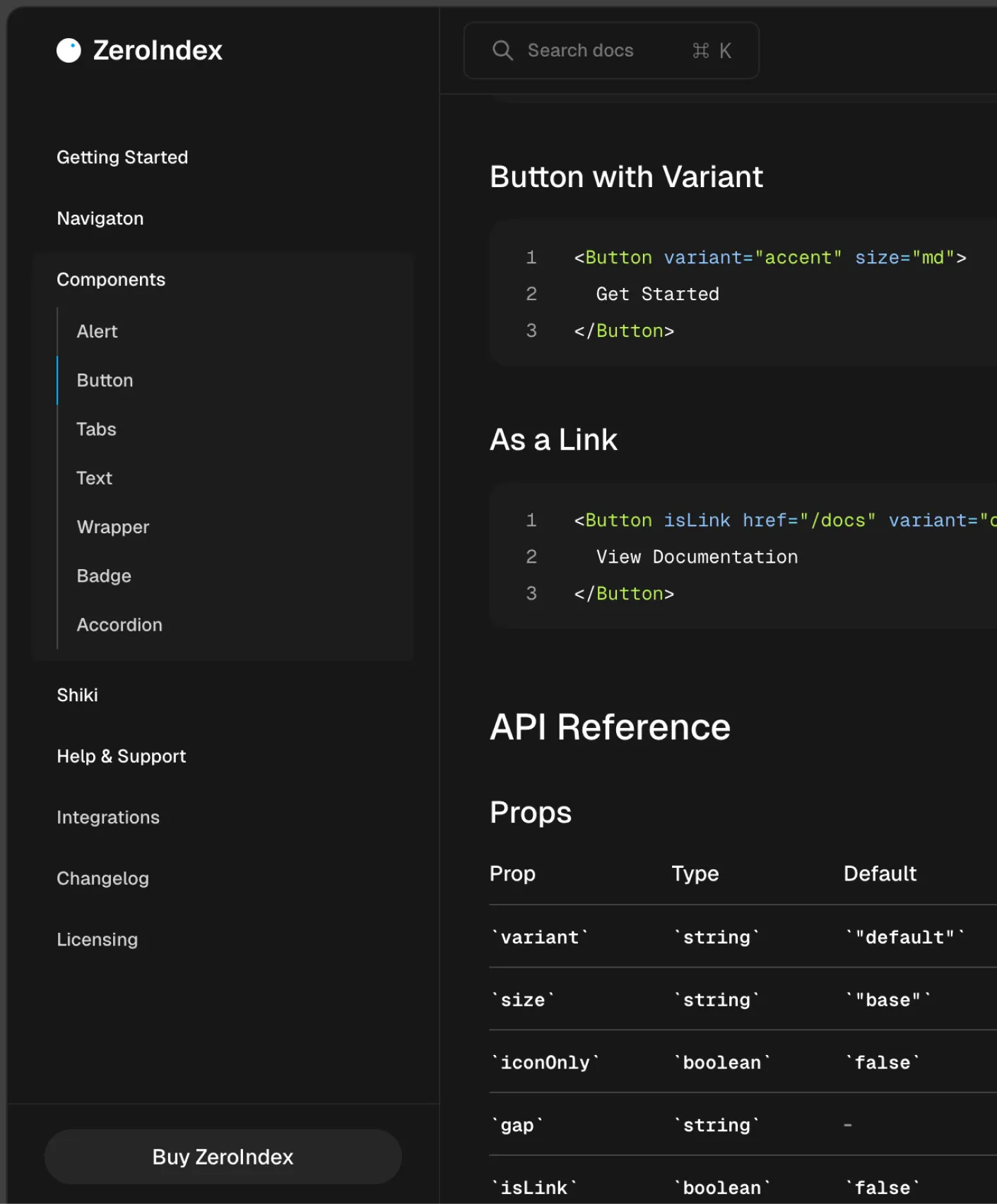
Button — A flexible and customizable button. Fully reusable with support for various styles, sizes, and icons, along with multiple variants.
Link — Just like the button, but as a link. Fully reusable and customizable with styles, sizes, icons, and multiple variants for flexibility
Icon — A flexible SVG icon component with adjustable sizes and custom styling support.
Wrapper — A versatile wrapper with multiple variants, supporting custom classes for easy styling and layout adjustments.
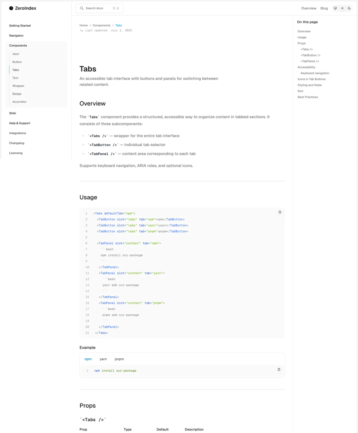
Tabs — A composable tab interface with keyboard support and animated panels. Easily used for toggling views or sections in a UI.
Alert — A contextual alert component for displaying important messages, warnings, or feedback, with support for icons and variants.
Accordion — An accessible and interactive disclosure component built with native `<details>` support, ideal for FAQs and collapsible sections.
Tailwind v4
- public
- src
- components
- layouts
- pages
- content
- folders
- config.ts
- data
- scripts
- styles
- global.css
- endv.d.ts
- astro.config.mjs
- package.json
- README.md
- ts.config.json