Creating a complex responsive grid layout with Tailwind CSS

Wed Jan 31 2024 Author ✺ Michael Andreuzza

Creating the grid

Perfect for the so called “bento grids”. full desktop grid
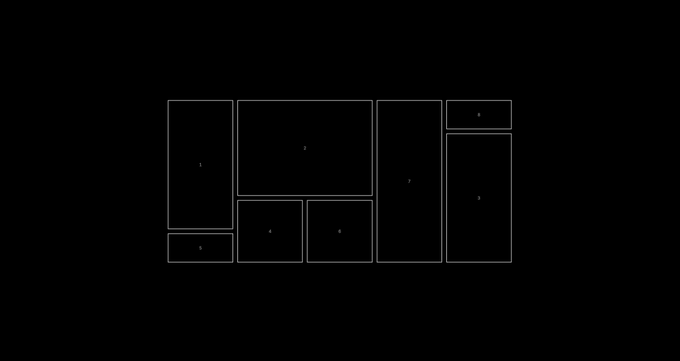
The grid magic happens here

  • ’grid’ initiates a grid layout.
  • ‘grid-cols-5’ and ‘grid-rows-5’ establish a 5x5 grid structure. This layout forms the backbone of our design. Individual grid items are key

Individual grid items are key

  • Use ‘row-span’ and ‘col-span’ to control the size and position of each item.
  • This flexibility allows for a variety of layouts within the same grid structure.

Centering content within grid items

  • Apply ‘flex’, ‘justify-center’, and ‘items-center’ within each grid cell.
  • This ensures that content is perfectly centered, both horizontally and vertically.

The grid snippet

<div class="grid grid-cols-5 grid-rows-5 gap-4 text-white">
  <div class="row-span-4">1</div>
  <div class="col-span-2 row-span-3">2</div>
  <div class="row-span-4 col-start-5 row-start-2">6</div>
  <div class="row-span-2 col-start-2 row-start-4">7</div>
  <div class="col-start-1 row-start-5">9</div>
  <div class="row-span-2 col-start-3 row-start-4">10</div>
  <div class="row-span-5 col-start-4 row-start-1">12</div>
  <div class="col-start-5 row-start-1">14</div>
</div>

Now let’s make it responsive

Now on the ‘md:’ breakpoint the grid will look like this:
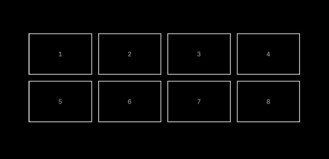
grid on md: brerakpoint

We have added ‘md:grid-cols-4’ break point to the grid container.

  • md: This is a responsive prefix in Tailwind CSS. It applies the following styling rule at the ‘md’ breakpoint and above. The ‘md’ breakpoint is typically defined at a minimum width of 768 pixels, but this can be customised in Tailwind’s configuration…
  • grid-cols-4: This part of the class specifies that the element should have a grid layout with four columns.

On mobile the grid looks like this.

The grid container also has class without any breakpoint called ‘grid-cols-2’.

  • grid-cols-2: This part of the class is quite straightforward. It sets up your grid to have two columns. Tailwind uses a 12-col system, so using

  • ’grid-cols-2’ means that the available space will be divided into two equal columns.
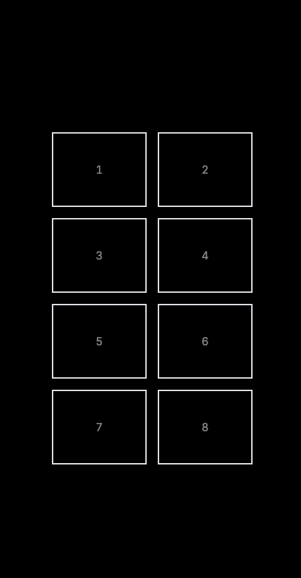
    grid on mobile brerakpoint We have also added the lg: prefix on ‘grid-cols-5’, ‘grid-rows-5‘row-span’ and ‘col-span’.

  • lg:: This prefix is part of Tailwind’s responsive design system. It indicates that the styling rule that follows should be applied only when the screen size is at or larger than the ‘lg’ breakpoint.

Finally this is how our code will look like

<div
  class="grid grid-cols-1 md:grid-cols-3 lg:grid-cols-5 grid-rows-8 md:grid-rows-5 gap-4 text-white/50"
>
  <!-- Item 1 -->
  <div
    class="row-span-2 md:row-span-4 lg:row-span-4 border p-10 flex justify-center items-center"
  >
    1
  </div>
  <!-- Item 2 -->
  <div
    class="border p-10 row-span-2 md:col-span-2 md:row-span-3 lg:col-span-2 lg:row-span-3 flex justify-center items-center"
  >
    2
  </div>
  <!-- Item 3 -->
  <div
    class="row-span-2 md:row-span-4 lg:row-span-4 border p-10 col-start-3 lg:col-start-5 row-start-3 lg:row-start-2 flex justify-center items-center"
  >
    3
  </div>
  <!-- Item 4 -->
  <div
    class="row-span-2 border p-10 col-start-1 md:col-start-2 lg:col-start-2 row-start-5 md:row-start-4 lg:row-start-4 flex justify-center items-center"
  >
    4
  </div>
  <!-- Item 5 -->
  <div
    class="row-span-2 border p-10 col-start-1 md:col-start-1 lg:col-start-1 row-start-7 md:row-start-5 lg:row-start-5 flex justify-center items-center"
  >
    5
  </div>
  <!-- Item 6 -->
  <div
    class="row-span-2 border p-10 col-start-2 md:col-start-3 lg:col-start-3 row-start-5 md:row-start-4 lg:row-start-4 flex justify-center items-center"
  >
    6
  </div>
  <!-- Item 7 -->
  <div
    class="row-span-2 md:row-span-5 lg:row-span-5 border p-10 col-start-3 md:col-start-4 lg:col-start-4 row-start-7 md:row-start-1 lg:row-start-1 flex justify-center items-center"
  >
    7
  </div>
  <!-- Item 8 -->
  <div
    class="row-span-2 border p-10 col-start-2 md:col-start-5 lg:col-start-5 row-start-7 md:row-start-1 lg:row-start-1 flex justify-center items-center"
  >
    8
  </div>
</div>

Creating a complex responsive grid layout with Tailwind CSS

Wed Jan 31 Author ✺ Michael Andreuzza

Perfect for the so called bento grids

Creating the grid

Perfect for the so called “bento grids”. full desktop grid

The grid magic happens here

  • ’grid’ initiates a grid layout.
  • ‘grid-cols-5’ and ‘grid-rows-5’ establish a 5x5 grid structure. This layout forms the backbone of our design. Individual grid items are key

Individual grid items are key

  • Use ‘row-span’ and ‘col-span’ to control the size and position of each item.
  • This flexibility allows for a variety of layouts within the same grid structure.

Centering content within grid items

  • Apply ‘flex’, ‘justify-center’, and ‘items-center’ within each grid cell.
  • This ensures that content is perfectly centered, both horizontally and vertically.

The grid snippet

<div class="grid grid-cols-5 grid-rows-5 gap-4 text-white">
  <div class="row-span-4">1</div>
  <div class="col-span-2 row-span-3">2</div>
  <div class="row-span-4 col-start-5 row-start-2">6</div>
  <div class="row-span-2 col-start-2 row-start-4">7</div>
  <div class="col-start-1 row-start-5">9</div>
  <div class="row-span-2 col-start-3 row-start-4">10</div>
  <div class="row-span-5 col-start-4 row-start-1">12</div>
  <div class="col-start-5 row-start-1">14</div>
</div>

Now let’s make it responsive

Now on the ‘md:’ breakpoint the grid will look like this:

grid on md: brerakpoint

We have added ‘md:grid-cols-4’ break point to the grid container.

  • md: This is a responsive prefix in Tailwind CSS. It applies the following styling rule at the ‘md’ breakpoint and above. The ‘md’ breakpoint is typically defined at a minimum width of 768 pixels, but this can be customised in Tailwind’s configuration…
  • grid-cols-4: This part of the class specifies that the element should have a grid layout with four columns.

On mobile the grid looks like this.

The grid container also has class without any breakpoint called ‘grid-cols-2’.

  • grid-cols-2: This part of the class is quite straightforward. It sets up your grid to have two columns. Tailwind uses a 12-col system, so using

  • ’grid-cols-2’ means that the available space will be divided into two equal columns.

    grid on mobile brerakpoint We have also added the lg: prefix on ‘grid-cols-5’, ‘grid-rows-5‘row-span’ and ‘col-span’.

  • lg:: This prefix is part of Tailwind’s responsive design system. It indicates that the styling rule that follows should be applied only when the screen size is at or larger than the ‘lg’ breakpoint.

Finally this is how our code will look like

<div
  class="grid grid-cols-1 md:grid-cols-3 lg:grid-cols-5 grid-rows-8 md:grid-rows-5 gap-4 text-white/50"
>
  <!-- Item 1 -->
  <div
    class="row-span-2 md:row-span-4 lg:row-span-4 border p-10 flex justify-center items-center"
  >
    1
  </div>
  <!-- Item 2 -->
  <div
    class="border p-10 row-span-2 md:col-span-2 md:row-span-3 lg:col-span-2 lg:row-span-3 flex justify-center items-center"
  >
    2
  </div>
  <!-- Item 3 -->
  <div
    class="row-span-2 md:row-span-4 lg:row-span-4 border p-10 col-start-3 lg:col-start-5 row-start-3 lg:row-start-2 flex justify-center items-center"
  >
    3
  </div>
  <!-- Item 4 -->
  <div
    class="row-span-2 border p-10 col-start-1 md:col-start-2 lg:col-start-2 row-start-5 md:row-start-4 lg:row-start-4 flex justify-center items-center"
  >
    4
  </div>
  <!-- Item 5 -->
  <div
    class="row-span-2 border p-10 col-start-1 md:col-start-1 lg:col-start-1 row-start-7 md:row-start-5 lg:row-start-5 flex justify-center items-center"
  >
    5
  </div>
  <!-- Item 6 -->
  <div
    class="row-span-2 border p-10 col-start-2 md:col-start-3 lg:col-start-3 row-start-5 md:row-start-4 lg:row-start-4 flex justify-center items-center"
  >
    6
  </div>
  <!-- Item 7 -->
  <div
    class="row-span-2 md:row-span-5 lg:row-span-5 border p-10 col-start-3 md:col-start-4 lg:col-start-4 row-start-7 md:row-start-1 lg:row-start-1 flex justify-center items-center"
  >
    7
  </div>
  <!-- Item 8 -->
  <div
    class="row-span-2 border p-10 col-start-2 md:col-start-5 lg:col-start-5 row-start-7 md:row-start-1 lg:row-start-1 flex justify-center items-center"
  >
    8
  </div>
</div>

Lexington

Beautifully designed HTML, Astro.js and Tailwind themes! Save months of time and build your startup landing page in minutes.