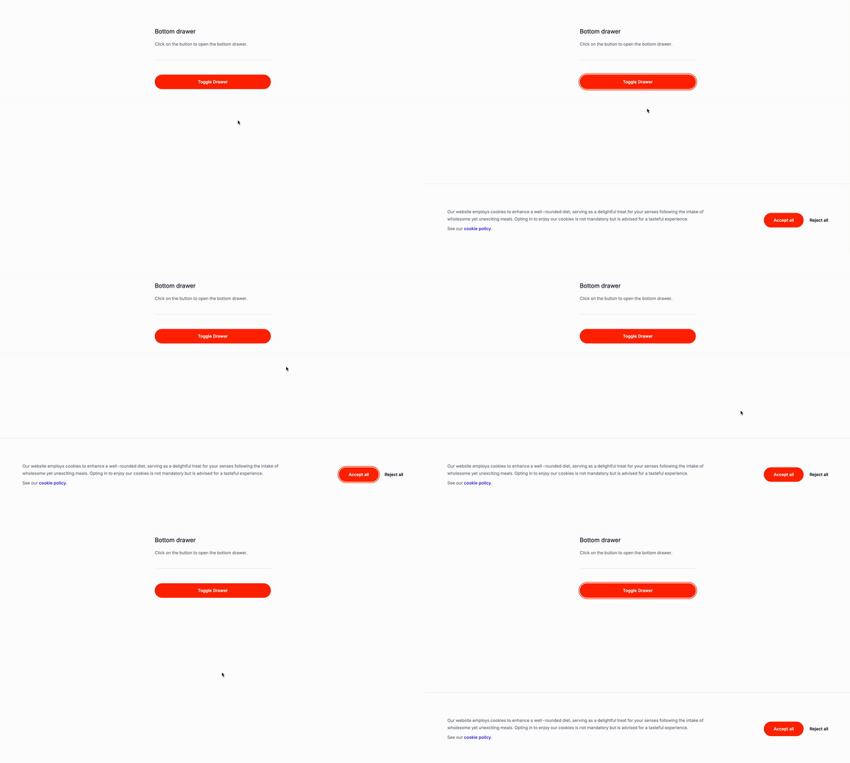
Today we’re going to recreate the bottom drawer from the previous tutorial with Alpine JS and Tailwind CSS, but this time we’ll use JavaScript instead of Alpine JS.
What is a Bottom Drawer?
A bottom drawer is a UI element located at the bottom of the screen, used to present extra information or options that complement the main content. It is often employed to show details about the current page, such as a navigation menu, a list of recent items, or various settings.
Use Cases:
-
Navigation Menus: Bottom drawers are ideal for mobile or tablet apps, providing easy access to navigation options without occupying much screen space. Users can navigate through different sections or pages conveniently without cluttering the interface.
-
Settings Panels: For applications where users frequently adjust settings, bottom drawers offer an intuitive spot for settings panels. Users can access and modify preferences seamlessly, enhancing the user experience by keeping settings readily accessible.
-
Sidebar Menus: When vertical space is limited, bottom drawers can replace traditional sidebar menus. This placement allows users to access navigation links or categories easily while focusing on the main content, improving usability across various screen sizes and orientations.
-
Pop-ups: Bottom drawers can effectively present contextual information or prompts without disrupting the user’s current task. This unobtrusive approach ensures that important messages are conveyed clearly, enhancing the user experience.
-
Modals: Bottom drawers provide a consistent and accessible way to display modal dialogs. By positioning modals at the bottom of the screen, users can interact with the content without losing context, maintaining visual continuity and usability.
-
Tooltips: Using bottom drawers for tooltips offers a neat solution for presenting additional information or guidance. This placement ensures that supplementary details are easily accessible without obstructing the user’s view, contributing to a more intuitive and user-friendly experience.
Let’s get started
Understanding the code:
The button
ìd=toggleButtonaria-expanded=“false”`: This is the button that will be used to toggle the bottom drawer. This will be the trigger for the bottom drawer.
The bottom drawer container
id="bottomDrawer": This is the container that will hold the bottom drawer.fxed: This is the positioning property that will make the bottom drawer fixed to the bottom of the screen.inset-x-0: This is the horizontal positioning property that will make the bottom drawer start from the left side of the screen.bottom-0: This is the vertical positioning property that will make the bottom drawer start from the bottom of the screen.transform: This is the transform property that will make the bottom drawer start from the bottom of the screen.translate-y-full: This is the transform property that will make the bottom drawer start from the bottom of the screen.transition-transform: This is the transition property that will make the bottom drawer start from the bottom of the screen.duration-300: This is the duration property that will make the bottom drawer start from the bottom of the screen.
The reject button
id="rejectButton": This is the button that will be used to close the bottom drawer.
Irrelevant classes have been removed for the sake of brevity
<button id="toggleButton"> Toggle Cookie Settings </button>
<div id="bottomDrawer" class="fixed inset-x-0 bottom-0 transform translate-y-full transition-transform duration-300">
<div>
<!-- Drawer content -->
<div class="flex items-center flex-none gap-x-5">
<button type="button"> Accept all </button>
<button type="button" id="rejectButton"> Reject all </button>
</div>
</div>
</div>Let’s add some JavaScript
The addEventListener
DOMContentLoaded: This is the event that will be used to add the JavaScript code to the page.toggleButton: This is the button that will be used to toggle the bottom drawer.bottomDrawer: This is the container that will hold the bottom drawer.rejectButton: This is the button that will be used to close the bottom drawer.
The toggleDrawer function
toggleDrawer(): This is the function that will be used to toggle the bottom drawer.bottomDrawer.classList.toggle("translate-y-full"): This is the code that will be used to toggle the bottom drawer.bottomDrawer.classList.toggle("translate-y-0"): This is the code that will be used to toggle the bottom drawer.
The closeDrawer function
closeDrawer(): This is the function that will be used to close the bottom drawer.bottomDrawer.classList.add("translate-y-full"): This is the code that will be used to close the bottom drawer.bottomDrawer.classList.remove("translate-y-0"): This is the code that will be used to close the bottom drawer.
The toggleButton click event
toggleButton.addEventListener("click", toggleDrawer);: This is the code that will be used to toggle the bottom drawer when the button is clicked.rejectButton.addEventListener("click", closeDrawer);: This is the code that will be used to close the bottom drawer when the reject button is clicked.document.addEventListener("click", (event): This is the code that will be used to close the bottom drawer when the user clicks outside of it.!bottomDrawer.contains(event.target): This is the code that will be used to close the bottom drawer when the user clicks outside of it.!toggleButton.contains(event.target): This is the code that will be used to close the bottom drawer when the user clicks outside of it.closeDrawer();: This is the code that will be used to close the bottom drawer when the user clicks outside of it.
document.addEventListener("DOMContentLoaded", () => {
const toggleButton = document.getElementById("toggleButton");
const bottomDrawer = document.getElementById("bottomDrawer");
const rejectButton = document.getElementById("rejectButton");
function toggleDrawer() {
bottomDrawer.classList.toggle("translate-y-full");
bottomDrawer.classList.toggle("translate-y-0");
}
function closeDrawer() {
bottomDrawer.classList.add("translate-y-full");
bottomDrawer.classList.remove("translate-y-0");
}
toggleButton.addEventListener("click", toggleDrawer);
rejectButton.addEventListener("click", closeDrawer);
document.addEventListener("click", (event) => {
if (
!bottomDrawer.contains(event.target) &&
!toggleButton.contains(event.target)
) {
closeDrawer();
}
});
});Conclusion
This is a simple bottom drawer that can be used for any type of content, such as a cookie policy, navigation menu, or settings panel, you name it. The code is easy to understand and the structure is clear. The use of Tailwind CSS and JavaScript makes it easy to style the bottom drawer and add interactivity. Remeber to make it as accessible as possible.
Hope you enjoyed this tutorial and have a great day!
/Michael Andreuzza
One price.
Lifetime access.
-
34 Premium Astro Templates
-
All Future Templates Included
-
Unlimited Projects · Lifetime License
