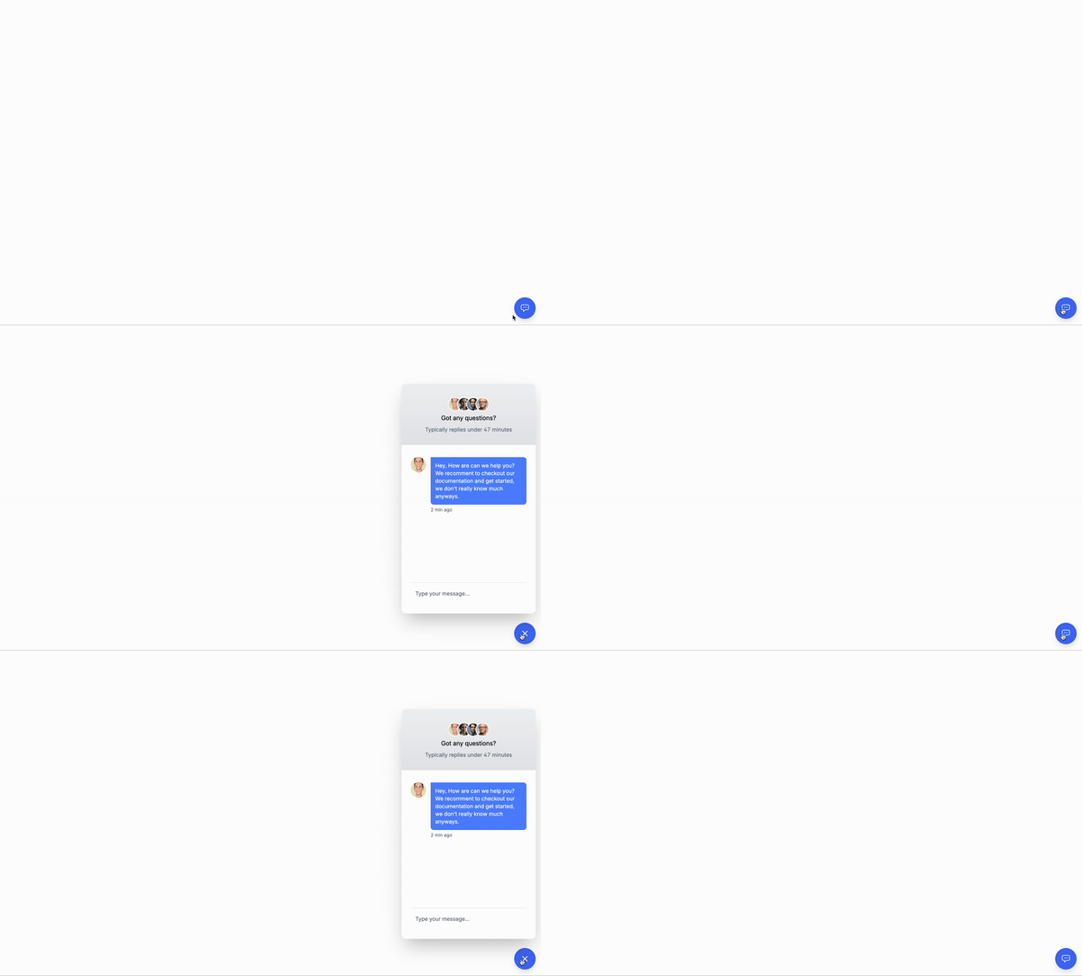
Remember the chat bubble we did with Tailwind CSS and Alpinejs? Well today we’ll be doing the same thing but using vanilla JavaScript instead!
A quick refresh of what is a chat or contact bubble is…
A chat bubble is a small bubble that appears on the screen when this one is toggled, normally with a button that says “Chat”, “Help”, or “Contact”. This one is normally on the bottom right of the screen and it contains a form and inputs that allows the user to send a message to another person.
Use Cases:
- Customer Support: It can be integrated into websites or web applications to provide real-time customer support. Users can click on the chat bubble to initiate a conversation with a support representative.
- Sales Assistance: Chat bubbles can be used to engage website visitors and assist them with product inquiries, helping to drive sales and conversions.
- Feedback Collection: Websites can use chat bubbles to solicit feedback from users about their experience, gather suggestions for improvement, or address any issues they encounter.
- Onboarding Assistance: Chat bubbles can provide onboarding assistance to new users, guiding them through the features and functionalities of a website or application.
- Lead Generation: Chat bubbles can capture leads by prompting visitors to provide their contact information or engage in a conversation about products or services.
This is the structure of the project: Understanding the code:
The wrapper element
id="app": This is the root element of the application.id="modal": This is the element that contains the chat bubble and the form.
The modal classe for positioning the chat bubble
hidden: This is the condition that determines whether the chat bubble is visible or not. We will use this to hide the chat bubble when the user clicks outside of it.fixed: This is the positioning of the chat bubble.flex-col: This is the layout of the chat bubble, we need to add this so that the chat bubble can be positioned vertically. Remember we are adding flex to toggle the visibility of the chat bubble.z-50: This is the z-index of the chat bubble.bottom-[100px]: This is the positioning of the chat bubble, we need to add this so that it is positioned at the bottom of the screen. As you can see is usingbottom-[100px]which is custom, just use what you want.top-0: This is the positioning of the chat bubble, we need to add this so that it is positioned at the top of the screen.left-0: This is the positioning of the chat bubble, we need to add this so that it is positioned at the left of the screen.sm:top-auto: This is the positioning of the chat bubble, we need to add this so that it is positioned at the top of the screen when the screen size is small.sm:right-5: This is the positioning of the chat bubble, we need to add this so that it is positioned at the right of the screen when the screen size is small.sm:left-auto: This is the positioning of the chat bubble, we need to add this so that it is positioned at the left of the screen when the screen size is small.h-[calc(100%-95px)]: This is a custom height for the chat bubble.w-full: This is the width of the chat bubble.sm:w-[350px]: This is the width of the chat bubble when the screen size is small.overflow-auto: This is the overflow of the chat bubble, we need to add this so that the chat bubble can scroll if the content is too long.min-h-[250px]: This is the minimum height of the chat bubble.sm:h-[600px]: This is the minimum height of the chat bubble when the screen size is small.
The rest of the classes on this div are visual styles, we will use them to style the chat bubble.
The buttons to open and close the chat bubble
id="toggleButton": This is the button that toggles the chat bubble.id="openIcon": This is the icon that appears when the chat bubble is open.id="closeIcon": This is the icon that appears when the chat bubble is closed.
Classes and irrelevant content are removed for brevity, but I’ll keep those classes relevant to the tutorial.
<div id="app">
<div id="modal" class="hidden fixed flex-col z-50 bottom-[100px] top-0 ring-0 left-0 sm:top-auto sm:right-5 sm:left-auto h-[calc(100%-95px)] w-full sm:w-[350px] overflow-auto min-h-[250px] sm:h-[600px] bg-white shadow-2xl rounded-xl transition-opacity duration-200 ease transform">
<div>
<div>
<div>
<img src="..." alt="#" />
<img src="..." alt="#" />
<img src="..." alt="#" />
<img src="..." alt="#" />
</div>
</div>
<h3>Got any questions?</h3>
<p> Typically replies under 47 minutes </p>
</div>
<div>
<div>
<img src="..." alt="" />
<div>
<div>
<p> Hey, How are can we help you? We recommend to checkout our documentation and get started, we don't really know much anyways. </p>
</div>
<span>2 min ago</span>
</div>
</div>
<div>
<input type="text" placeholder="Type your message…" />
</div>
</div>
</div>
<button id="toggleButton">
<svg id="openIcon">
<!-- Svg content for the chat bubble icon goes here-->
</svg>
<svg id="closeIcon">
<!-- Svg content for the close bubble icon goes here-->
</svg>
</button>
</div>The JavaScript
The event listener
document.addEventListener("DOMContentLoaded", function() {: This is the event listener that runs when the page is loaded.var modal = document.getElementById("modal");: This is the variable that holds the modal element.var toggleButton = document.getElementById("toggleButton");: This is the variable that holds the toggle button element.var openIcon = document.getElementById("openIcon");: This is the variable that holds the open icon element.var closeIcon = document.getElementById("closeIcon");: This is the variable that holds the close icon element.
The toggle button
toggleButton.addEventListener("click", function() {: This is the event listener that runs when the toggle button is clicked.var isHidden = modal.classList.contains("hidden");: This is the condition that determines whether the modal is hidden or not.if (isHidden) {: This is the condition that determines whether the modal is hidden or not.modal.classList.remove("hidden");: This is the action that removes the hidden class from the modal.modal.classList.add("flex");: This is the action that adds the flex class to the modal.setTimeout(function() {: This is the action that adds a timeout to the transition effect.modal.classList.remove("opacity-0", "translate-y-5");: This is the action that removes the opacity-0 and translate-y-5 classes from the modal.}, 10);: This is the action that sets the timeout to 10 milliseconds.openIcon.classList.add("hidden");: This is the action that adds the hidden class to the open icon.closeIcon.classList.remove("hidden");: This is the action that removes the hidden class from the close icon.} else {: This is the condition that determines whether the modal is hidden or not.modal.classList.add("opacity-0", "translate-y-5");: This is the action that adds the opacity-0 and translate-y-5 classes to the modal.setTimeout(function() {: This is the action that adds a timeout to the transition effect.modal.classList.add("hidden");: This is the action that adds the hidden class to the modal.modal.classList.remove("flex");: This is the action that removes the flex class from the modal.}, 200);: This is the action that sets the timeout to 200 milliseconds.openIcon.classList.remove("hidden");: This is the action that removes the hidden class from the open icon.closeIcon.classList.add("hidden");: This is the action that adds the hidden class to the close icon.
The event listener
document.addEventListener("click", function(event) {: This is the event listener that runs when the user clicks outside of the modal.if (!modal.contains(event.target) && !toggleButton.contains(event.target)) {: This is the condition that determines whether the user clicked outside of the modal.modal.classList.add("opacity-0", "translate-y-5");: This is the action that adds the opacity-0 and translate-y-5 classes to the modal.setTimeout(function() {: This is the action that adds a timeout to the transition effect.modal.classList.add("hidden");: This is the action that adds the hidden class to the modal.modal.classList.remove("flex");: This is the action that removes the flex class from the modal.}, 200);: This is the action that sets the timeout to 200 milliseconds.openIcon.classList.remove("hidden");: This is the action that removes the hidden class from the open icon.closeIcon.classList.add("hidden");: This is the action that adds the hidden class to the close icon.}: This is the end of the event listener.
document.addEventListener("DOMContentLoaded", function() {
var modal = document.getElementById("modal");
var toggleButton = document.getElementById("toggleButton");
var openIcon = document.getElementById("openIcon");
var closeIcon = document.getElementById("closeIcon");
toggleButton.addEventListener("click", function() {
var isHidden = modal.classList.contains("hidden");
if (isHidden) {
modal.classList.remove("hidden");
modal.classList.add("flex");
setTimeout(function() {
modal.classList.remove("opacity-0", "translate-y-5");
}, 10); // timeout for transition effect
openIcon.classList.add("hidden");
closeIcon.classList.remove("hidden");
} else {
modal.classList.add("opacity-0", "translate-y-5");
setTimeout(function() {
modal.classList.add("hidden");
modal.classList.remove("flex");
}, 200); // match transition duration
openIcon.classList.remove("hidden");
closeIcon.classList.add("hidden");
}
});
document.addEventListener("click", function(event) {
if (
!modal.contains(event.target) &&
!toggleButton.contains(event.target)
) {
modal.classList.add("opacity-0", "translate-y-5");
setTimeout(function() {
modal.classList.add("hidden");
modal.classList.remove("flex");
}, 200);
openIcon.classList.remove("hidden");
closeIcon.classList.add("hidden");
}
});
});Conclusion
This is a simple chat bubble that uses Tailwind CSS and JavaScript. It’s a great starting point for building more complex chat bubbles and checkout the other tutorials for more advanced examples. Remember to add validation and error handling to make sure the chat bubble is always up-to-date, accurate, secure and accessible.
Something good to know is that there is already companies that offer chat bubbles, so you can use them as a starting point and avoid all the hustle of building your own.
Hope you enjoyed this tutorial and have a great day!
/Michael Andreuzza
One price.
Lifetime access.
-
34 Premium Astro Templates
-
All Future Templates Included
-
Unlimited Projects · Lifetime License
