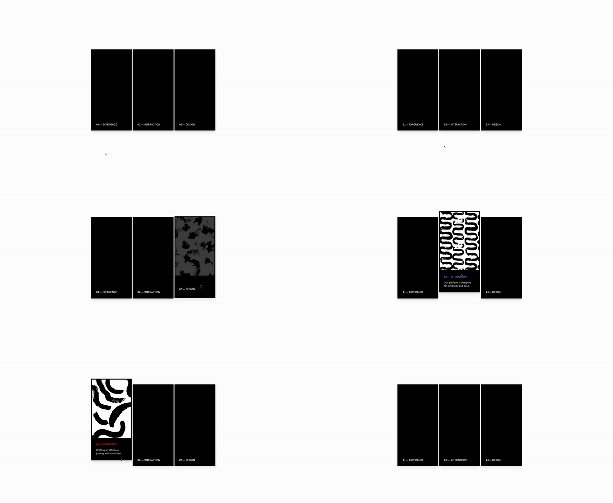
How to create a dynamic feature grid with Astrojs and Tailwind CSS

If you’re already familiar with Astro.js, let’s add some interactivity with Tailwind CSS. We’ll focus on the dynamic rendering of feature cards using an array. This method not only simplifies your code but also adds a layer of sophistication to your website.
Let’s build it
We are starting witht he array because Astro.js allows us to inject JavaScript directly into our HTML, enabling dynamic class assignments through template literals. This powerful feature lets us tailor the styling of each card based on its properties, ensuring our grid is not only dynamic but also visually cohesive.
The important parts are this dynamic styles:
-
bgImage: The URL for the background image of each card. This visual element adds depth and interest to your cards, making them more engaging. -
bgColor: Specifies the background color of each card. In the context of Tailwind CSS, this is often a class name that applies a color (e.g., bg-black). It’s used for cards without a background image or to provide a colored overlay. In this case I used black in all three because, I liked the color. -
titleColor: Defines the color of the title text, enhancing readability against the card’s background. In Tailwind CSS, this is represented by class names (e.g.,text-white).
// Define an array of objects named 'features'. Each object represents a feature of your platform or product,
// including properties for title, background image URL, description, background color, and title hover color.
const features = [
  {
    title: " Experience",
    bgImage: "...",
    description: "Crafting an effortless journey with user-first.",
    bgColor: "bg-black", // Background color class for Tailwind CSS.
    titleColor: "group-hover:text-orange-500", // Tailwind CSS class for text color change on group hover.
  },
  {
    title: " Interaction",
    bgImage: "...",
    description: "Our platform is designed for simplicity and ease.",
    bgColor: "bg-black", // Background color class for Tailwind CSS.
    titleColor: "group-hover:text-indigo-400", // Tailwind CSS class for text color change on group hover.
  },
  {
    title: " Design",
    bgImage: "...",
    description: "Our design philosophy centers around the user.",
    bgColor: "bg-black", // Background color class for Tailwind CSS.
    titleColor: "group-hover:text-cyan-400", // Tailwind CSS class for text color change on group hover.
  },
  // Additional feature objects...
];
The skeleton
And the magic happens here, dynamically rendering each feature card:
This si what we are goign to control dyanmically
-
`style={{backgroundImage: url('${feature.bgImage}')}};`: This inline style dynamically sets the background image of each article element based on thebgImageURL provided in each feature object. It uses JavaScript template literals to insert the image URL directly into the CSS property. -
class={`${{feature.bgColor}} relative h-full group-hover:bg-opacity-0 min-h-150 flex flex-wrap flex-col pt-[30rem] hover:bg-opacity-75 transform duration-300`}: This class string combines Tailwind CSS utility classes and custom classes defined in the feature object: -
${{feature.bgColor}}: Dynamically applies a background color class from the feature object. -
class={`${{feature.bgColor}} p-8 h-full justify-end flex flex-col`}: Similar to the previous, this applies a dynamic background color and sets up flexbox styling to position the feature content (title and description) at the bottom of the card: -
class={`text-white mt-2 text-xl mb-5 transform translate-y-20 uppercase group-hover:translate-y-0 duration-300 ${{feature.titleColor}}`}: Styles the title with a mix of static and dynamic classes: -
text-white ${{feature.titleColor}}: Ensures the text color is white, with an additional dynamic color class that can change based on group hover.
Number String with Dash
Not specifically from Astro, but is there to simplify our code
{String(index + 1).padStart(2, "0") + "⏤"}: Converts the current index to a 2-digit string, adds 1 to start numbering from 1, and appends a dash for formatting. Useful for creating consistent, numbered labels for each feature.
The full template
{
  features.map((feature, index) => (
    <>
      <article
        class="mx-auto shadow-xl bg-cover bg-center min-h-150 relative border-8 border-black transform duration-500 hover:-translate-y-12 group"
        style={`background-image: url('${feature.bgImage}');`}
      >
        <div
          class={`${feature.bgColor} relative h-full group-hover:bg-opacity-0 min-h-150 flex flex-wrap flex-col pt-[30rem] hover:bg-opacity-75 transform duration-300`}
        >
          <div
            class={` ${feature.bgColor} p-8 h-full justify-end flex flex-col`}
          >
            <h1
              class={`text-white mt-2 text-xl mb-5 transform translate-y-20 uppercase group-hover:translate-y-0 duration-300 ${feature.titleColor}`}
            >
              {String(index + 1).padStart(2, "0") + "⏤"} {feature.title}
            </h1>
            <p class="opacity-0 text-white text-xl group-hover:opacity-80 transform duration-500">
              {feature.description}
            </p>
          </div>
        </div>
      </article>
    </>
  ))
}
And there you have it—a step-by-step guide to creating a dynamic feature grid using Astro.js and Tailwind CSS. By combining Astro.js’s efficient rendering capabilities with the stylistic flexibility of Tailwind CSS, you’ve learned how to craft an interactive component that not only looks great but also enhances your website’s user experience.
/Michael Andreuzza

