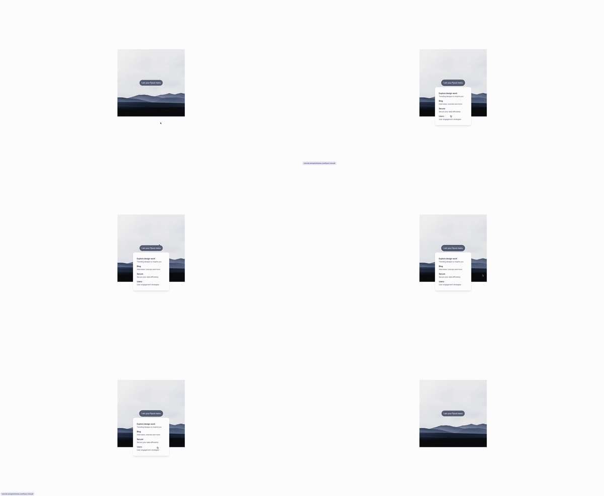
Let’s build a simple flyout menu, AKA dropdown.
Let’s have a look
-
Alpine.js Initialization and State Management:
x-data="{ open: false }"This attribute initializes Alpine.js on the enclosing div and sets up a reactive data model with a single propertyopen, which tracks whether the dropdown menu is visible (true) or not (false). This model serves as the local state for the dropdown component. -
Triggering the Dropdown:
@click="open = !open"Attached to the button, this directive toggles the open state between true and false upon each click. This is how the dropdown menu is shown or hidden. It changes the state, which in turn, triggers the reactivity system of Alpine.js to show or hide the dropdown content based on the current state. -
Handling Outside Clicks:
@click.away="open = false"Listens for clicks outside the dropdown’s parentdivand setsopentofalse, closing the dropdown. -
Transition Effects:
x-show="open": Toggles the visibility of the dropdown menu based on theopenstate.
<div
@click.away="open = false"
class="relative flex"
x-data="{ open: false }">
</div>Alpine.js Transitions
Alpine.js provides a simple way to add enter and leave transitions to elements, making it possible to animate them smoothly when they are inserted into or removed from the DOM. The attributes used in the dropdown menu code snippet control these transitions:
-
x-show="open": This directive toggles the visibility of the dropdown content based on theopenstate variable. Whenopenistrue, the content is shown; whenfalse, it is hidden. -
x-transition:enter="transition ease-out duration-100": Specifies the enter transition’s properties.transition ease-out duration-100means the element will transition into view over 100 milliseconds with an “ease-out” timing function, making the start of the transition fast and then slowing down. -
x-transition:enter-start="transform opacity-0 scale-95": Sets the starting state of the enter transition.transform opacity-0 scale-95means the element starts slightly scaled down (to 95% of its full size) and completely transparent. -
x-transition:enter-end="transform opacity-100 scale-100": Defines the end state of the enter transition. The element transitions to full opacity (opacity-100) and its original scale (scale-100), making it fully visible and at its natural size. -
x-transition:leave="transition ease-in duration-75": Similar tox-transition:enter, but for the leave transition. Theease-in duration-75makes the element disappear with an “ease-in” timing over 75 milliseconds, starting slow and ending fast. -
x-transition:leave-start="transform opacity-100 scale-100"andx-transition:leave-end="transform opacity-0 scale-95": These attributes define the starting and ending states for the leave transition, mirroring the enter transition but in reverse. The element fades out toopacity-0and scales down to95%of its size as it exits.
<div
x-show="open"
x-transition:enter="transition ease-out duration-100"
x-transition:enter-start="transform opacity-0 scale-95"
x-transition:enter-end="transform opacity-100 scale-100"
x-transition:leave="transition ease-in duration-75"
x-transition:leave-start="transform opacity-100 scale-100"
x-transition:leave-end="transform opacity-0 scale-95"
class="....">
</div>Tailwind CSS Classes
The dropdown menu also utilizes Tailwind CSS for styling and layout, with classes that control its position, size, and appearance:
class="absolute z-10 w-screen max-w-xs px-2 mt-3 transform -translate-x-1/2 left-1/2": A combination of utility classes that achieve the following:absolute: Positions the dropdown absolutely relative to its nearest positioned ancestor.z-10: Sets the stacking order, ensuring the dropdown appears above other content.max-w-xs: Limits the maximum width of the dropdown.w-screen: Sets the width to match the viewport width.px-2: Applies padding along the x-axis.mt-3: Adds margin to the top, spacing the dropdown away from the toggle button.transform -translate-x-1/2 left-1/2: Centers the dropdown horizontally relative to its parent. Thetransformutility enables the use of translate, and-translate-x-1/2moves the element left by half its width, whileleft-1/2positions it at the center of the screen.
<div
x-show="open"
x-transition:enter="..."
x-transition:enter-start="..."
x-transition:enter-end="..."
x-transition:leave="..."
x-transition:leave-start="..."
x-transition:leave-end="..."
class="absolute z-10 w-screen max-w-xs px-2 mt-3 transform -translate-x-1/2 left-1/2">
</div>Together, these transitions and classes create a user-friendly dropdown menu with smooth animations and a clean, modern appearance.
/Michael Andreuzza
One price.
Lifetime access.
-
34 Premium Astro Templates
-
All Future Templates Included
-
Unlimited Projects · Lifetime License
