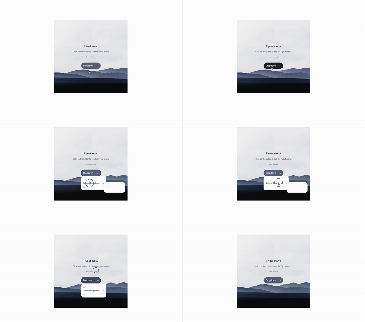
Let’s create a flyout menu with a submenu using only Tailwind CSS. This is a great way to add a flyout menu to your website.
What is a Flyout Menu with Submenu?
A flyout menu with a submenu is a type of interactive navigation element commonly used on websites to organize and display a large amount of information in a compact and user-friendly way.
-
Flyout Menu: This menu appears dynamically when a user interacts with a specific button, link, or area on a webpage, typically by hovering the mouse over it or clicking on it. The menu “flies out” from its origin, displaying a list of options or links.
-
Submenu: Within a flyout menu, certain options might contain additional levels of navigation, called submenus. When you hover over or click on a specific item within the main flyout menu, a secondary menu (the submenu) appears, offering more detailed or related options. This allows you to group related links or options together, reducing clutter on the main menu.
-
Example: Imagine you have a “Products” button on your website. When you hover over it, a flyout menu appears showing categories like “Electronics,” “Clothing,” and “Home Goods.” If you hover over “Electronics,” a submenu might fly out, showing subcategories like “Smartphones,” “Laptops,” and “Cameras.”
This design helps keep your navigation organized and user-friendly, especially on content-rich websites where space is limited, but a lot of options need to be easily accessible.
Use Cases:
- Navigation Menus: Enhance your website’s navigation by organizing content into categories and subcategories, making it easier for users to find what they’re looking for.
- E-commerce Sites: Use flyout menus to display product categories and subcategories, improving the shopping experience by allowing customers to quickly browse products.
- Admin Dashboards: Implement flyout menus in admin panels to organize complex settings and options, making it easier for users to manage content and settings.
- Content-Rich Websites: For blogs or news sites, use flyout menus to categorize articles and topics, helping visitors navigate through a large volume of content effortlessly.
- Mobile-Friendly Menus: Adapt the flyout menu for responsive design, offering a compact, touch-friendly navigation solution for mobile users.
Let’s get to the markup
The drodpown menu wrapper
The flyout menu wrapper is a simple li element with a button and a div that contains the flyout menu items.
group: This is a utility class that allows you to group multiple elements together.relative: This is a utility class that allows you to position an element relative to its normal position.tabindex="-1": This is an attribute that allows you to set the tab order of an element. It is used to make the flyout menu accessible to keyboard users.
The button itself doesn’t have any specific class to make it work. Classes are removed for brevity.
<li class="relative group" tabindex="-1">
<!-- flyout button -->
<button>flyout </button>
<!-- First flyout menu goes here-->
</li>The first flyout menu container
The first flyout menu container is a simple div element that contains the flyout menu items, here we’re using the invisible and opacity-0 classes to make it invisible and transparent.
invisible: This is a utility class that hides an element but keeps it in the flow of the document.opacity-0: This is a utility class that sets the opacity of an element to 0.transition-all: This is a utility class that adds a transition effect to an element.group-focus-within:visible: This is a utility class that applies thevisibleclass to the element when the flyout menu is focused.group-focus-within:opacity-100: This is a utility class that applies theopacity-100class to the element when the flyout menu is focused.z-50: This is a utility class that sets the z-index of an element to 50. It is used to ensure that the flyout menu is displayed on top of other elements.
<div
class="absolute z-50 invisible w-48 opacity-0 top-full transform transition-all group-focus-within:visible group-focus-within:opacity-100">
<!-- Frist Flyout content -->
</div>The second flyout menu container
The second flyout is sort of the same, but we apply the group/secondflyout class to the li element and the secondflyout class to the button. This is to make sure that the second flyout menu is only visible when the first flyout menu is focused.
group/secondflyout: This is a utility class that allows you to group multiple elements together and apply a specific class to the first element that matches the group.relative: This is a utility class that allows you to position an element relative to its normal position.
<li class="relative group/secondflyout">
<button>
<span>Second flyout</span>
</button>
<!-- Second flyout menu container goes here -->
</li>The second flyout menu
The second flyout menu is another div element that contains the flyout menu items. We’re using the invisible and opacity-0 classes to make it invisible and transparent, just like the first flyout menu.
invisible: This is a utility class that hides an element but keeps it in the flow of the document.opacity-0: This is a utility class that sets the opacity of an element to 0.transition-all: This is a utility class that adds a transition effect to an element.z-50: This is a utility class that sets the z-index of an element to 50.
This classes are key to make the second flyout menu work
group-focus-within/secondflyout:visible: This is a utility class that applies thevisibleclass to the element when the second flyout menu is focused.group-focus-within/secondflyout:opacity-100: This is a utility class that applies theopacity-100class to the element when the second flyout menu is focused.group-hover/secondflyout:visible: This is a utility class that applies thevisibleclass to the element when the second flyout menu is hovered.group-hover/secondflyout:opacity-100: This is a utility class that applies theopacity-100class to the element when the second flyout menu is hovered.
<div
class="absolute top-0 z-50 invisible w-40 opacity-0 left-full transform transition-all group-focus-within/secondflyout:visible group-focus-within/secondflyout:opacity-100 group-hover/secondflyout:visible group-hover/secondflyout:opacity-100">
<ul class="mt-1 space-y-2">
<!-- Flyout items -->
</ul>
</div>Here’s the final markup withotu visial styles
<ul>
<!-- Other navigation items -->
<li
class="relative group"
tabindex="-1">
<button>flyout </button>
<div
class="absolute z-50 invisible w-48 opacity-0 top-full transform transition-all group-focus-within:visible group-focus-within:opacity-100">
<!-- Frist Flyout items -->
<ul class="space-y-2">
<!-- Flyout items -->
<li class="relative group/secondflyout">
<button>
<span>Second flyout</span>
</button>
<div
class="absolute top-0 z-50 invisible w-40 opacity-0 left-full transform transition-all group-focus-within/secondflyout:visible group-focus-within/secondflyout:opacity-100 group-hover/secondflyout:visible group-hover/secondflyout:opacity-100">
<ul class="mt-1 space-y-2">
<!-- Flyout items -->
</ul>
</div>
</li>
<!-- Flyout items -->
</ul>
</div>
</li>
<!-- Other navigation items -->
</ul>Conclusion
This is a simple flyout menu with a submenu example that demonstrates how to use Tailwind CSS and Alpinejs to create a flyout menu with submenu. It’s a great starting point for building more complex flyout menus and submenus.
Hope you enjoyed this tutorial and have a great day!
/Michael Andreuzza
One price.
Lifetime access.
-
34 Premium Astro Templates
-
All Future Templates Included
-
Unlimited Projects · Lifetime License
