How to create a grid toggle with Tailwind CSS and Alpinejs
Let’s build a super useful grid toggle with Tailwind CSS and Alpinejs.
What is a grid toggle?
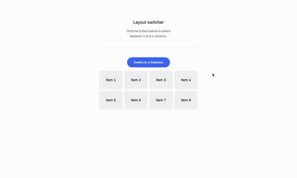
A grid toggle is a component that allows the user to switch between two different grid layouts. It’s commonly used in web applications to display different content in a grid format. The grid toggle can be used to switch between two different grid layouts, such as two columns or four columns, or none at all. It’s a simple and effective way to display content in a grid format, making it easy to organize and present information.
Use cases:
- Product listings: A grid toggle can be used to switch between two different grid layouts, such as two columns or four columns, to display product listings.
- Blog posts: A grid toggle can be used to switch between two different grid layouts, such as two columns or four columns, to display blog posts.
- News articles: A grid toggle can be used to switch between two different grid layouts, such as two columns or four columns, to display news articles.
- Image galleries: A grid toggle can be used to switch between two different grid layouts, such as two columns or four columns, to display image galleries.
Let’s get started
This is the structure of the project: Understanding the code:
x-data="{ isFourColumns: true }": This is the data that will be used to store the state of the grid toggle.<div x-show="isFourColumns">: This is the content of the first step.<div x-show="!isFourColumns">: This is the content of the second step.<button @click="isFourColumns = !isFourColumns">: This is the button that toggles the grid layout.<div :class="{'grid-cols-4': isFourColumns, 'grid-cols-2': !isFourColumns}": This is the grid layout.
Classes are removed for brevity, but I’ll keep those classes relveant to the tutorial.
<div

  x-data="{ isFourColumns: true }">
  <div>
    <button
      @click="isFourColumns = !isFourColumns"
      x-text="isFourColumns ? 'Switch to 2 Columns' : 'Switch to 4 Columns'">
    </button>
  </div>
  <!-- Grid Layout -->
  <div
    :class="{'grid-cols-4': isFourColumns, 'grid-cols-2': !isFourColumns}"
    class="grid gap-2 mt-4">
    <!-- Items in the Grid -->
    <div>Item 1</div>
    <div>Item 2</div>
    <div>Item 3</div>
    <div>Item 4</div>
    <div>Item 5</div>
    <div>Item 6</div>
    <div>Item 7</div>
    <div>Item 8</div>
  </div>
</div>
Conclusion
This is a simple grid toggle that can be used for any type of content, such as a product listing, blog posts, news articles, or image galleries.
Hope you enjoyed this tutorial and have a great day!
/Michael Andreuzza