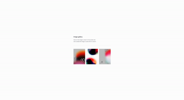
Let’s say you have a collection of images that you want to display in a gallery. That’s what this tutorial is all about.
What are image galleries?
Image galleries are a way to display a collection of images in a visually appealing way. They are used to showcase a variety of images or to provide a preview of a product or service.
Use Cases:
- Product images: For example, a product gallery can be used to showcase different product images or features.
- Service images: A service gallery can be used to showcase different service images or features.
- Event images: An event gallery can be used to showcase different event images or features.
- Blog images: A blog gallery can be used to showcase different blog images or features.
and so on and so forth. There’s a lot of different use cases for image galleries, and the possibilities are endless.
Let’s get started by creating the structure
Understanding the code:
x-data="{ currentImage: null }": This is the data that will be used to store the current image.x-init="(): This is the initialization code that will be executed when the component is first rendered.window.addEventListener('keydown', (event): This is the event listener that will be added to the window object.if (event.key === 'Escape'): This is the condition that will be checked when the Escape key is pressed.currentImage = null;: This is the code that will be executed when the Escape key is pressed.x-on:click="currentImage = '/path-to-your/image.png'": This is the event listener that will be added to the image elements.src="/path-to-your/image.png": This is the where you will put the path to your image.x-on:click="currentImage = null": This is the event listener that will be added to the close button.@click.away="currentImage = null": This is the event listener that will be added to the close button.:src="currentImage": This is the attribute that will be added to the image element.
Classes are removed for brevity, but I’ll keep those classes relevant to the tutorial.
<div
x-data="{ currentImage: null }"
x-init="() => {
window.addEventListener('keydown', (event) => {
if (event.key === 'Escape') {
currentImage = null;
}
});
}">
<div class="grid grid-cols-3 gap-4">
<div
x-on:click="currentImage = '/path-to/image-1.png'">
<img
src="/path-to/image-1.png"
alt="Image 1"
/>
</div>
<div
x-on:click="currentImage = '/path-to/image-2.png'">
<img
src="/path-to/image-2.png"
alt="Image 2"
/>
</div>
<div
x-on:click="currentImage = '/path-to/image-3.png'">
<img
src="/path-to/image-3.png"
alt="Image 3"
/>
</div>
<!-- Add more image placeholders as needed -->
</div>
<!-- Modal -->
<div
x-show="currentImage"
role="dialog"
aria-modal="true"
aria-labelledby="modal-title">
<div
@click.away="currentImage = null"
tabindex="-1"
aria-labelledby="modal-title"
aria-describedby="modal-description">
<button
@click="currentImage = null"
>Close</button
>
<img
:src="currentImage"
alt="Full Size Image"
/>
</div>
</div>
</div>
<div
@click.away="currentImage = null"
>
<img
:src="currentImage"
/>
</div>
</div>
</div>
Conclusion
This is a simple image gallery that can be used for any type of content, such as products, services, or blog posts. But before using it make sure to make it fully accessible and responsive. You can also add more features to the gallery, such as zooming in and out, or adding a caption to each image, a button to go back to the previous image, to close the modal, and so on.
Hope you enjoyed this tutorial and have a great day!
/Michael Andreuzza
One price.
Lifetime access.
-
34 Premium Astro Templates
-
All Future Templates Included
-
Unlimited Projects · Lifetime License