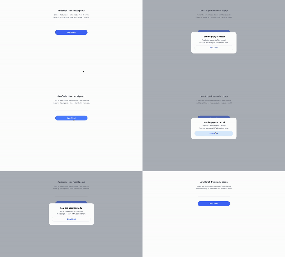
Happy Monday everyone! Today, we are going to create a JavaScript-free modal popup using only Tailwind CSS, because we can. This is a great way to add interactivity to your website without using JavaScript.
Why a modal without JavaScript?
Using a modal without JavaScript can simplify your codebase, reduce the amount of dependencies, and improve loading times. It’s especially useful when you’re aiming for a lightweight website, or when JavaScript might not be necessary or available. Tailwind CSS offer powerful utility classes that allow us to handle the modal’s visibility, animations, and responsiveness purely through HTML and CSS.
Use cases:
-
Static Websites: For small websites, such as portfolios, blogs, or informational pages, where minimal interactivity is required. A JavaScript-free modal can help keep the site lightweight and fast.
-
Low Bandwidth or Resource-Limited Environments: In situations where users may have limited access to resources, such as low bandwidth or older devices, a JavaScript-free solution reduces the load on the client’s device.
-
Accessibility-First Designs: If your project prioritizes accessibility and you want to ensure that users who disable JavaScript still have full functionality, a CSS-only modal can be an excellent solution.
-
Privacy-Conscious Websites: Some users prefer to avoid JavaScript for privacy reasons, as it can be used to track user behavior. A JavaScript-free modal respects these preferences while still providing interactivity.
-
Progressive Enhancement: When you’re building a web application with a focus on progressive enhancement, a CSS-only modal serves as a fallback for users who may have JavaScript disabled or who are using browsers that don’t fully support it.
-
Prototyping and Design Mockups: When quickly prototyping UI components or creating design mockups, a JavaScript-free modal can help designers and developers visualize functionality without the need to write additional JavaScript.
By the end of this session, you’ll have a fully functional modal popup that relies entirely on HTML and Tailwind CSS for its operation. Let’s dive in!
Let’s create the modal
As you can see, the modal is an extremely simple HTML structure. It consists of a hidden checkbox, a label for the checkbox, and a modal element that is hidden by default.
The key classes here are peer, peer-checked:flex and hidden.
peer: This is a Tailwind CSS utility class that sets the element to be positioned relative to its peer element.peer-checked:flex: This is a Tailwind CSS utility class that sets the element to be positioned relative to its peer element when the checkbox is checked.hidden: This is a Tailwind CSS utility class that sets the element to be hidden.
The hidden checkbox
The hidden checkbox is used to toggle the visibility of the modal. It is hidden by default, and its state is controlled by the class.
Attributes:
type="checkbox": This is a HTML attribute that specifies the type of input element.id="modal-toggle": This is an HTML attribute that specifies the unique identifier of the input element.
Classes:
hidden: This is a Tailwind CSS utility class that sets the element to be hidden.peer: This is a Tailwind CSS utility class that sets the element to be positioned relative to its peer element.
<input type="checkbox" id="modal-toggle" class="hidden peer"/>The trigger button
The trigger button is used to open the modal. Classe are omitted for brevity, the button only need visual styling classes to make it look like a button, so we can focus on the modal. Just add style it as you wish. Attributes:
for="modal-toggle": This is an HTML attribute that specifies the id of the checkbox that controls the visibility of the modal.
<label for="modal-toggle"> Open Modal </label>The modal
The modal is the main content of the modal itself. It is hidden by default, and its visibility is controlled by the checkbox.
peer-checked:flex: This is a Tailwind CSS utility class that sets the element to be positioned relative to its peer element when the checkbox is checked.hidden: This is a Tailwind CSS utility class that sets the element to be hidden.fixed: This is a Tailwind CSS utility class that sets the element to be fixed. This is important because the modal should be positioned relative to the viewport, not the page.
<div class="peer-checked:flex hidden fixed ...">
<!-- Modal content goes here -->
</div>The button to close the modal
The button to close the modal is used to close, well…the modal. *Attributes:
for="modal-toggle": This is an HTML attribute that specifies the id of the checkbox that controls the visibility of the modal.
<label for="modal-toggle"> Close Modal </label>The whole markup for the modal
Classes are omitted for brevity.
<div>
<!-- Hidden checkbox -->
<input type="checkbox" id="modal-toggle" class="hidden peer"/>
<!-- Trigger button -->
<label for="modal-toggle"> Open Modal </label>
<!-- Modal -->
<div class="peer-checked:flex hidden fixed ...">
<div>
<!-- Modal content goes here -->
<label for="modal-toggle"> Close Modal </label>
</div>
</div>
</div>Conclusion
This is a simple modal that demonstrates how to use Tailwind CSS to create a modal with a predefined set of styles and how use of peer and peer-checked:flex classes to control the modal’s visibility without JavaScript. Take in mind that you can also creeate this this behavior with also CSS.
Hope you enjoyed this tutorial and have a great day!
/Michael Andreuzza
One price.
Lifetime access.
-
34 Premium Astro Templates
-
All Future Templates Included
-
Unlimited Projects · Lifetime License
