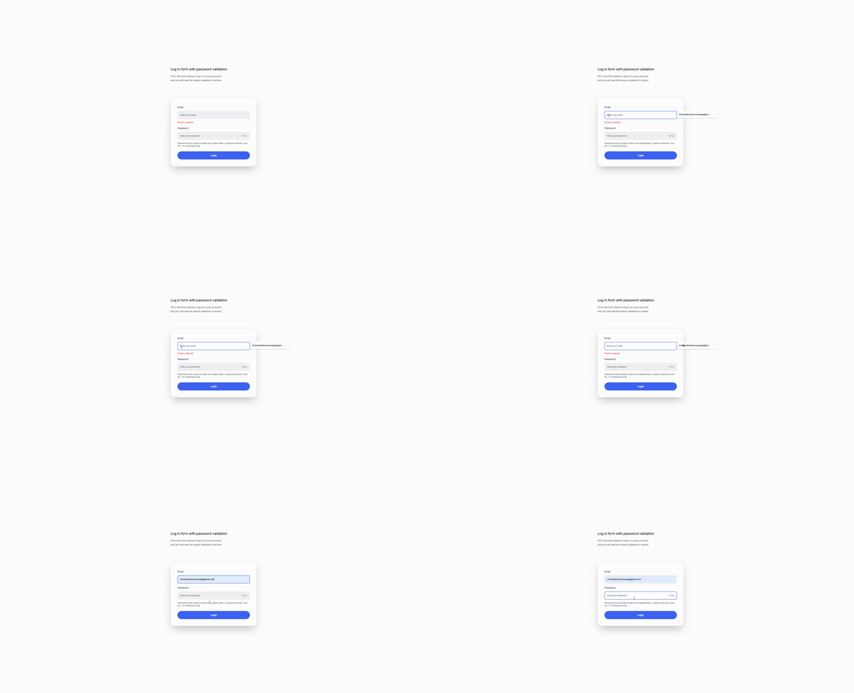
Lets build a form with but before, lets see where wen can use auth forms for.
You can use auth forms for:
Authentication forms are crucial components of web and application security, serving as the primary method for verifying the identity of users. These forms can be implemented in various ways, catering to different security needs, user experiences, and application contexts. Here’s a list of how authentication forms can be used across different scenarios:
- Traditional Username and Password: A standard method where users enter their username and password to gain access.
- Multi-Factor Authentication (MFA): Enhances security by requiring users to provide two or more verification factors, such as a password and a code sent via SMS or an authenticator app.
- Social Media Logins: Allows users to log in using their existing social media accounts (Facebook, Google, Twitter), simplifying the login process.
- Single Sign-On (SSO): Permits access to multiple applications or services with one set of credentials, commonly used in corporate environments.
- Biometric Authentication: Employs unique biological traits (fingerprints, facial recognition, voice recognition) for user verification, increasingly common in mobile devices.
- Email Link Authentication: Sends a temporary login link to the user’s email, enabling login without entering a password, enhancing convenience and security.
- SMS/Text Message Verification: Sends a one-time code to the user’s mobile phone as part of a two-factor authentication process.
- Magic Link Authentication: Sends a seamless login link via email, SMS, or other messaging services, eliminating the need for a password.
- Captcha Verification: Adds a challenge-response test to ensure the login action is performed by a human, helping prevent automated attacks.
- Security Questions: Asks personalized questions in addition to the standard login process for an added layer of security.
- OAuth: An open standard for access delegation, allowing users to grant access to their information on other websites without sharing their passwords.
- Token-Based Authentication: Utilizes tokens (e.g., JSON Web Tokens) instead of traditional passwords for accessing server resources.
- Hardware Tokens: Requires a physical device (key fob, smart card) that generates a unique login code, used in high-security environments.
Now, let’s build the structure of the form.
This is how the form will look like
<div
x-data="{ loginEmail: '', loginPassword: '', passwordPattern: /^(?=.*[A-Z])(?=.*\W).+$/, showPassword: false }">
<form
x-on:submit.prevent="login">
<div >
<label
for="login_email"
>Email</label
>
<input
type="email"
id="login_email"
x-model="loginEmail"
placeholder="Enter your email"
required
/>
<p
x-show="!loginEmail"
class="text-red-500 ">
Email is required
</p>
</div>
<div>
<label
for="login_password"
>Password</label
>
<div class="relative">
<input
:type="showPassword ? 'text' : 'password'"
id="login_password"
x-model="loginPassword"
placeholder="Enter your password"
required
/>
<span
x-text="showPassword ? 'Hide' : 'Show'"
@click="showPassword = !showPassword"
>Show</span
>
</div>
<p class="...">
Password must contain at least one capital letter and a special
character.
</p>
<p
x-show="loginPassword && !passwordPattern.test(loginPassword)"
class="text-red-500...">
Password does not meet requirements
</p>
</div>
<div class="mt-4">
<button
type="submit"
>Login</button
>
</div>
</form>
</div>This part is the data that will be used in the form, it will contain the email and password of the user and a pattern that will be used to validate the password.
- The
showPasswordvariable will be used to show or hide the password input field. - The
passwordPatternvariable will be used to validate the password. - The
loginEmailandloginPasswordvariables will be used to store the email and password of the user.
<div x-data="{ loginEmail: '', loginPassword: '', passwordPattern: /^(?=.*[A-Z])(?=.*\W).+$/, showPassword: false }"></div>This part is the form itself, we will use the x-on:submit.prevent="login" attribute to prevent the form from submitting when the user clicks the submit button.
<form x-on:submit.prevent="login">
<!-- The form content -->
</form>On the email input x-model="loginEmail" attribute will bind the value of the input field to the loginEmail variable and the x-show="!loginEmail" attribute will show the error message if the email is not filled in.
<div>
<label for="login_email">Email</label>
<input
type="email"
id="login_email"
x-model="loginEmail"
placeholder="Enter your email"
required
/>
<p
x-show="!loginEmail"
class="text-red-500">
Email is required
</p>
</div>In the password input we will find:
- The
:type="showPassword ? 'text' : 'password'"attribute will show or hide the password input field. - The
x-model="loginPassword"attribute will bind the value of the input field to theloginPasswordvariable. - the
x-text="showPassword ? 'Hide' : 'Show'"attribute will show or hide the show/hide button when the user clicks it. - The
@click="showPassword = !showPassword"attribute will toggle theshowPasswordvariable when the user clicks the show/hide button. - The
x-show="loginPassword && !passwordPattern.test(loginPassword)"attribute will show the error message if the password is not filled in or does not meet the requirements. This message will be hidden if the password is filled in and meets the requirements. - The text inside the
psaying ” Password must contain at least one capital letter, a special character, and be 1-8 characters long” is always visible to avoid confusion, is part of good UX
<div>
<label for="login_password">Password</label>
<div>
<input
:type="showPassword ? 'text' : 'password'"
id="login_password"
x-model="loginPassword"
placeholder="Enter your password"
required
/>
<span
x-text="showPassword ? 'Hide' : 'Show'"
@click="showPassword = !showPassword"
>Show</span
>
</div>
<p class="...">
Password must contain at least one capital letter and a special character.
</p>
<p
x-show="loginPassword && !passwordPattern.test(loginPassword)"
class="text-red-500...">
Password does not meet requirements
</p>
</div>This button will trigger the login function when it is clicked.
<button type="submit" class="...">Login</button>Conclusion
In this tutorial, we learned how to create a login form using Tailwind CSS and Alpine.js. We covered topics such as creating a login form, handling form submissions, validating user input, and displaying error messages using Alpine.js. We also explored how to use Tailwind CSS to style the form and add animations to the login button. By following this tutorial, you can create a secure and user-friendly login form using Tailwind CSS and Alpine.js.
/Michael Andreuzza
One price.
Lifetime access.
-
34 Premium Astro Templates
-
All Future Templates Included
-
Unlimited Projects · Lifetime License
