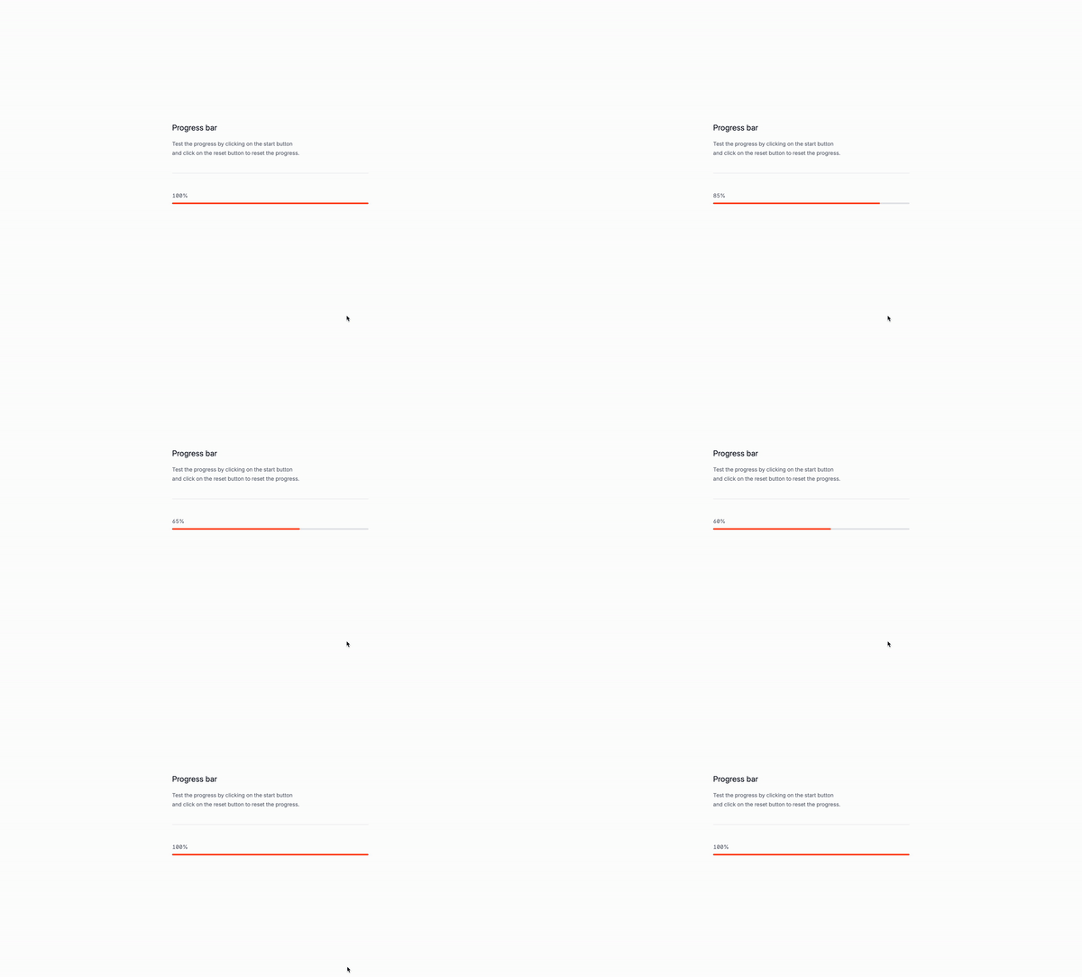
A pregress bar, that’s what we are going to build.
Why are progress bars important
When you are building a website, you will probably have to show a progress bar to your users for many different reasons. For example, you might want to show a progress bar to your users when they are uploading a file, or when they are downloading something. Some Use cases:
- Show a progress bar to your users when they are uploading a file.
- Show a progress bar to your users when they are downloading something.
- Show a progress bar to your users when they are processing a form.
- When reading a blog post, show a progress bar to show long is left to read.
Let’s create the structure
The important parts:
x-data="{ progress: 0, interval: null }"is the data that will be used to store the progress value.x-init="() => { interval = setInterval(() => { progress < 100 ? progress += 5 : clearInterval(interval); }, 100); }"is the code that will be executed every 100ms to update the progress value.x-text="progress + '%'"is the code that will be executed to display the progress value.x-bind:style="'width: ' + progress + '%;'"is the code that will be executed to set the width of the progress bar.
<div
x-data="{ progress: 0, interval: null }"
x-init="() => { interval = setInterval(() => { progress < 100 ? progress += 5 : clearInterval(interval); }, 100); }">
<div
x-text="progress + '%'">
</div>
<div>
<div
x-bind:style="'width: ' + progress + '%;'"
>
</div>
</div>
</div>Let’s add some the classes with Tailwind CSS
The important parts:
w-fullis the width of the container.text-sm text-base-500is the text color.bg-base-200is the background color.rounded-fullis the border radius.h-2is the height of the progress bar.transition-allis the transition effect.ease-in-outis the animation effect.duration-500is the duration of the animation.cursor-pointeris the cursor style.relativeis the positioning style.overflow-hiddenis the overflow style.
<div
x-data="{ progress: 0, interval: null }"
x-init="() => { interval = setInterval(() => { progress < 100 ? progress += 5 : clearInterval(interval); }, 100); }"
class="w-full">
<div
class="text-sm text-base-500"
x-text="progress + '%'">
</div>
<div class="relative h-2 mt-2 rounded-full bg-base-200">
<div
x-bind:style="'width: ' + progress + '%;'"
class="absolute top-0 left-0 h-full bg-orange-500 rounded-full">
</div>
</div>
</div>Well that was it! You can now use the progress bar in your project.
Conclusion
In this tutorial, we learned how to create a progress bar using Tailwind CSS and Alpine.js. We covered the basics of Tailwind CSS, including its syntax and classes, and how to use them in our progress bar.
/Michael Andreuzza
One price.
Lifetime access.
-
34 Premium Astro Templates
-
All Future Templates Included
-
Unlimited Projects · Lifetime License
