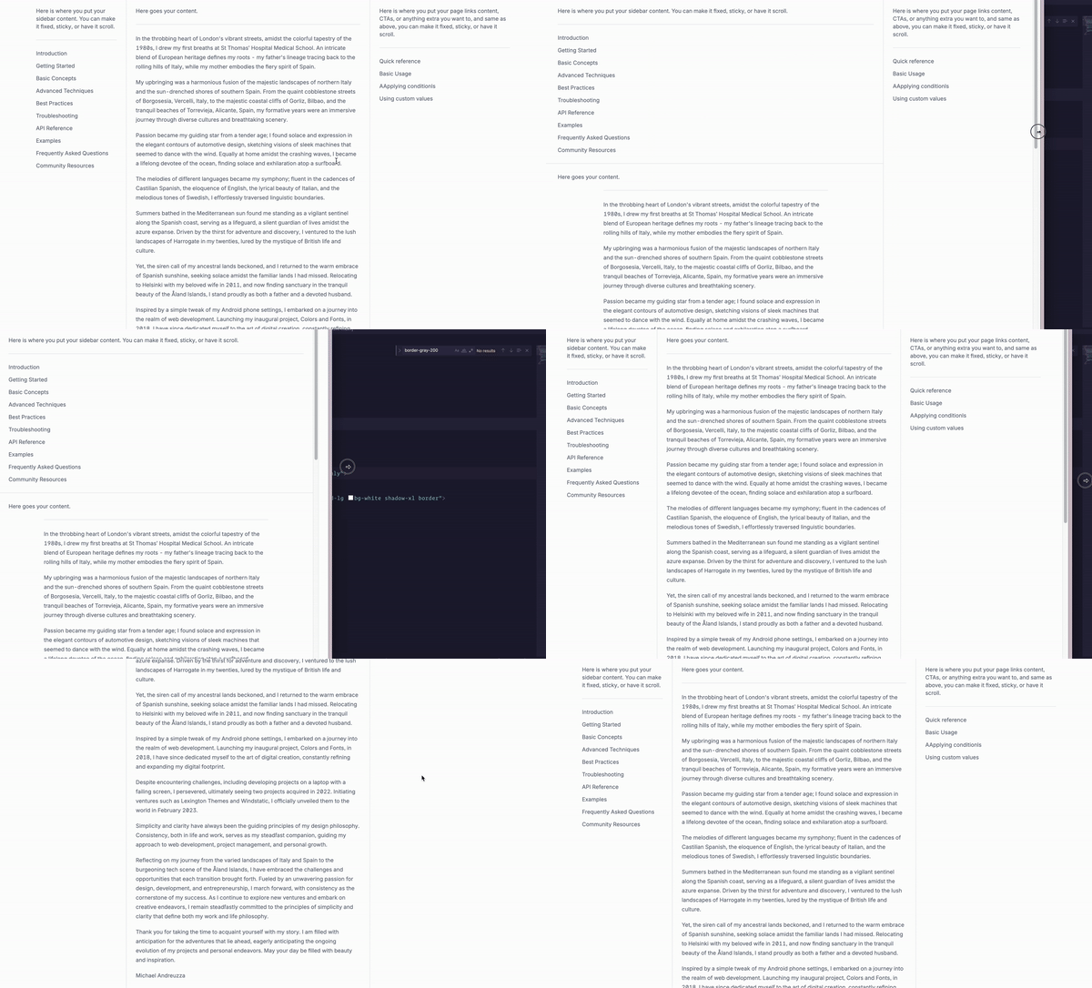
Today we are going to create a responsive multi-column layout using Tailwind CSS. Sometimes is quiet difficult to create a responsive layout with Tailwind CSS, but with this tutorial you will learn how to do it. This tutorial will show you how to create a multi-column layout that takes up the full width of the screen.
What is a multi-column layout?
A multi-column layout is a design pattern where content is organized into multiple columns that are displayed side by side. This approach allows for a structured and organized presentation of information, making it easier for users to navigate and consume content. Multi-column layouts are an essential part of web design and are widely used across various industries. They help in maximizing the use of screen space, especially on larger displays, and in creating visually appealing and easy-to-read content arrangements.
Examples of Multi-Column Layouts
-
Sidebar Layout:
- Description: This layout features a main content area alongside one or more sidebars. Sidebars typically contain navigation menus, additional information, or advertisements.
- Use Cases: Blogs, e-commerce websites, and documentation sites where supplementary content (like a menu or related links) is needed alongside the main content.
-
Three-Column Layout:
- Description: This layout includes a central content column flanked by sidebars on both sides. Each sidebar can be used for navigation, ads, or additional links, while the main column contains the primary content.
- Use Cases: News websites, social media platforms, and dashboards where multiple streams of content or tools need to be displayed simultaneously.
-
Grid Layout:
- Description: In a grid layout, multiple columns of equal width are used to display items in a uniform grid. This is effective for showcasing items like products, photos, or articles in a structured format.
- Use Cases: Online stores, portfolios, and galleries where visual uniformity and easy browsing of multiple items are important.
#### Use Cases
-
E-commerce Websites:
- Sidebar Layout: Used to organize product categories and filters in a sidebar while showcasing featured products in the main content area.
- Three-Column Layout: Displaying promotions and recommendations on either side of the main product listings.
-
News Websites:
- Three-Column Layout: Presenting articles in the center with trending news and advertisements on the sides.
- Grid Layout: Displaying a grid of recent articles or different news categories.
-
Social Media Platforms:
- Sidebar Layout: Featuring navigation and user profile options in a sidebar while displaying the main feed in the center.
- Three-Column Layout: Showing the main feed in the center, with friend suggestions and trending topics on the sides.
-
Portfolio Websites:
- Grid Layout: Showcasing projects, case studies, and testimonials in a structured, visually appealing manner.
- Three-Column Layout: Displaying work samples in the center with additional information and contact details in the sidebars.
-
Blogs:
- Sidebar Layout: Arranging blog posts in the main area with categories, archives, and popular posts in the sidebar.
- Grid Layout: Displaying blog excerpts in a grid to allow easy browsing.
-
Corporate Websites:
- Sidebar Layout: Displaying company information and services in the main area with navigation and contact info in the sidebar.
- Three-Column Layout: Featuring company news and updates in the center with additional resources and links on the sides.
-
Educational Websites:
- Sidebar Layout: Organizing course materials and announcements in the main area with navigation and resources in the sidebar.
- Grid Layout: Displaying a grid of courses or resources for easy browsing.
-
Magazines and Editorial Sites:
- Three-Column Layout: Showcasing feature articles in the center with lifestyle, technology, and entertainment sections on the sides.
- Grid Layout: Presenting articles and multimedia content in a visually appealing grid.
-
Real Estate Websites:
- Sidebar Layout: Featuring property listings in the main area with filters and search options in the sidebar.
- Grid Layout: Displaying properties in a grid format to allow users to compare multiple listings simultaneously.
-
Dashboards and Admin Panels:
- Three-Column Layout: Arranging widgets, charts, and data tables in a structured layout for efficient information display.
- Sidebar Layout: Displaying navigation menus and user settings in a sidebar with main content in the center.
Using Tailwind CSS to create these multi-column layouts ensures that they are responsive, maintainable, and visually consistent across different devices and screen sizes.
Let’s get started writing the markup
The main wrapper, the page itself
- The main wrapper of the multi-column layout is a
divelement that is positioned using theflow-rootutility class. flex: This class sets the flex container to be the main wrapper of the multi-column layout.min-h-full: This class sets the minimum height of the main wrapper to be the full height of its parent container.flex-col: This class sets the flex container to be a column.
<div class="flex flex-col min-h-full">
<!-- This is where the content of your page goes -->
</div>The main column wrapper
- The main column wrapper is a
divelement that is positioned using themx-autoutility class. This ensures that the main column wrapper takes up the full width of its parent container. w-full: This class sets the width of the main column wrapper to be the full width of its parent container.max-w-7xl: This class sets the maximum width of the main column wrapper to be 7xl.grow: This class sets the main column wrapper to grow to fill the available space.lg:flex: This class sets the main column wrapper to be a flex container on large screens (e.g., desktops).
<div class="flex flex-col min-h-full">
<div class="w-full mx-auto max-w-7xl grow lg:flex xl:px-2">
<!-- All content goes here -->
</div>
</div>The wrapper for the left sidebar and center column
The first column wrapper will contain the left sidebar and the center column, this way we can easily control the width of the sidebar and the center column.
flex-1: This class sets the width of the column wrapper to be the remaining space in the main column wrapper.xl:flex: This class sets the column wrapper to be a flex container on extra large screens (e.g., large desktops).
<div class="flex flex-col min-h-full">
<div class="w-full mx-auto max-w-7xl grow lg:flex xl:px-2">
<div class="flex-1 xl:flex">
<!-- All content goes here -->
</div>
</div>
</div>The sidebar
border-b: This class adds a border to the bottom of the sidebar.px-4: This class adds horizontal padding of 4 pixels to the sidebar.py-6: This class adds vertical padding of 6 pixels to the sidebar.sm:px-6: This class adds horizontal padding of 6 pixels to the sidebar on small screens (e.g., mobile devices).lg:pl-8: This class adds left padding of 8 pixels to the sidebar on large screens (e.g., desktops).xl:w-64: This class sets the width of the sidebar to 64 pixels on extra large screens (e.g., large desktops).xl:shrink-0: This class sets the width of the sidebar to 0 pixels on extra large screens (e.g., large desktops).xl:border-b-0: This class removes the border from the bottom of the sidebar on extra large screens (e.g., large desktops).xl:border-r: This class adds a border to the right of the sidebar on extra large screens (e.g., large desktops).xl:pl-6: This class adds left padding of 6 pixels to the sidebar on extra large screens (e.g., large desktops).
<div lass="border-b px-4 py-6 sm:px-6 lg:pl-8 xl:w-64 xl:shrink-0 xl:border-b-0 xl:border-r xl:pl-6">
<!-- Sidebar content page goes -->
</div>The center column
px-4: This class adds horizontal padding of 4 pixels to the center column.py-6: This class adds vertical padding of 6 pixels to the center column.sm:px-6: This class adds horizontal padding of 6 pixels to the center column on small screens (e.g., mobile devices).lg:pl-8: This class adds left padding of 8 pixels to the center column on large screens (e.g., desktops).xl:flex-1: This class sets the width of the center column to be the remaining space in the main column wrapper.xl:pl-6: This class adds left padding of 6 pixels to the center column on extra large screens (e.g., large desktops).
<div class="px-4 py-6 sm:px-6 lg:pl-8 xl:flex-1 xl:pl-6">
<!-- Center content page goes -->
</div>The right sidebar
shrink-0: This class sets the width of the right sidebar to 0 pixels.border-t: This class adds a border to the top of the right sidebar.px-4: This class adds horizontal padding of 4 pixels to the right sidebar.py-6: This class adds vertical padding of 6 pixels to the right sidebar.sm:px-6: This class adds horizontal padding of 6 pixels to the right sidebar on small screens (e.g., mobile devices).lg:w-96: This class sets the width of the right sidebar to 96 pixels on large screens (e.g., desktops).lg:border-l: This class adds a border to the left of the right sidebar on large screens (e.g., desktops).lg:border-t-0: This class removes the border from the top of the right sidebar on large screens (e.g., desktops).lg:pr-8: This class adds right padding of 8 pixels to the right sidebar on large screens (e.g., desktops).xl:pr-6: This class adds right padding of 6 pixels to the right sidebar on extra large screens (e.g., large desktops).
<div class="px-4 py-6 border-t shrink-0 sm:px-6 lg:w-96 lg:border-l lg:border-t-0 lg:pr-8 xl:pr-6">
<!-- Right sidebar content page goes -->
</div>The full markup
This is how the full markup for the multi-column layout will look like, including the wrapper, the left sidebar, the center column, and the right sidebar. This markup ensures that the layout takes up the full width of the screen and has a responsive design.
<div class="flex flex-col min-h-full">
<!-- Main column wrapper -->
<div class="w-full mx-auto max-w-7xl grow lg:flex xl:px-2">
<!-- Left sidebar & main wrapper -->
<div class="flex-1 xl:flex">
<div class="px-4 py-6 border-b sm:px-6 lg:pl-8 xl:w-64 xl:shrink-0 xl:border-b-0 xl:border-r xl:pl-6">
<!-- Sidebar content goes here -->
</div>
<!-- Center column -->
<div class="px-4 py-6 sm:px-6 lg:pl-8 xl:flex-1 xl:pl-6">
<!-- Content column content goes here -->
</div>
</div>
<!-- Right sidebar -->
<div class="px-4 py-6 border-t shrink-0 sm:px-6 lg:w-96 lg:border-l lg:border-t-0 lg:pr-8 xl:pr-6">
<!-- Right sidebar content goes here -->
</div>
</div>
</div>Conclusion
In this tutorial, we explored the concept of multi-column layouts and how to create a responsive multi-column layout using Tailwind CSS. We learned how to create a multi-column layout that takes up the full width of the screen and has a responsive design. We also learned how to create a sidebar and a center column in the multi-column layout. Finally, we learned how to create a right sidebar in the multi-column layout.
Hope you enjoyed this tutorial and have a great day!
/Michael Andreuzza
One Price.
Lifetime Access.
-
33 Premium Astro Templates
-
All Future Templates Included
-
Unlimited Projects · Lifetime License
