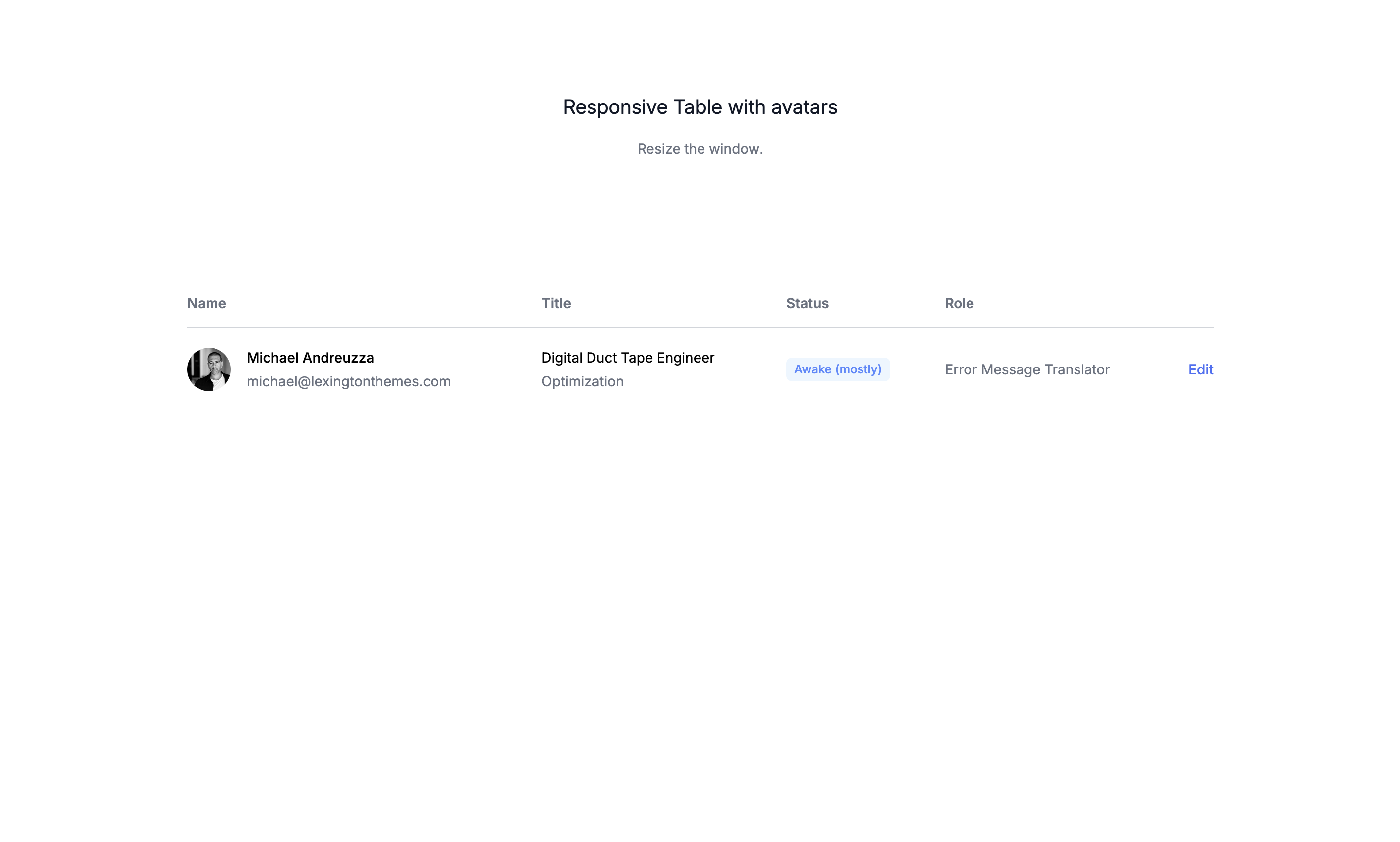
Hello everyone! It’s Monday, and today we are going to create a responsive table using Tailwind CSS. This tutorial will show you how to create a table that that doesn’t break when the screen size changes.
What is a table?
A table is a data structure that organizes data into rows and columns. It is a common way to display data in a structured and organized manner. Tables are used in a wide range of applications, from spreadsheets to databases to data visualization tools. They are an essential part of web design and are widely used in various industries.
Use cases: Use cases:
- Spreadsheets: Tables are commonly used in spreadsheets to organize data in rows and columns.
- Database Management: Tables are the fundamental structure for storing data in relational databases, enabling efficient querying and manipulation of data.
- Data Visualization: Tables can be used to present raw data before it is transformed into charts or graphs, providing a clear and organized overview.
- Content Management Systems (CMS): Tables help in managing and displaying content such as product lists, user data, and other structured information within a CMS.
- E-commerce: Online stores use tables to display product inventories, price lists, order histories, and customer data.
- Project Management: Tables are used in project management tools to organize tasks, timelines, resource allocation, and project statuses.
- Financial Reports: Companies use tables to present financial data, such as balance sheets, income statements, and cash flow statements.
- Education: Educational platforms use tables to display schedules, grades, attendance records, and course content.
- Healthcare: Medical records and patient data are often organized in tables to facilitate easy access and updates.
- Research: Scientists and researchers use tables to compile and analyze experimental data, survey results, and statistical information.
- Scheduling: Tables are used to create timetables, appointment schedules, and event calendars.
- Inventory Management: Businesses use tables to keep track of stock levels, supplier information, and order details.
- Customer Relationship Management (CRM): CRM systems use tables to organize and manage customer information, interactions, and sales data.
- Human Resources: HR departments use tables to maintain employee records, track performance metrics, and manage payroll information.
Let’s get started writting the markup
The main wrapper
The main wrapper of the table is a div element that is positioned using the flow-root utility class. This ensures that the table is positioned independently of other elements on the page as mentioned above.
flow-root: This class ensures that the table is positioned independently of other elements on the page as mentioned above.
<div class="flow-root">
<!-- Table goes here -->
</div>Setting the horizontal overflow
The table is wrapped in another div element that is positioned using the overflow-x-auto utility class. This ensures that the table scrolls horizontally if its content exceeds the width of the container.
overflow-x-auto: This class sets the horizontal overflow to auto, allowing the table to scroll horizontally if its content exceeds the width of the container.
<div class="flow-root">
<div class="overflow-x-auto">
<!-- Table goes here -->
</div>
</div>The table container
The table container is a div element that is positioned using the inline-block utility class. This ensures that the table is positioned within the overflow-x-auto container.
inline-block: This class sets the table container to be displayed as an inline block element, allowing it to be positioned within theoverflow-x-autocontainer.min-w-full: This class sets the width of the table container to be the full width of its parent container.align-middle: This class sets the vertical alignment of the table container to be middle within its parent container.sm:px-6: This class adds horizontal padding of 6 pixels to the table container on small screens (e.g., mobile devices).py-2: This class adds vertical padding of 2 pixels to the table container.lg:px-8: This class adds horizontal padding of 8 pixels to the table container on large screens (e.g., desktops).
<div class="flow-root">
<div class="overflow-x-auto">
<div class="inline-block min-w-full py-2 align-middle sm:px-6 lg:px-8">
<!-- Table goes here -->
</div>
</div>
</div>Thew table itself
The table itself is a table element that is positioned using the min-w-full utility class. This ensures that the table takes up the full width of its container.
min-w-full: This class sets the width of the table to be the full width of its container.divide-y: This class adds a divider between each row of the table.divide-base-300: This class sets the color of the divider to a light gray.
<div class="flow-root">
<div class="overflow-x-auto">
<div class="inline-block min-w-full py-2 align-middle sm:px-6 lg:px-8">
<table class="min-w-full divide-y divide-base-300">
<!-- Table content goes here -->
<table class="min-w-full divide-y divide-base-300">
</div>
</div>
</div>The table header
The table header is a thead element that is positioned using the relative utility class. This ensures that the table header is positioned relative to its parent container. The table header contains the table’s column names.
The common classes for the table header cells
py-3.5: This class sets the vertical padding of the table header cells to 3.5 pixels.text-left: This class sets the text alignment of the table header cells to left.
The specific classes for the first table header cell
pl-4: This class sets the left padding of the table header cells to 4 pixels.pr-3: This class sets the right padding of the table header cells to 3 pixels.sm:pl-0: This class sets the left padding of the table header cells to 0 pixels on small screens (e.g., mobile devices).
<thead>
<tr>
<th scope="col" class="py-3.5 pl-4 pr-3 text-left sm:pl-0">Name</th>
<th scope="col" class="px-3 py-3.5 text-left">Title</th>
<th scope="col" class="px-3 py-3.5 text-left">Status</th>
<th scope="col" class="px-3 py-3.5 text-left">Role</th>
<th scope="col" class="relative py-3.5 pl-3 pr-4 sm:pr-0">
<span class="sr-only">Edit</span>
</th>
</tr>
</thead>The table body
The table body is a tbody element that is positioned using the divide-y utility class. This ensures that the table body has a divider between each row of the table.
<tbody class="bg-white divide-y divide-base-50">
<tr>
<!-- Table row goes here -->
</tr>
<!-- More people... -->
</tbody>The table’s data rows
The table’s data rows are represented by tr elements that are positioned using the whitespace-nowrap utility class. This ensures that the table’s data rows do not wrap to the next line.
Common classes for the table’s data rows
whitespace-nowrap: This class ensures that the table’s data rows do not wrap to the next line.py-5: This class sets the vertical padding of the table’s data rows to 5 pixels.text-sm: This class sets the font size of the table’s data rows to small.
The specific classes for the first table’s data row
pl-4: This class sets the left padding of the table’s data rows to 4 pixels.sm:pl-0: This class sets the left padding of the table’s data rows to 0 pixels on small screens (e.g., mobile devices).
The specific classes for the last table’s data row
pr-4: This class sets the right padding of the table’s data rows to 4 pixels.pl-3: This class sets the left padding of the table’s data rows to 3 pixels.sm:pr-0: This class sets the right padding of the table’s data rows to 0 pixels on small screens (e.g., mobile devices).text-right: This class sets the text alignment of the table’s data rows to right.
<tr>
<td class="py-5 pl-4 pr-3 text-sm whitespace-nowrap sm:pl-0">
<div class="flex items-center">
<div class="flex-shrink-0 size-11">
<img class="rounded-full size-11" src="/avatars/8.png" alt="" />
</div>
<div class="ml-4">
<div class="font-medium text-black">Michael Andreuzza</div>
<div class="mt-1 text-base-500">michael@lexingtonthemes.com</div>
</div>
</div>
</td>
<td class="px-3 py-5 text-sm whitespace-nowrap text-base-500">
<div class="text-black">Digital Duct Tape Engineer</div>
<div class="mt-1 text-base-500">Optimization</div>
</td>
<td class="px-3 py-5 text-sm whitespace-nowrap text-base-500">
<span
class="inline-flex items-center px-2 py-1 text-xs font-medium text-blue-500 rounded-md bg-blue-50"
>Awake (mostly)</span
>
</td>
<td class="px-3 py-5 text-sm whitespace-nowrap text-base-500">
Error Message Translator
</td>
<td
class="relative py-5 pl-3 pr-4 text-sm font-medium text-right whitespace-nowrap sm:pr-0"
>
<a href="#" class="text-blue-600 hover:text-blue-900"
>Edit<span class="sr-only">,Michael Andreuzza</span></a
>
</td>
</tr>The full markip
Here is the full markup for the responsive table, including the wrapper, the horizontal overflow, the table container, the table header, the table body, and the table’s data rows. This markup ensures that the table takes up the full width of the screen and has a divider between each row.
<div class="flow-root">
<div class="overflow-x-auto">
<div class="inline-block min-w-full py-2 align-middle sm:px-6 lg:px-8">
<table class="min-w-full divide-y divide-base-300">
<thead>
<tr>
<th
scope="col"
class="py-3.5 pl-4 pr-3 text-left text-sm font-medium text-base-500 sm:pl-0"
>
Name
</th>
<th
scope="col"
class="px-3 py-3.5 text-left text-sm font-medium text-base-500"
>
Title
</th>
<th
scope="col"
class="px-3 py-3.5 text-left text-sm font-medium text-base-500"
>
Status
</th>
<th
scope="col"
class="px-3 py-3.5 text-left text-sm font-medium text-base-500"
>
Role
</th>
<th scope="col" class="relative py-3.5 pl-3 pr-4 sm:pr-0">
<span class="sr-only">Edit</span>
</th>
</tr>
</thead>
<tbody class="bg-white divide-y divide-base-50">
<tr>
<td class="py-5 pl-4 pr-3 text-sm whitespace-nowrap sm:pl-0">
<div class="flex items-center">
<div class="flex-shrink-0 size-11">
<img
class="rounded-full size-11"
src="/avatars/8.png"
alt=""
/>
</div>
<div class="ml-4">
<div class="font-medium text-black">Michael Andreuzza</div>
<div class="mt-1 text-base-500">
michael@lexingtonthemes.com
</div>
</div>
</div>
</td>
<td class="px-3 py-5 text-sm whitespace-nowrap text-base-500">
<div class="text-black">Digital Duct Tape Engineer</div>
<div class="mt-1 text-base-500">Optimization</div>
</td>
<td class="px-3 py-5 text-sm whitespace-nowrap text-base-500">
<span
class="inline-flex items-center px-2 py-1 text-xs font-medium text-blue-500 rounded-md bg-blue-50"
>Awake (mostly)</span
>
</td>
<td class="px-3 py-5 text-sm whitespace-nowrap text-base-500">
Error Message Translator
</td>
<td
class="relative py-5 pl-3 pr-4 text-sm font-medium text-right whitespace-nowrap sm:pr-0"
>
<a href="#" class="text-blue-600 hover:text-blue-900"
>Edit<span class="sr-only">,Michael Andreuzza</span></a
>
</td>
</tr>
<!-- More people... -->
</tbody>
</table>
</div>
</div>
</div>Conclusion
In this tutorial, we explored the concept of responsive tables and how to create a responsive table using Tailwind CSS. We learned how to create a responsive table that takes up the full width of the screen and has a divider between each row.
Hope you enjoyed this tutorial and have a great day!
/Michael Andreuzza
One Price.
Lifetime Access.
-
33 Premium Astro Templates
-
All Future Templates Included
-
Unlimited Projects · Lifetime License
