How to create a scroll to top button with Tailwind CSS and Alpinejs

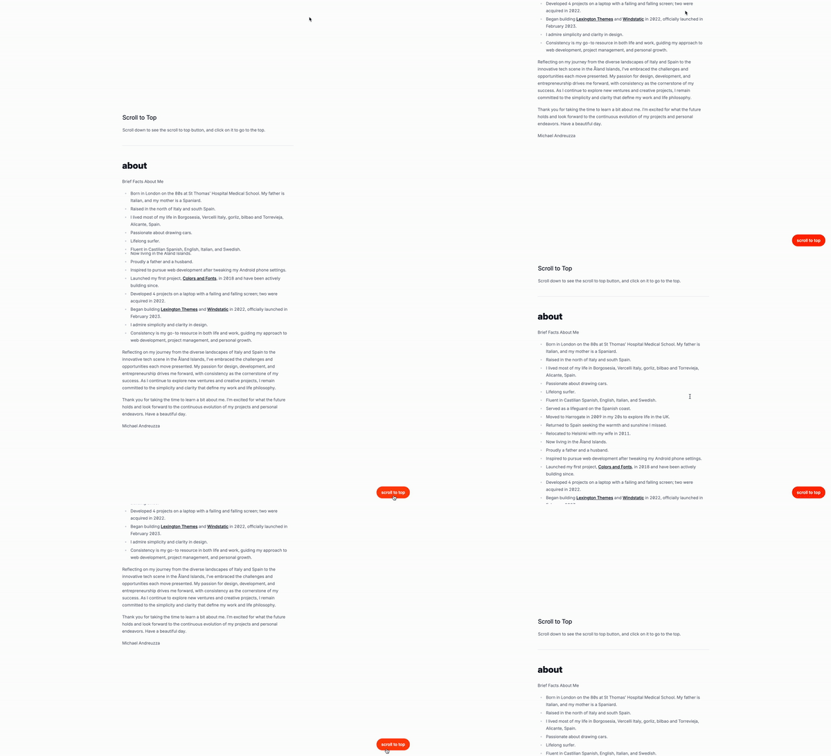
In this tutorial, we’ll be creating a scroll to top button using Tailwind CSS and Alpine.js.
What is a scroll to top button?
A scroll to top button is a button that appears at the bottom of a webpage when the user scrolls down. It allows the user to quickly return to the top of the page. This is useful for websites that have a lot of content and want to make it easier for users to navigate back to the top.
Use cases:
- Blogs: A blog may have a scroll to top button to help users navigate back to the top of the page.
- E-commerce: An e-commerce website may have a scroll to top button to help users navigate back to the top of the page.
- Landing pages: A landing page may have a scroll to top button to help users navigate back to the top of the page.
- Social media: A social media website may have a scroll to top button to help users navigate back to the top of the page.
- Webinars: A webinar may have a scroll to top button to help users navigate back to the top of the page.
Understanding the code:
x-data="{ isVisible: false }": This is the data that will be used to store the visibility of the button.x-init="window.addEventListener('scroll', () => { isVisible = window.scrollY > 100; })": This is the event listener that will be added to the window object.class="fixed bottom-6 right-6 z-50": This is the class that will be added to the button.x-show="isVisible": This is the condition that will be checked when the button is shown.x-transition:enter="transition ease-out duration-300": This is the enter transition that will be applied when the button is shown.x-transition:enter-start="opacity-0 transform translate-y-2": This is the enter start transition that will be applied when the button is shown.x-transition:enter-end="opacity-100 transform translate-y-0": This is the enter end transition that will be applied when the button is shown.x-transition:leave="transition ease-in duration-300": This is the leave transition that will be applied when the button is hidden.x-transition:leave-start="opacity-100 transform translate-y-0": This is the leave start transition that will be applied when the button is hidden.x-transition:leave-end="opacity-0 transform translate-y-2": This is the leave end transition that will be applied when the button is hidden.<button: This is the button element.title="Scroll to top": This is the title attribute that will be added to the button. For accessibility purposes, it is recommended to use a descriptive title that accurately describes the button’s purpose.aria-label="Scroll to top": This is the aria-label attribute that will be added to the button. For accessibility purposes, it is recommended to use a descriptive aria-label that accurately describes the button’s purpose.@click="window.scrollTo({ top: 0, behavior: 'smooth' })": This is the event listener that will be added to the button.
Classes are removed for brevity and clarity within the code, but I’ll keep those classes relveant to the tutorial.
<div
  x-data="{ isVisible: false }"
  x-init="window.addEventListener('scroll', () => { isVisible = window.scrollY > 100; })"
  class="fixed bottom-6 right-6 z-50"
  x-show="isVisible"
  x-transition:enter="transition ease-out duration-300"
  x-transition:enter-start="opacity-0 transform translate-y-2"
  x-transition:enter-end="opacity-100 transform translate-y-0"
  x-transition:leave="transition ease-in duration-300"
  x-transition:leave-start="opacity-100 transform translate-y-0"
  x-transition:leave-end="opacity-0 transform translate-y-2">
  <button
    title="Scroll to top"
    aria-label="Scroll to top"
    @click="window.scrollTo({ top: 0, behavior: 'smooth' })"
>
    scroll to top
  </button>
</div>
Conclusion
This is a simple scroll to top button that can be used for any type of content, such as blogs, e-commerce, landing pages, social media, or webinars. The code is easy to understand and the structure is clear. The use of Tailwind CSS and Alpine.js makes it easy to style the button and add interactivity. Hope you enjoyed this tutorial and have a great day!

