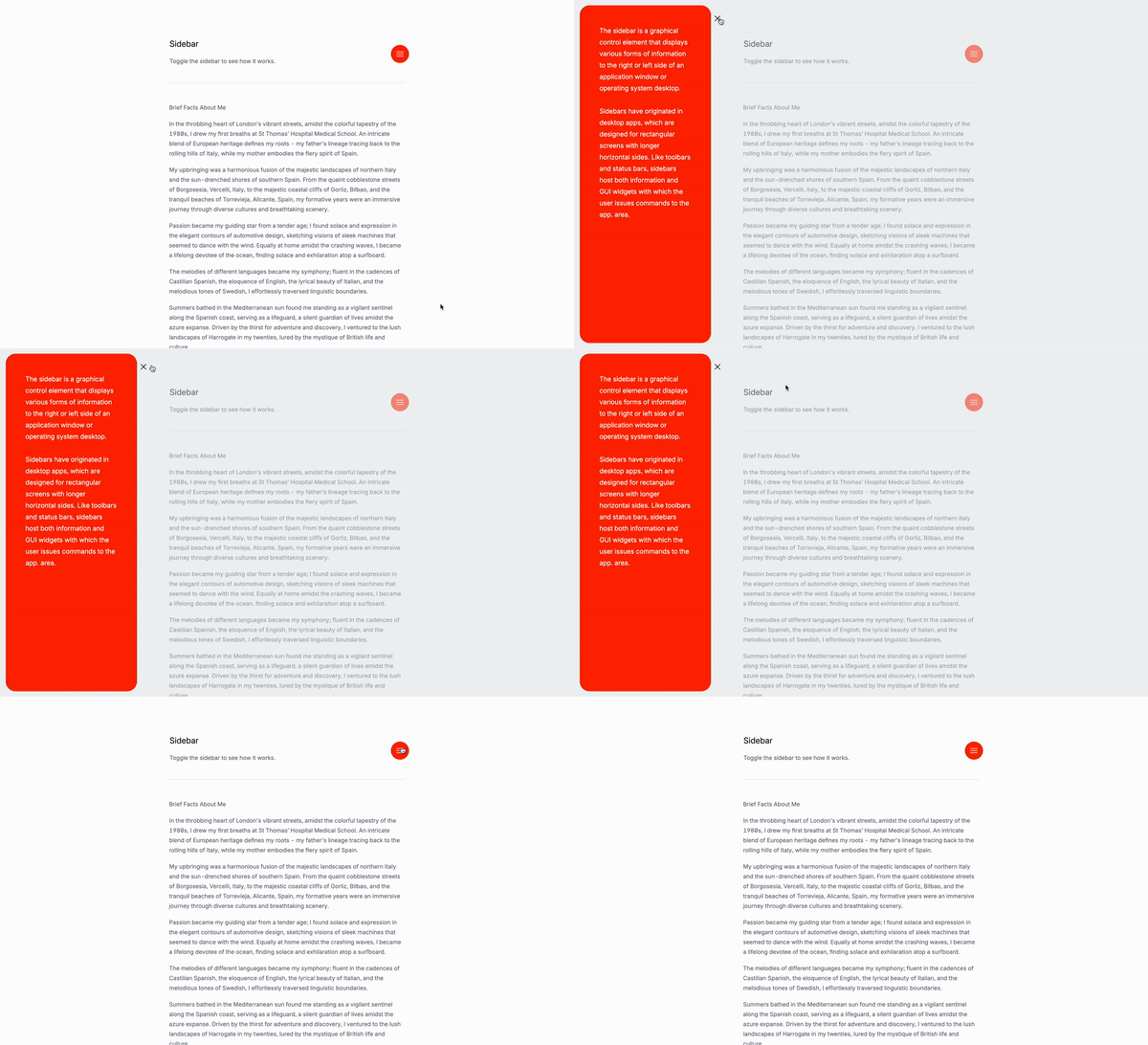
Recreating the sidebar navigation that we did with Alpinejs but this time with Tailwind CSS and JavaScript.
What is a sidebar?
Sidebars are a common feature in web applications, providing a way for users to navigate between different sections or content areas. They can be used to display a menu of options, such as a navigation bar or a dropdown menu, or to display a list of items, such as a sidebar or a menu or also text content.
Use Cases:
- Navigation bars: Sidebars are often used as navigation, providing a way for users to navigate between different sections or content areas of a website.
- Dashboards: In dashboard applications, sidebars commonly display key metrics, navigation options, and filters, allowing users to manage and access their data efficiently.
- Settings menus: Sidebars can house settings and configuration options, giving users a centralized place to manage their preferences and application settings.
- E-commerce filters: In online stores, sidebars are used to provide filtering options such as categories, price ranges, and product specifications, helping users find products quickly.
- Social media platforms: Sidebars often contain user profiles, friend lists, notifications, and shortcuts to various platform features, enhancing user engagement and ease of access.
- Content management systems (CMS): In CMS interfaces, sidebars provide tools for managing content, such as creating new posts, editing existing ones, and organizing media files.
- Messaging applications: Sidebars can display recent conversations, contacts, and chat groups, facilitating quick communication and organization of messages.
- Documentation sites: Sidebars are used to present a structured table of contents, allowing users to easily navigate through different sections of the documentation.
- File explorers: In file management applications, sidebars offer quick access to directories, drives, and frequently used folders, improving file organization and retrieval.
- Project management tools: Sidebars can show project overviews, task lists, calendars, and team member details, aiding in efficient project tracking and collaboration.
- Media players: Sidebars provide quick access to playlists, media libraries, and playback controls, enhancing the user experience in managing and enjoying media content.
- Email clients: Sidebars are used to organize folders, labels, and quick links to different categories of emails, improving email management and productivity.
…and many other use cases that I can’t think of right now.
The button to open the sidebar
id="openSidebar": This is the id of the button that opens the sidebar.
Classes are removed for brevity, but I’ll keep those classes relevant to the tutorial.
<button
id="openSidebar">
<!--- SVG or text goes here -->
</button>The button to close the sidebar
id="closeSidebar": This is the id of the button that closes the sidebar. Classes are removed for brevity, but I’ll keep those classes relevant to the tutorial.
<button
id="closeSidebar">
<!--- SVG or text goes here -->
</button>The sidebar’s structure
id="sidebar": This is the id of the sidebar.style="display: none;": This is the style of the sidebar. This is used to hide the sidebar by default.id="backdrop": This is the id of the backdrop.class="relative z-50": This is the class of the backdrop. This is used to make the backdrop appear on top of the page.style="display: none;": This is the style of the backdrop. This is used to hide the backdrop by default.<div class="fixed inset-0 bg-base-200/50"></div>: This is the backdrop.
Classes are removed for brevity, but I’ll keep those classes relevant to the tutorial.
<div
id="sidebar"
style="display: none;">
<!-- Overlay -->
<div
id="backdrop"
class="relative z-50"
style="display: none;">
<div class="fixed inset-0 bg-base-200/50"></div>
<!-- Sidebar content -->
<div>
<!-- Close button goes here -->
<div
class="flex flex-col p-12 pb-2 overflow-y-auto bg-orange-600 grow rounded-3xl">
<!-- Placeholder content, replace with your own -->
</div>
</div>
</div>
</div>The script
document.addEventListener("DOMContentLoaded", () => {: This is the script that runs when the page is loaded.const sidebar = document.getElementById("sidebar");: This is the code that gets the sidebar element.const backdrop = document.getElementById("backdrop");: This is the code that gets the backdrop element.const openButton = document.getElementById("openSidebar");: This is the code that gets the open button element.const closeButton = document.getElementById("closeSidebar");: This is the code that gets the close button element.const toggleSidebar = (show) => {: This is the code that toggles the sidebar.sidebar.style.display = show ? "flex" : "none";: This is the code that sets the display property of the sidebar to “flex” if show is true, or “none” if show is false.backdrop.style.display = show ? "block" : "none";: This is the code that sets the display property of the backdrop to “block” if show is true, or “none” if show is false.};: This is the code that ends the toggleSidebar function.openButton.addEventListener("click", () => toggleSidebar(true));: This is the code that adds an event listener to the open button that calls the toggleSidebar function with true as the argument.closeButton.addEventListener("click", () => toggleSidebar(false));: This is the code that adds an event listener to the close button that calls the toggleSidebar function with false as the argument.backdrop.addEventListener("click", () => toggleSidebar(false));: This is the code that adds an event listener to the backdrop that calls the toggleSidebar function with false as the argument.window.addEventListener("keydown", (e) => {: This is the code that adds an event listener to the window that listens for keyboard events.if (e.key === "Escape") toggleSidebar(false);: This is the code that checks if the key pressed is “Escape” and calls the toggleSidebar function with false as the argument.});: This is the code that ends the event listener.
document.addEventListener("DOMContentLoaded", () => {
const sidebar = document.getElementById("sidebar");
const backdrop = document.getElementById("backdrop");
const openButton = document.getElementById("openSidebar");
const closeButton = document.getElementById("closeSidebar");
const toggleSidebar = (show) => {
sidebar.style.display = show ? "flex" : "none";
backdrop.style.display = show ? "block" : "none";
};
openButton.addEventListener("click", () => toggleSidebar(true));
closeButton.addEventListener("click", () => toggleSidebar(false));
backdrop.addEventListener("click", () => toggleSidebar(false));
window.addEventListener("keydown", (e) => {
if (e.key === "Escape") toggleSidebar(false);
});
});Conclusion
In this tutorial, we learned how to create a sidebar navigation using Tailwind CSS and JavaScript. Remember to customize the sidebar to fit your specific needs and design preferences and make it fully accessible for all users.
Hope you found this tutorial helpful and jave a good day!
/Michael Andreuzza
One Price.
Lifetime Access.
-
32 Premium Astro Templates
-
All Future Templates Included
-
Unlimited Projects · Lifetime License
