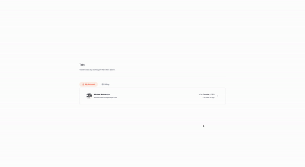
How to create a set of tabs with Tailwind CSS and Alpinejs
Mon Apr 08 2024 Author ✺ Michael Andreuzza
Let’s create a dynamic tab component using Alpine.js and Tailwind CSS, but first…
Why tabs?
Tabs streamline user interfaces and enhance web experiences in numerous ways:
Easy Navigation
- Straightforward and intuitive, making it simple to move between content sections.
Efficient Space Use
- Maximize limited space by organizing content neatly, reducing clutter.
Quicker Load Times
- Faster performance by loading only the active tab’s content, especially beneficial for heavy pages.
Organized Content
- Better content structure by logically grouping related information, improving navigability.
Stylish & Adaptable
- Customizable design that enhances UI aesthetics and adapts to various content types.
User Engagement
- Encourages exploration, increasing user interaction with content.
Simple Implementation
- Easy to integrate with most web development tools and responsive across all devices.
Familiarity
- Well-known user interface pattern that reduces the learning curve.
Tabs not only make content more accessible and appealing but also ensure a smoother and more engaging user experience.
Creating the component
The first step is to create the HTML structure for the tabs and panels. and this is how it looks like:
<div
  x-data="{ activeTab: 0 }"
>
  <!-- Tab List -->
  <ul
    role="tablist">
    <!-- Tab 1 -->
    <li>
      <button
        @click="activeTab = 0"
        :aria-selected="activeTab === 0"
        :class="{ '...': activeTab === 0 }"
        class="..."
        role="tab">
        <!-- Icon and Title for Tab 1 -->

        <span>My Account</span>
      </button>
    </li>
    <!-- Tab 2 -->
    <li>
      <button
        @click="activeTab = 1"
        :aria-selected="activeTab === 1"
        :class="{ '...': activeTab === 1 }"
        class="..."
        role="tab">

        <span>Billing</span>
      </button>
    </li>
  </ul>

  <!-- Panels -->
  <div
    role="tabpanels">
    <!-- Panel 1 -->
    <section
      x-show="activeTab === 0"
      role="tabpanel">
      <!-- Content for Panel 1 -->
    </section>
    <!-- Panel 2 -->
    <section
      x-show="activeTab === 1"
      role="tabpanel">
      <!-- Content for Panel 2 -->
    </section>
  </div>
</div>
The main parts
- The
x-dataattribute is used to define the initial state of the component, in this case, the active tab is set to 0. - The
roleattribute is set totablistto indicate that the list of tabs is a tablist. - The
roleattribute is set totabpanelsto indicate that the list of panels is a tabpanels. - The
roleattribute is set totabpanelto indicate that each panel is a tabpanel. - The
aria-selectedattribute is set totruefor the active tab andfalsefor the inactive tabs. - The
classattribute is set to...to indicate that the class should be dynamically generated based on the active tab. - The
@clickattribute is used to handle the click event on the tabs and update the active tab state. - The
x-showattribute is used to show or hide the corresponding panel based on the active tab.
You can customize the CSS classes and styles to match your design preferences. In this example, we’re using Tailwind CSS classes to style the tabs and panels. Hope you enjoyed the tutorial and learned how to create a tab component with Tailwind CSS and Alpine.js.