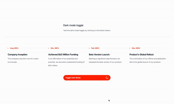
Today is toggle day!
What is a theme toggle?
A theme toggle is a feature that allows users to switch between different themes or color schemes. It is a great way to customize the look and feel of your website or application. With a theme toggle, you can easily switch between different themes or color schemes, giving your users a more personalized experience.
Advantages of a theme toggle
- Customization: Theme toggles allow you to customize the look and feel of your website or application.
- User experience: Theme toggles enhance the user experience by providing a way for users to switch between different themes or color schemes.
- Accessibility: Theme toggles are accessible to users with disabilities, as they provide a way to switch between different themes or color schemes.
- Personalization: Theme toggles allow users to personalize the look and feel of your website or application.
- Branding: Theme toggles can be used to brand your website or application with a specific theme or color scheme.
Lets get to the code
The structure
<div >
<button
@click="darkMode = !darkMode">
<span
x-show="!darkMode">
Toggle Dark Mode
<!-- Here goes the icon for the dark mode -->
</span>
<span
x-show="darkMode">
Toggle Light Mode
<!-- Here goes the icon for the light mode -->
</span>
</button>
</div>
</div>The Alpine JS code
Here we ausing:
x-showto show or hide the text<span x-show="!darkMode">and<span x-show="darkMode">to show or hide the text based on the value of thedarkModeTailwind CSS class.x-on:clickto add an event listener to the button:<button @click="darkMode = !darkMode">that toggles thedarkModeclass when the button is clicked.darkModeto store the current state of the theme:@click="darkMode = !darkMode"to toggle the theme state.
The button include two svg icons to switch between light and dark mode and a text to show the current state of the theme. The x-show directive is used to show or hide the text based on the value of the darkMode Tailwind CSS class. The x-on:click directive is used to add an event listener to the button that toggles the darkMode class when the button is clicked.
Adding the classes to your markup
First, we need to add darkMode: 'class' on the tailwind.config.js file. This will allow us to add the dark class to the body tag when the theme toggled.
Normally “Tailwind’s” dark mode is based on the prefers-color-scheme media query, hence we need to add on the config. just like this:
module.exports = {
darkMode: 'class',
// Other config options
}After that, we need to add x-data="{ darkMode: false }" to the body tag. This will tell Alpine to initialize the darkMode variable to false when the page loads and where is the toggle being applied, so if you add to just a component, only the component will be affected.
<body x-data="{ darkMode: false }">
<!--- Content -->
</body>This how your component will look like for example if you want the body to be dark when the dark theme is toggled:
<body x-data="{ darkMode: false }" class="bg-white dark:bg-black">
<!--- Content -->
</body>Well, this is the basic structure of a theme toggle. You can customize it to your liking and add more features like a color picker or a theme switcher. The key is to use Tailwind CSS classes and Alpine JS to create a customizable and user-friendly theme toggle for your website or application.
/Michael Andreuzza
One price.
Lifetime access.
-
34 Premium Astro Templates
-
All Future Templates Included
-
Unlimited Projects · Lifetime License