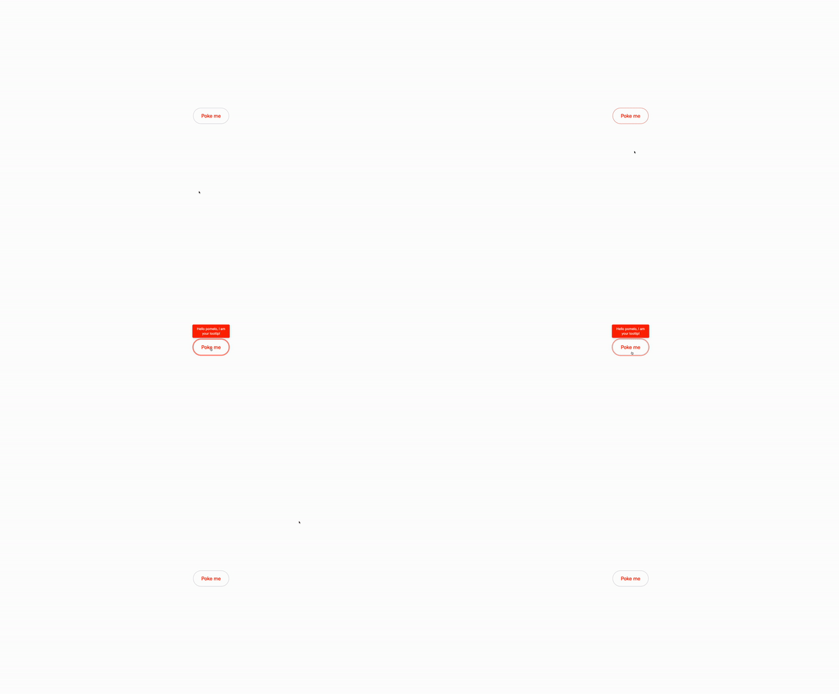
Yeah, you read that right, we are going to create a tooltip with Tailwind CSS and JavaScript. This is a simple and easy to use tooltip that you can use in your projects. We can simply make them with CSS also, but let’s use JavaScript for this one, just for the sake of learning how to do it.
Why are tooltips important?
Tooltips are a great way to provide additional information to your users. They can be used to explain a feature, provide context, or show additional details. They are especially useful when you have a lot of content or when you want to provide more information without cluttering the page. Tooltips can also be used to show errors or warnings, or to provide feedback to the user, a simple way to enhance the user experience.
Use cases:
- Extra Clues on Tap: Encountered a puzzling button or link? A tooltip provides the necessary details, saving you from any guesswork.
- Hidden Menus Revealed: Additional options might be right under your nose, hidden from plain view. Tooltips can guide you to these concealed features.
- Quick Explainers: Confused by an icon? Tooltips provide instant explanations, offering clarity at a glance.
- Deep Dives: Hover over a complex chart or graph, and tooltips break down the information into manageable pieces.
- Form Field Assistants: Uncertain about what to enter in a form field? Tooltips provide helpful hints to assist you.
- List and Table Insights: When dealing with dense lists or tables, tooltips highlight key information for easy access.
- Maps and Locations: Lost in geographical details? Tooltips can point out significant landmarks and locations, helping you navigate.
- Media Controls Explained: Tooltips on media players explain the functions of various controls, ensuring you’re never lost.
- Interactive Tutorials: Tooltips can guide users through an interactive tutorial, explaining each step as they go.
- Error Explanations: When a form input is incorrect, a tooltip can explain the error and provide suggestions for correction.
- Accessibility Features: Tooltips can provide additional context for users relying on screen readers, enhancing accessibility.
- E-commerce Product Details: On product pages, tooltips can display additional details about features or promotions without cluttering the page.
- Software Documentation: In software applications, tooltips can offer quick references to documentation or FAQs, helping users understand complex features.
- Social Media Insights: On social media platforms, tooltips can display additional information about posts, such as the number of likes or shares.
- Gaming Guides: In video games, tooltips can provide hints or tips when hovering over certain items or areas, enhancing the gaming experience.
- Scheduling Tools: In calendar or scheduling applications, tooltips can show additional details about events or appointments without opening them.
- User Onboarding: New users can benefit from tooltips that guide them through the features of an application.
- Data Entry Guidance: In complex data entry tasks, tooltips can offer guidance on how to fill out specific fields.
- Real-Time Notifications: Tooltips can explain real-time notifications or alerts, providing context without interrupting the user experience.
So many use cases!
Building the tooltip
Understanding the markup
ìd="tooltip-container: is the parent element that will contain the tooltip.ìd="tooltip-button: is the button that will trigger the tooltip.
The tooltip container
ìd="tooltip"is the tooltip itself.absolute: is the positioning of the tooltipt and will be positioned absolutely relative to the parent element.z-10: is the z-index of the tooltip. It will be positioned above all other elements on the page, this will ensure that the tooltip is always visible, when the user hovers over the button.
Classes are omitted for brevity
<div id="tooltip-container">
<button id="tooltip-button" type="button"> Poke me </button>
<div id="tooltip" class="absolute z-10" style="display: none;">
<div role="menu" aria-orientation="vertical" aria-labelledby="options-menu">
<!-- Tooltip Content -->
</div>
</div>
</div>the Script
document.addEventListener("DOMContentLoaded", () => {: This is the event listener that will run when the page is loaded.const tooltipContainer = document.getElementById("tooltip-container");: This line of code will get the element with the id of “tooltip-container” and store it in a variable calledtooltipContainer.const tooltip = document.getElementById("tooltip");: This line of code will get the element with the id of “tooltip” and store it in a variable calledtooltip.const showTooltip = () => (tooltip.style.display = "flex");: This line of code will set the display property of thetooltipelement to “flex” and will also set thedisplayproperty of thetooltipelement to “flex”.const hideTooltip = () => (tooltip.style.display = "none");: This line of code will set the display property of thetooltipelement to “none” and will also set thedisplayproperty of thetooltipelement to “none”.tooltipContainer.addEventListener("mouseenter", showTooltip);: This line of code will add an event listener to thetooltip-containerelement that will run theshowTooltipfunction when the mouse enters the element.tooltipContainer.addEventListener("mouseleave", hideTooltip);: This line of code will add an event listener to thetooltip-containerelement that will run thehideTooltipfunction when the mouse leaves the element.
document.addEventListener("DOMContentLoaded", () => {
const tooltipContainer = document.getElementById("tooltip-container");
const tooltip = document.getElementById("tooltip");
const showTooltip = () => (tooltip.style.display = "flex");
const hideTooltip = () => (tooltip.style.display = "none");
tooltipContainer.addEventListener("mouseenter", showTooltip);
tooltipContainer.addEventListener("mouseleave", hideTooltip);
});Conclusion
This is a super simple tooltip that you can recreate with Tailwind CSS and JavaScript. You can customize the tooltip content and style to fit your needs. Before using it in your project, make sure to test it thoroughly to ensure that it works as expected and it’s accessible to all users.
Remember that you create a tooltip with simple CSS and even with just Tailwind CSS without JavaScript, you can still create a tooltip that is accessible and easy to use.
Hope you enjoyed this tutorial and have a good day!
/Michael Andreuzza
One price.
Lifetime access.
-
34 Premium Astro Templates
-
All Future Templates Included
-
Unlimited Projects · Lifetime License
