Well, today we are going to create an animated envelope using only Tailwind CSS.
Why and envelope, and what’s the point?
Well, for nothing really but show what you can do with Tailwind CSS and clip-path. It’s a great way to create a unique and eye-catching design where you can add a bit of animation and your own personal touch.
Let’s write the markup
The wrapper
We will start givine the wrapper a width of 600px and a height of and aspect ratio of 16/9. This can be customized to your liking depending on the shape and size of your envelope.
relative: This is a relative positioning element that allows us to position the child elements relative to its parent.w-[650px]: This sets the width of the wrapper to 650px.mx-auto: This centers the wrapper horizontally.group: This is a group element that allows us to apply CSS styles to the child elements as a group.aspect-[16/9]: This sets the aspect ratio of the wrapper to 16/9.flex: This is a flex container that allows us to create a flexible layout. This is a key class for creating an envelope, otherwise the envelope would look like a mess.
<div
class="relative w-[650px] mx-auto group aspect-[16/9] flex items-center justify-center"
>
<!--- Rest of the content --->
</div>The inside letter
When the envelope is opened, it shows a letter inside, let’s create it.
transition-all: This adds a transition effect to the letter, making it appear and disappear smoothly.flex: This is a flex container that allows us to create a flexible layout.flex-col: This is a flex column container that allows us to create a column layout.items-start: This sets the items to start.px-16: This sets the padding on the left and right sides to 16px.py-10: This sets the padding on the top and bottom to 10px.justify-start: This sets the justify content to start.duration-300: This sets the duration of the transition to 300ms.group-hover:duration-1000: This sets the duration of the transition to 1000ms when the user hovers over the element.bg-white: This sets the background color to white.w-full: This sets the width to 100%.h-full: This sets the height to 100%.absolute: This makes the element positioned absolutely. This is important for the letter to be positioned correctly.group-hover:-translate-y-36: This translates the element 36px up when the user hovers over the element.
<div
class="absolute flex flex-col items-start justify-start w-full h-full px-16 py-10 bg-white transition-all duration-300 group-hover:duration-1000 group-hover:-translate-y-36"
>
<!--- The letter content goes here--->
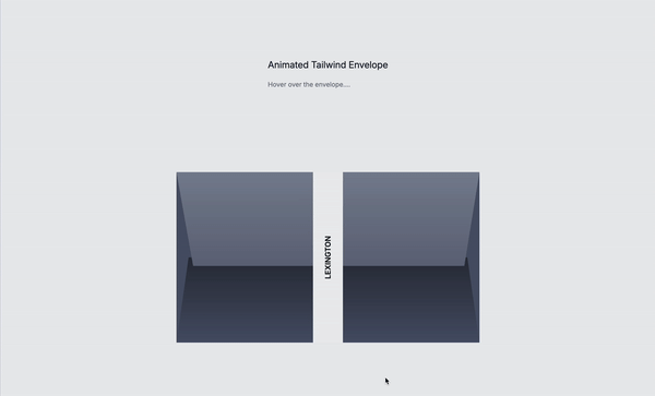
</div>The center stamp or ribbon
This is “modern” stamp, is like a way of closing the envelope.
bg-[#edeef0]: This sets the background color to #edeef0.w-16: This sets the width to 16px.uppercase: This makes the text uppercase.text-[#0c0d10]: This sets the text color to #0c0d10.h-full: This sets the height to 100%.flex: This is a flex container that allows us to create a flexible layout.items-center: This sets the items to center.z-40: This sets the z-index to 40. This is important for the stamp to be positioned correctly.justify-center: This sets the justify content to center.font-medium: This makes the text medium.group-hover:opacity-0: This sets the opacity to 0 when the user hovers over the element.transition-all: This adds a transition effect to the element, making it appear and disappear smoothly.duration-1000: This sets the duration of the transition to 1000ms.group-hover:-translate-y-96: This translates the element 96px up when the user hovers over the element.
<div
class="bg-[#edeef0] w-16 uppercase text-[#0c0d10] h-full flex items-center z-40 justify-center font-medium group-hover:opacity-0 transition-all duration-1000 group-hover:-translate-y-96"
>
<div class="-rotate-90">Lexington</div>
</div>Let’s create the envelope shape
On this part, we have 4 divs, each one representing a different part of the envelope. We will create the shape of the envelope using clip-path. The clip-path property allows us to create complex shapes by defining a path that defines the shape.
In this case, we are using a polygon to create the shape of the envelope. The polygon is defined by a series of coordinates that define the vertices of the polygon. Each coordinate consists of two numbers separated by a comma, representing the x and y coordinates of the vertex. The coordinates are relative to the top-left corner of the envelope. The polygon is closed by connecting the first and last vertices.
The top, which is where the letter comes out of the envelope
transition-all: This adds a transition effect to the element, making it appear and disappear smoothly.duration-1000: This sets the duration of the transition to 1000ms.z-10: This sets the z-index to 10.bg-gradient-to-b: This sets the background gradient to a linear gradient that goes from the top to the bottom.absolute: This makes the element positioned absolutely.
Only for the top layer
group-hover:duration-100: This sets the duration of the transition to 100ms when the user hovers over the element.This is important to only add it on the top because it has to disappear before the letter comes out of the envelope. So we only add this on the top shapegroup-hover:[clip-path:polygon(0_0,_100%_0,_100%_0,_0_0)]: This sets the clip-path to a polygon that defines the shape of the top layer when the envelope is hovered.
<!--- Top -->
<div class="transition-all duration-1000 group-hover:duration-100 z-10 bg-gradient-to-b from-[#808698] to-[#51576c] absolute group-hover:[clip-path:polygon(0_0,_100%_0,_100%_0,_0_0)] w-full h-full [clip-path:polygon(0_0,_100%_0,_95%_55%,_5.5%_55%)]"></div>
<!-- left -->
<div class="transition-all duration-700 absolute w-full h-full bg-[#4f576e] [clip-path:polygon(0_0,_0%_100%,_8%_51%)]"></div>
<!-- right -->
<div class="transition-all duration-700 absolute w-full h-full group-hover:rounded-tr-none bg-[#4f576e] [clip-path:polygon(100%_0,_100%_100%,_92%_51%)]"></div>
<!--- Bottom -->
<div class="transition-all duration-700 absolute w-full h-full bg-gradient-to-b from-[#0c0d10] to-[#4f576e] [clip-path:polygon(4%_50%,_96%_50%,_100%_100%,_0%_100%)]"></div>undefined</div>The final markup
<div
class="relative w-[650px] mx-auto group aspect-[16/9] flex items-center justify-center"
>
<div
class="absolute flex flex-col items-start justify-start w-full h-full px-16 py-10 bg-white transition-all duration-300 group-hover:duration-1000 group-hover:-translate-y-36"
>
<div class="flex justify-between w-full">
<div>
<p class="font-medium text-black tex-tsm">Michael Andreuzza</p>
<p class="text-xs text-base-500">
123 Fake Street <br />
New York <br />
NY 10001
</p>
<p class="mt-6 text-xs font-medium text-base-500">Billed to</p>
<p class="mt-1 text-sm font-medium text-black">Juan Perez</p>
<p class="text-xs text-base-500">
456 Fake Street <br />
Narnia <br />
NY 10002
</p>
</div>
<div class="text-sm uppercase font-sembold">Michael and Co</div>
</div>
<div class="mt-8">
<p class="font-medium text-black tex-tsm">Dear Mr. Perez,</p>
<p class="text-xs text-base-500">
I hope this letter finds you well. This is a reminder that payment for
services rendered by Michael and Co. is now due. Please find the details
of the invoice below:
</p>
</div>
</div>
<!--- Stamp -->
<div
class="bg-[#edeef0] w-16 uppercase text-[#0c0d10] h-full flex items-center z-40 justify-center font-medium group-hover:opacity-0 transition-all duration-1000 group-hover:-translate-y-96"
>
<div class="-rotate-90">Lexington</div>
</div>
<!--- Top -->
<div
class="transition-all duration-1000 group-hover:duration-100 z-10 bg-gradient-to-b from-[#808698] to-[#51576c] absolute group-hover:[clip-path:polygon(0_0,_100%_0,_100%_0,_0_0)] w-full h-full [clip-path:polygon(0_0,_100%_0,_95%_55%,_5.5%_55%)]"
></div>
<!-- left -->
<div
class="transition-all duration-700 absolute w-full h-full bg-[#4f576e] [clip-path:polygon(0_0,_0%_100%,_8%_51%)]"
></div>
<!-- right -->
<div
class=" transition-all duration-700 absolute w-full h-full group-hover:rounded-tr-none bg-[#4f576e] [clip-path:polygon(100%_0,_100%_100%,_92%_51%)]"
></div>
<!--- Bottom -->
<div
class="transition-all duration-700 absolute w-full h-full bg-gradient-to-b from-[#0c0d10] to-[#4f576e] [clip-path:polygon(4%_50%,_96%_50%,_100%_100%,_0%_100%)]"
></div>
</div>Conlusion
In this tutorial, we created an animated envelope using Tailwind CSS and clip-path. Nothing trivial, but it’s a great way to add a bit of personal touch to your designs. You can customize the shape and size of the envelope to fit your needs. Remember to customize it and adapt it to your specific use case and make it more user-friendly, responsive and accessible.
Hope you enjoyed this tutorial and have a good day!
/Michael Andreuzza
One price.
Lifetime access.
-
34 Premium Astro Templates
-
All Future Templates Included
-
Unlimited Projects · Lifetime License