How to create an adaptable navigation on scroll with Astro, Tailwind CSS, and Alpine.js
Today we are going to create an adaptable navigation on scroll with Alpinejs and Tailwind CSS within an Astro project.
Understanding the scroll effect with Alpine.js
Alpine.js uses a combination of its x-data directive to initialize data for a component and the @scroll.window event listener to react to scroll events. This functionality is particularly useful for implementing adaptive UI elements, such as changing the appearance of a navigation bar as the user scrolls down a page.
Key concepts and classes
x-dataDirective: Initializes component state. Here, it’s used to set a boolean value indicating whether the page is at the top or not.@scroll.windowModifier: Listens for scroll events on the window object. It updates the component’s state based on the scroll position.- Conditional Classes with:
classBinding: Alpine.js allows for conditional class bindings, enabling you to add or remove classes based on the component’s state.
Implementing scroll-triggered class changes
Let’s break down the code to see how these concepts work together to change the navigation bar’s appearance on scroll.
1 Initialize State with x-data
We start by defining a state named atTop that tracks whether the user has scrolled past a certain threshold.
<div x-data="{ atTop: true }">
Detect scroll with @scroll.window
Next, we use @scroll.window to modify atTop based on the user’s scroll position. If the page is scrolled down more than 50 pixels, atTop becomes false.
@scroll.window="atTop = (window.pageYOffset > 50 ? false : true)"
Dynamic Class Binding with :class
With the state in place, we can dynamically bind classes to our navigation bar using the :class directive. This allows us to add different classes based on whether atTop is true or false.
:class="{ 'bg-black bg-opacity-90 backdrop-blur-xl': !atTop, 'bg-white': atTop }"
In this example, when the user scrolls down (and atTop is false), the navigation bar’s classes change to bg-black bg-opacity-90 backdrop-blur-xl, applying a darker background, increased opacity, and a blur effect. When the user scrolls back to the top (atTop is true), the classes revert, showing a white background.
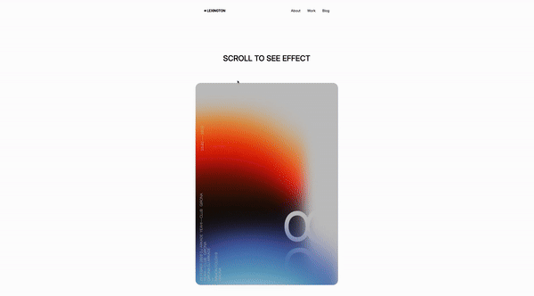
The Result
By combining these Alpine.js features, we create a navigation bar that reacts to the user’s scroll position, enhancing the visual experience and interactivity of the site. This approach can be adapted to trigger various effects, such as animations, color changes, or visibility toggles, based on how far the user has scrolled.
Alpine.js’s simplicity and power for creating dynamic UIs are evident in how effortlessly it can add such sophisticated behaviors to web elements. With just a bit of JavaScript embedded directly in your HTML, you achieve a high level of interactivity that would typically require more complex solutions.
/Michael Andreuzza