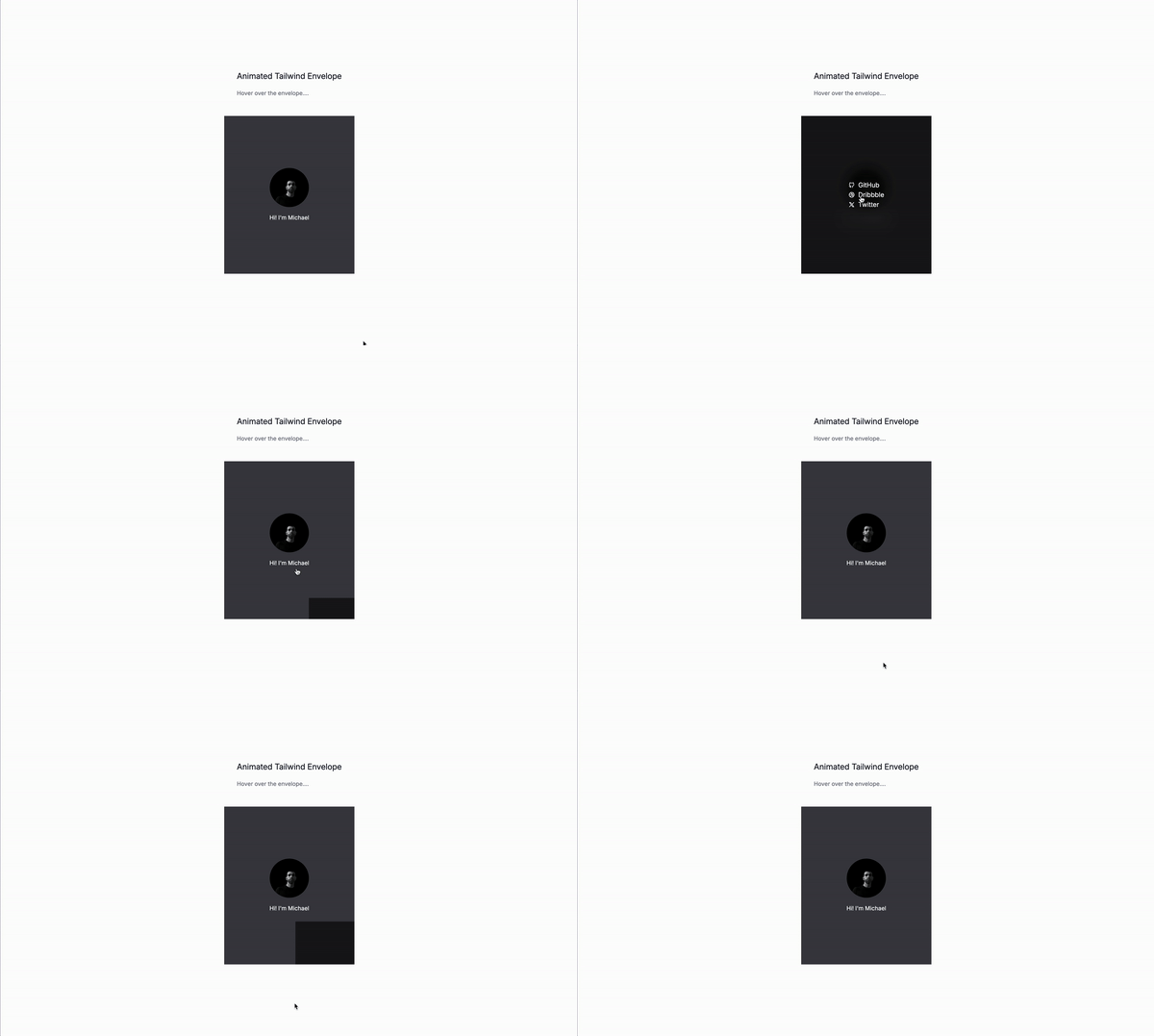
Let’s create an animated profile card with Tailwind CSS. This tutorial will show you how to create a profile card that animates when you hover over it. The card will have a hover effect that reveals a list of links.
What are profile cards?
Profile cards are a great way to showcase your personal brand and give your visitors a glimpse into your life. They are also a great way to introduce yourself to potential clients or customers. A profile card can be as simple as a photo and a name, or it can be more elaborate with additional information, like a bio, a list of links, or even a video!
Use cases
- Introduce yourself to potential clients or customers
- Showcase your personal brand
- Provide a quick overview of your work or services
- Highlight your achievements or accomplishments
Let’s get started!
Thr wrapper
relativeis used to position the card relative to the parent element.overflow-hiddenis used to hide any overflowing content.flexis used to create a flex container.flex-colis used to create a column layout.items-centeris used to center the items vertically.justify-centeris used to center the items horizontally.
<div class="relative flex flex-col items-center justify-center overflow-hidden">
<!--- Content goes here --->
</div>The card itself
relativeis used to position the card relative to the parent element.overflow-hiddenis used to hide any overflowing content.w-fullis used to make the card take up the full width of its parent.h-fullis used to make the card take up the full height of its parent.py-32is used to add padding to the top and bottom of the card.cursor-pointeris used to make the card clickable.
<div class="relative w-full h-full py-32 overflow-hidden cursor-pointer ">
<!--- Content goes here --->
</div>The card background
z-10is used to make the card background appear on top of other elements.absoluteis used to make the card background positioned absolutely.w-fullis used to make the card background take up the full width of its parenth-fullis used to make the card background take up the full height of its parent.peeris used to designate this element as a reference point for conditional styling of its siblings or children using the peer-* variants. This allows you to change the styles of other elements based on the state of this peer element (e.g., hover, focus, checked).
<div class="absolute z-10 w-full h-full peer"></div>The card with the links
absoluteis used to make the card with the links positioned absolutely.peer-hover:right-0is used to make the card with the links appear on the right side of the card when the user hovers over it.peer-hover:rounded-b-noneis used to remove the rounded corners from the card with the links when the user hovers over it.peer-hover:bottom-0is used to make the card with the links appear at the bottom of the card when the user hovers over it.peer-hover:items-centeris used to center the items vertically within the card with the links when the user hovers over it.peer-hover:justify-centeris used to center the items horizontally within the card with the links when the user hovers over it.peer-hover:w-fullis used to make the card with the links take up the full width of the card when the user hovers over it.peer-hover:h-fullis used to make the card with the links take up the full height of the card when the user hovers over it.-bottom-44is used to position the card with the links 44 pixels from the bottom of the card.-right-16is used to position the card with the links 16 pixels from the right of the card.w-36is used to set the width of the card with the links to 36 pixels.h-44is used to set the height of the card with the links to 44 pixels.
<div class="absolute peer-hover:right-0 peer-hover:rounded-b-none peer-hover:bottom-0 peer-hover:items-center peer-hover:justify-center peer-hover:w-full peer-hover:h-full -bottom-44 -right-16 w-36 h-44">
<!--- Content goes here --->
</div>Tthe full markdown
<div
class="relative flex flex-col items-center justify-center overflow-hidden ">
<div
class="relative w-full h-full py-32 overflow-hidden cursor-pointer ">
<div class="absolute z-10 w-full h-full peer"></div>
<div
class="absolute flex items-end justify-end text-xl text-center text-white peer-hover:right-0 peer-hover:rounded-b-none peer-hover:bottom-0 peer-hover:items-center peer-hover:justify-center peer-hover:w-full peer-hover:h-full -bottom-44 -right-16 w-36 h-44 bg-black/60 backdrop-blur-lg transition-all duration-500">
<ul>
<li >
<!--- SVG Icions foes here --->
<a>Your link</a>
</li>
<!--- Add more links here --->
</ul>
</div>
<div>
<img
src="#_"
alt=""
/>
<div>
Hi! I'm Michael
</div>
</div>
</div>
</div>Conclusion
This is just a small example of a profile card with Tailwind CSS. You can customize it to fit your needs and add more features like other hover effects, other links, or even a video.
Hope you enjoyed this tutorial and have a god day!
/Michael Andreuzza
One Price.
Lifetime Access.
-
32 Premium Astro Templates
-
All Future Templates Included
-
Unlimited Projects · Lifetime License
