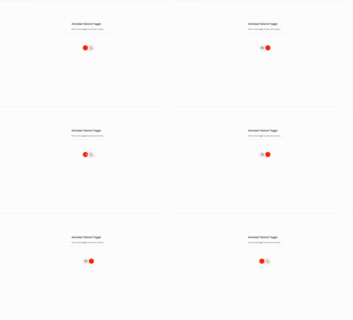
It’s toggle day! Let’s create a toggle that animates when you click it only with Tailwind CSS. Zero JavaScript required!
What is a toggle?
A toggle is a button that can be toggled on or off. It’s a common UI element that is used in many applications. For example, a toggle button can be used to turn on or off a light or a feature in an application. ( Like the one we have in the demo ).
Use Cases
- Toggle a light or a feature in an application.
- Toggle a button to show or hide content.
- Toggle a button to expand or collapse a menu.
- Toggle a button to open or close a modal.
- Toggle a button to enable or disable a feature. and many more!
Let’s start writing the code.
The Wrapper
First, let’s create the wrapper for the toggle. We’ll use the label element to wrap the toggle and the input element to toggle the state of the toggle. The input element is hidden by default and will be shown when the user clicks on the toggle. We’ll use the for attribute to associate the input element with the id of the toggle. Finally, we’ll use the aria-labelledby attribute to associate the label with the toggle. This will make the label accessible to screen readers.
for="theme-toggle": Associates theinputelement with theidof the toggle.
Information for the screen reader
We’ll use the sr-only class to hide the text from the screen and only show it to screen readers.
<span class="sr-only">Toggle theme</span>The SVGs
We’ll use a sun and a moon SVG to represent the toggle state. So let’s position them on the left and right side of the toggle.
Light mode SVG
absolute: Positions the SVG absolutely.left-[0.5em]: Positions the SVG on the left side of the toggle.top-1/2: Positions the SVG in the middle of the toggle.flex: Makes the SVG a flex container.size-8: Sets the size of the SVG.-translate-y-1/2: Moves the SVG up by half its height.items-center: Centers the SVG vertically.justify-center: Centers the SVG horizontally.aria-hidden="true": Hides the SVG from screen readers.
<svg class="absolute left-[0.5em] top-1/2 size-8 -translate-y-1/2 items-center justify-center " aria-hidden="true"></svg>Dark mode SVG
absolute: Positions the SVG absolutely.right-[0.5em]: Positions the SVG on the right side of the toggle.top-1/2: Positions the SVG in the middle of the toggle.size-8: Sets the size of the SVG.-translate-y-1/2: Moves the SVG up by half its height.
<svg class="absolute right-[0.5em] top-1/2 size-8 -translate-y-1/2 items-center justify-center" aria-hidden="true"></svg>The input
We’ll use the input element to toggle the state of the toggle. The input element is hidden by default and will be shown when the user clicks on the toggle. We’ll use the for attribute to associate the input element with the id of the toggle.
peer: Makes the input element a peer element.sr-only: Hides the input element from the screen.id="theme-toggle": Associates theinputelement with theidof the toggle.name="theme-toggle": Associates theinputelement with thenameof the toggle.type="checkbox": Specifies that theinputelement is a checkbox.aria-labelledby="theme-toggle-label": Associates theinputelement with theidof the label.
<input
class="sr-only peer"
id="theme-toggle"
name="theme-toggle"
type="checkbox"
aria-labelledby="theme-toggle-label"
/>The slider
We’ll use the span element to create the slider. We’ll use the id of the slider to associate it with the id of the toggle.
absolute: Positions the slider absolutely.left-[0.25em]: Positions the slider on the left side of the toggle.top-1/2: Positions the slider in the middle of the toggle.flex: Makes the slider a flex container.size-10: Sets the size of the slider.-translate-y-1/2: Moves the slider up by half its height.items-center: Centers the slider vertically.justify-center: Centers the slider horizontally.rounded-full: Rounds the slider.transition-all: Transitions the background color of the slider.duration-300: Sets the duration of the transition to 300 milliseconds.peer-checked:left-[calc(100%-2.75em)]: Moves the slider to the right when the toggle is checked.peer-focus:ring-2: Adds a focus ring to the slider when the toggle is focused.peer-focus:ring-blue-400: Sets the focus ring color to blue.
<span
id="theme-toggle-label"
class="absolute left-[0.25em] top-1/2 flex size-10 -translate-y-1/2 items-center justify-center rounded-full bg-orange-600 to-base-400 transition-all duration-300 peer-checked:left-[calc(100%-2.75em)] peer-focus:ring-2 peer-focus:ring-blue-400"
aria-hidden="true">
</span>Tehg whole markdown
<label
for="theme-toggle"
class="relative flex items-center w-24 h-12 mx-auto rounded-full shadow cursor-pointer bg-base-100 ring-1 ring-inset ring-white"
>
<span class="sr-only">Toggle theme</span>
<!--- Light mode SVG -->
<svg
class="absolute left-[0.5em] top-1/2 flex size-8 -translate-y-1/2 items-center justify-center text-orange-600"
aria-hidden="true"
>
</svg>
<!--- Dark mode SVG -->
<svg
class="absolute right-[0.5em] top-1/2 size-8 -translate-y-1/2 rounded-full text-orange-600"
aria-hidden="true"
>
</svg>
<input
class="sr-only peer"
id="theme-toggle"
name="theme-toggle"
type="checkbox"
aria-labelledby="theme-toggle-label"
/>
<span
id="theme-toggle-label"
class="absolute left-[0.25em] top-1/2 flex size-10 -translate-y-1/2 items-center justify-center rounded-full bg-orange-600 to-base-400 transition-all duration-300 peer-checked:left-[calc(100%-2.75em)] peer-focus:ring-2 peer-focus:ring-blue-400"
aria-hidden="true"
></span>
</label>Conclusion
That’s it! You now know how to create an animated toggle with Tailwind CSS. You can use this code as a starting point for your own toggle. Make sure to make it accessible to screen readers.
Have a great day!
/Michael Andreuzza
One price.
Lifetime access.
-
34 Premium Astro Templates
-
All Future Templates Included
-
Unlimited Projects · Lifetime License
