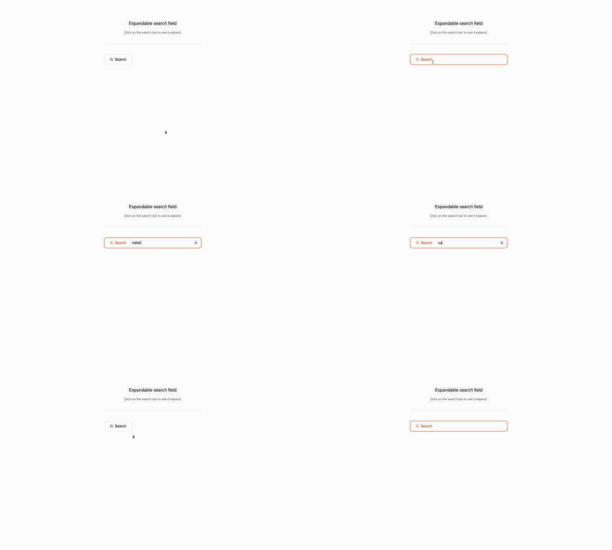
Today we are gogin to create an expandable search bar using only Tailwind CSS.
What is an expandable search bar?
An expandable search bar is a search bar that expands when the user clicks on it. It is often used to provide a quick and easy way for users to search for information. It is a great way to add a Search to your website or app.
Use cases:
-
Compact Design in Navigation Bars:
- Websites or applications with limited space in the navigation bar can benefit from an expandable search bar. It remains small and unobtrusive until the user needs it, conserving valuable space.
- Example: E-commerce sites where the primary focus is on product categories and promotional banners.
-
Mobile Applications:
- Mobile interfaces have limited screen real estate. An expandable search bar can remain minimal until needed, enhancing the user experience without taking up excessive space.
- Example: Social media apps where users frequently search for friends, posts, or tags.
-
Single-Page Applications (SPAs):
- SPAs often need a clean and clutter-free interface. An expandable search bar fits well in such designs, providing Search without overwhelming the user.
- Example: Dashboard applications used for data visualization and analytics.
-
Header Sections:
- Websites that have a prominent header section can use an expandable search bar to maintain a clean look. It ensures that the Search is always accessible but not intrusive.
- Example: News websites where the focus is on headlines and featured stories.
-
Content-Heavy Sites:
- Blogs, forums, and knowledge bases often contain vast amounts of content. An expandable search bar can help users quickly find what they are looking for without interrupting their browsing experience.
- Example: Technical documentation sites where users need to find specific information efficiently.
-
Interactive and Dynamic Interfaces:
- Interactive sites where user engagement is high can use expandable search bars to keep the interface dynamic and responsive.
- Example: Interactive learning platforms where users frequently search for lessons or topics.
-
E-commerce Sites:
- Online stores can use expandable search bars to enhance the shopping experience. Users can quickly search for products without navigating away from the current page.
- Example: Fashion retail sites where users might search for specific brands, styles, or categories.
-
Minimalistic Design Philosophy:
- Websites or apps adhering to a minimalistic design approach can use an expandable search bar to maintain a sleek and simple interface.
- Example: Portfolio websites where the visual content takes precedence, and search is secondary but necessary.
-
Sidebar Integration:
- In applications with sidebars, an expandable search bar can be integrated to provide Search without taking up too much space.
- Example: Project management tools where users need to search for tasks or projects within a sidebar.
-
User Preference and Interaction:
- Websites that prioritize user interaction and preference can use expandable search bars to enhance usability. Users who frequently use search can benefit from this feature.
- Example: Music streaming services where users often search for songs, artists, or playlists.
Let’s get started with the markup
The input field
peer: This is a utility class that allows you to style an element as if it were a peer element.cursor-pointer: This is a utility class that sets the cursor of the element to pointer.relative: This is a utility class that makes an element positioned relatively.z-10: This is a utility class that sets the z-index of the element to 10.h-12: This is a utility class that sets the height of the element to 12.w-32: This is a utility class that sets the width of the element to 32.pl-12: This is a utility class that sets the padding-left of the element to 12.focus:w-full: This is a utility class that sets the width of the element to full when it is focused.focus:pl-32: This is a utility class that sets the padding-left of the element to 32 when it is focused.focus:pr-4: This is a utility class that sets the padding-right of the element to 4 when it is focused.
<input
class="relative z-10 w-32 h-12 pl-12 cursor-pointer peer focus:w-full focus:pl-32 focus:pr-4"
/>The placeholder text
The placeholder text is the text that appears in the input field when it is empty. On this case you will have to adapt the size from the input field according to the placeholder, so you show the whole placeholer text and icon.
absolute: This is a utility class that makes an element positioned absolutely.inset-y-0: This is a utility class that sets the top, right, bottom, and left properties to 0.my-auto: This is a utility class that sets the margin-top, margin-right, margin-bottom, and margin-left properties to auto.h-6: This is a utility class that sets the height of the element to 6.w-32: This is a utility class that sets the width of the element to 32.px-3.5: This is a utility class that sets the padding-left of the element to 3.5.
<div class="absolute inset-y-0 my-auto h-6 w-32 px-3.5">
<div class="flex items-center justify-center gap-2">
<!--Icon goes here -->
<span>Search</span>
</div>
</div>The full markup Classes and visual styles are not included in the code below for brevity.
<form>
<input
class="relative z-10 w-32 h-12 pl-12 cursor-pointer peer focus:w-full focus:pl-32 focus:pr-4"
/>
<div class="absolute inset-y-0 my-auto h-6 w-32 px-3.5">
<div class="flex items-center justify-center gap-2">
<svg
xmlns="http://www.w3.org/2000/svg"
class="size-4"
viewBox="0 0 24 24"
fill="none"
stroke="currentColor"
stroke-width="2"
stroke-linecap="round"
stroke-linejoin="round"
class="icon icon-tabler icons-tabler-outline icon-tabler-search"
>
<path stroke="none" d="M0 0h24v24H0z" fill="none"></path>
<path d="M10 10m-7 0a7 7 0 1 0 14 0a7 7 0 1 0 -14 0"></path>
<path d="M21 21l-6 -6"></path>
</svg>
<span>Search</span>
</div>
</div>
</form>Conclusion
This is a simple expandable search bar that demonstrates how to use Tailwind CSS to create an expandable search bar with a predefined set of styles. It’s a great starting point for building more complex expandable search bars.
Hope you enjoyed this tutorial and have a great day!
/Michael Andreuzza
One price.
Lifetime access.
-
34 Premium Astro Templates
-
All Future Templates Included
-
Unlimited Projects · Lifetime License
