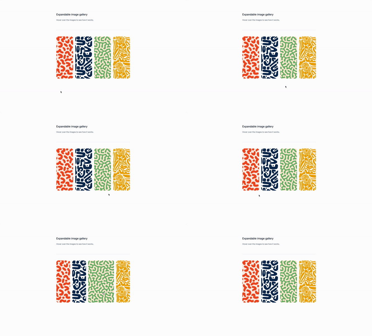
Finally Monday! We are going to create an expandable gallery with Tailwind CSS. no Js not Alpine.js, super simple yet super cool.
Why do we need an expandable gallery?
We don’t, but it’s a cool way to showcase your work and not make it boring to look at. A little interactivity never feels out of place.
Use Cases:
- Product listings: An expandable gallery can be used to showcase product listings, allowing users to click on an image to see more details.
- Blog posts: An expandable gallery can be used to showcase blog posts, allowing users to click on an image to see more content.
- News articles: An expandable gallery can be used to showcase news articles, allowing users to click on an image to see more content.
- Image galleries: An expandable gallery can be used to showcase image galleries, allowing users to click on an image to see more content. …and many other use cases.
Understanding the markup:
This is the container element that will hold the gallery.
<div class="grid place-items-center">-
gridis a flexbox layout that will create a grid of images. -
place-items-centeris a CSS property that centers the items in the grid. -
This is the image element that will be used to display the images.
<figure
class="relative w-32 h-80 flex-1 overflow-hidden transition-all duration-500 ease-in-out hover:flex-[2] hover:cursor-pointer hover:rounded-xl group ...">
<!-- Image goes here -->
</figure>relativeis a CSS property that makes the element position relative to its parent.w-32andh-80are CSS properties that set the width and height of the image.flex-1is a CSS property that sets the flex basis to 100%.overflow-hiddenis a CSS property that hides any overflowing content.transition-allis a CSS property that applies a transition effect to all properties of the element.duration-500is a CSS property that sets the transition duration to 500 milliseconds.ease-in-outis a CSS property that sets the transition timing function to ease-in-out.hover:flex-[2]is a CSS property that applies a flex basis of 2 to the element when the mouse hovers over it.hover:cursor-pointeris a CSS property that changes the cursor to a pointer when the mouse hovers over the element.hover:rounded-xlis a CSS property that applies a rounded border radius of 16 to the element when the mouse hovers over it.groupis a CSS property that groups the element with its siblings.
This is the image element that will be used to display the images.
<img
class="relative object-cover h-80 transition-all duration-500 ease-in-out group-hover:w-full"
src="..."
alt="..."
/>relativeis a CSS property that makes the element position relative to its parent.h-80is a CSS property that sets the height of the image to 80 pixels.object-coveris a CSS property that scales the image to cover the entire container.transition-allis a CSS property that applies a transition effect to all properties of the element.duration-500is a CSS property that sets the transition duration to 500 milliseconds.ease-in-outis a CSS property that sets the transition timing function to ease-in-out.group-hover:w-fullis a CSS property that applies a width of 100% to the element when the mouse hovers over it. As you can see it uses thegroup-hoverpseudo-class to target the element when the mouse hovers the parent element.
The full markup
<div class="grid place-items-center ...">
<figure
class="relative w-32 h-80 flex-1 overflow-hidden transition-all duration-500 ease-in-out hover:flex-[2] hover:cursor-pointer hover:rounded-xl group ...">
<img
class="relative object-cover h-80 transition-all duration-500 ease-in-out group-hover:w-full"
src="..."
alt="..."
/>
</figure>
</div>Conclusion
This is a simple expandable gallery that can be used for any type of content, such as product listings, blog posts, news articles, or image galleries. Remember to make the gallery fully accessible.
Hope you enjoyed this tutorial and have a great day!
/Michael Andreuzza
One price.
Lifetime access.
-
34 Premium Astro Templates
-
All Future Templates Included
-
Unlimited Projects · Lifetime License
