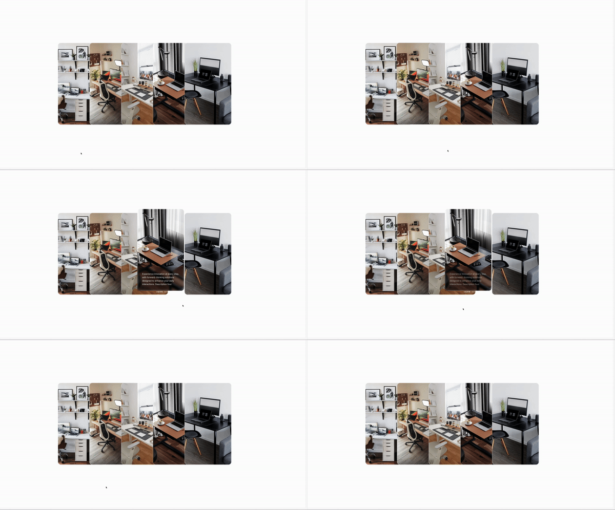
Today’s tutorial is about creating animated cards with Astrojs and Tailwind CSS. It’s fun, and easy to use!
Animating image cards on your website can significantly enhance user engagement and visual appeal. Tailwind CSS, with its utility-first approach, makes these animations straightforward and efficient…
But, why animated blog cards?
Animated blog cards are not just about the visual appeal; they serve as a dynamic interaction tool that can significantly enhance the user experience on your website. Here’s why you should consider creating animated blog cards:
Enhanced user engagement: Animation can capture users’ attention more effectively than static images. Animated blog cards can make your site more interactive and engaging, encouraging visitors to spend more time exploring your content.
Improved aesthetic appeal: A well-designed animation adds a layer of sophistication to your website, improving its overall aesthetic appeal. It reflects well on your brand’s attention to detail and commitment to providing a pleasant user experience.
Increased click-through rates: animated elements, including blog cards, have been shown to increase click-through rates. By drawing attention to specific posts, animations can guide users towards content you want to highlight.
Stand Out from the Competition: In a digital world full of content, standing out becomes increasingly challenging. Animated blog cards can give you an edge over competitors by offering a unique and memorable browsing experience.
The main classes
To achieve a compelling animated effect on image cards, utilize the following Tailwind CSS classes:
- Transform and Transition:
transform transition-all duration-300 ease-in-out - Hover State:
hover:scale-105 hover:opacity-75
These classes contribute to the smooth transition, scale, and opacity changes upon hovering, adding depth with shadows and ensuring content alignment with Flexbox.
The code
Here’s a concise example of an animated image card component:
{
features.map((feature, index) => (
<>
<div class="relative flex flex-col items-start m-1 transition ease-in-out duration-500 delay-150 transform md:w-96 md:-ml-32 md:hover:-translate-x-32 md:hover:-translate-y-8 shrink-0">
<article
class="relative mx-auto overflow-hidden bg-center bg-cover rounded-3xl ring-2 ring-inset ring-white/50 min-h-150 transform duration-500 group"
style={`background-image: url('${feature.bgImage}');`}>
<div
class={` relative h-full group-hover:bg-opacity-0 min-h-150 flex flex-wrap flex-col pt-[30rem] transform duration-500`}>
<div class="flex flex-col justify-end h-full p-8 group-hover:bg-black/30 duration-500 group-hover:backdrop-blur lg:p-10">
<p class="text-sm text-white opacity-0 2xl:text-lg group-hover:opacity-80 transform duration-500 ">
{feature.description}
</p>
</div>
</div>
</article>
</div>
</>
))
}This example demonstrates how to wrap an image and text within a div, applying Tailwind CSS classes for background, transition effects,… The hover state triggers the animation, enhancing the card’s interactivity.
/Michael Andreuzza
One price.
Lifetime access.
-
34 Premium Astro Templates
-
All Future Templates Included
-
Unlimited Projects · Lifetime License
