Let’s elevate your website with a captivating image component. If your Astro.js project is already set up, we’ll dive straight into using Tailwind CSS to craft the animations for our cards.
The main classes
All our images will use this classes in common:
rounded-xlto apply rounded corners.hover:rotate-0to ensure the image resets to a default rotation on hover.duration-500to control the speed of the animation over 500 milliseconds.hover:-translate-y-12to lift the image upwards on hover.h-fullandw-fullto ensure the image occupies the full height & width of its container.object-coverto ensure the image covers the area of its container without distortion.hover:scale-150to magnify the image on hover.transformto enable CSS transformations.origin-bottomto set the transformation origin to the bottom of the image.
To customize and enhance the animation effect, incorporate these additional classes:
rotate-6for a slight right tilt.-rotate-12for a more pronounced left tilt.
By combining these classes, you can create a dynamic, interactive image component that adds a layer of sophistication and engagement to your website. Tailwind CSS makes these animations straightforward to implement, offering a seamless way to enhance your site’s visual appeal.
Let’s get to the code
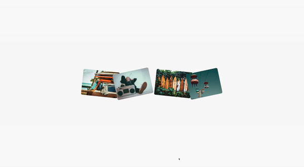
This is how the whole component will look like
<div class="hidden mx-auto mt-12 lg:grid lg:grid-cols-4 scale-125">
<a href="...">
<img
src="..."
class="object-cover w-full h-full rounded-xl rotate-6 hover:rotate-0 duration-500 hover:-translate-y-12 hover:scale-150 transform origin-bottom"
alt="..."
/>
</a
><a href="...">
<img
src="..."
class="object-cover w-full h-full rounded-xl -rotate-12 hover:rotate-0 duration-500 hover:-translate-y-12 hover:scale-150 transform origin-bottom"
alt="..."
/>
</a
><a href="...">
<img
src="..."
class="object-cover w-full h-full rounded-xl rotate-6 hover:rotate-0 duration-500 hover:-translate-y-12 hover:scale-150 transform origin-bottom"
alt="..."
/>
</a
><a href="...">
<img
src="..."
class="object-cover w-full h-full rounded-xl -rotate-12 hover:rotate-0 duration-500 hover:-translate-y-12 hover:scale-150 transform origin-bottom"
alt="..."
/>
</a>
</div>Simplifying the code
To avoid repetitive markup and class definitions, let’s streamline our process by using an array. This allows us to dynamically add classes, making the component more flexible and easier to manage.
// Define an array of image objects to make the component more dynamic and easily editable.
const images = [
{
url: "...", // Placeholder for the image URL
rotation: "rotate-6", // Class for a slight right tilt
},
{
url: "...", // Placeholder for the image URL
rotation: "-rotate-12", // Class for a pronounced left tilt
},
{
url: "...", // Placeholder for the image URL
rotation: "rotate-6", // Repeat class for consistency or thematic design
},
{
url: "...", // Placeholder for the image URL
rotation: "-rotate-12", // Repeat class for consistency or thematic design
},
];Now that we’ve established our array, let’s dynamically render each image within our component using the map method. This approach injects each image’s unique properties directly into the markup, streamlining the creation of our interactive image gallery.
<div class="hidden mx-auto mt-12 lg:grid lg:grid-cols-4 scale-125">
{
images.map((image) => (
<a href="#_">
<img
src={image.url}
class={`rounded-xl ${image.rotation} hover:rotate-0 duration-500 hover:-translate-y-12 h-full w-full object-cover hover:scale-150 transform origin-bottom`}
alt="#_"
/>
</a>
))
}
</div>The Template Literal
The expression uses a template literal, which is denoted by backticks (`). Template literals allow you to embed expressions inside strings, making it easier to construct strings dynamically. The ${} syntax within the template literal is used to interpolate JavaScript expressions into the string.
Dynamic Class Assignment
In your code, image.rotation is the JavaScript expression being dynamically inserted into the class list of the <img> element. Depending on the value of image.rotation for each object in the images array, a different rotation class (e.g., rotate-6 or -rotate-12) is applied to each image. This allows each image to have its unique rotation effect as specified in your data array.
Full Class String Explanation
rounded-xl: Applies rounded corners to the image.${image.rotation}: Dynamically adds a rotation class based on the image object’s property. This is where your dynamic class assignment occurs.hover:rotate-0: Resets the image rotation to 0 degrees on hover, effectively canceling out any rotation applied by${image.rotation}when the user hovers over the image.duration-500: Sets the transition duration to 500 milliseconds, making any hover effects (like rotation or scale changes) transition smoothly.hover:-translate-y-12: Moves the image up (translates it along the Y-axis in a negative direction) on hover.h-full w-full: Sets the height and width of the image to fully occupy its container’s dimensions.object-cover: Ensures the image covers the area of the container without distorting its aspect ratio, cropping the image if necessary.hover:scale-150: Enlarges the image to 150% of its original size on hover.transform: Enables CSS transforms on the element, a prerequisite for applying transformation effects like rotation and scale.origin-bottom: Sets the origin point for transformations to the bottom of the element, affecting how it rotates or scales.
This dynamic class string effectively combines static classes that apply to all images with a dynamic class that varies per image, enabling a rich, interactive styling approach that can be easily managed and extended.
/Michael Andreuzza
One Price.
Lifetime Access.
-
32 Premium Astro Templates
-
All Future Templates Included
-
Unlimited Projects · Lifetime License