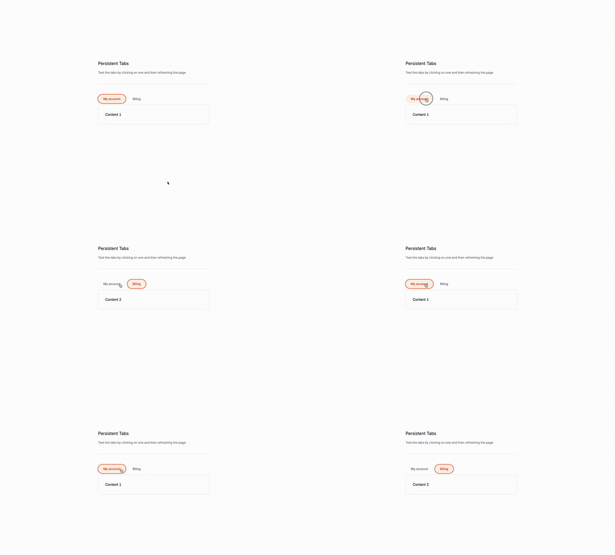
Hello everyone! This tutorial will show you how to create a persistent tabs component using Alpine JS and Tailwind CSS.
Why persistent tabs?
Persistent tabs offer several benefits in web applications:
- Improved User Experience: They maintain the user’s last selected tab across page reloads or navigation, providing a seamless and consistent interface.
- State Preservation: Users don’t lose their place or context when they refresh the page or return to it later.
- Efficiency: Reduces the need for users to repeatedly select their preferred tab, saving time and reducing frustration.
- Personalization: Allows for a more tailored user experience by remembering individual preferences.
- Reduced Cognitive Load: Users don’t have to remember which tab they were on, especially useful for complex applications with multiple sections.
Use cases
Persistent tabs can be useful in various scenarios:
- Dashboard Applications: Maintain the last viewed section of a multi-faceted dashboard.
- E-commerce Platforms: Remember the last category a user was browSign in a product catalog.
- Content Management Systems: Keep track of the last edited section in a multi-step content creation process.
- Social Media Platforms: Preserve the last viewed tab (e.g., posts, photos, about) on a user’s profile.
- Educational Platforms**: Maintain the last accessed module or lesson in an online course.
- Settings Pages: Remember the last settings category a user was modifying.
- Analytics Tools: Keep the last viewed data set or time range selected by the user.
- Project Management Tools: Preserve the last project view (e.g., Kanban board, timeline, list view) selected by the user.
- Documentation Websites: Remember the last viewed section of multi-page documentation.
- Multi-step Forms: Maintain the last completed step if a user needs to return to the form later.
By implementing persistent tabs, you can significantly enhance the usability and user-friendliness of your web application across these and many other use cases.
Let’s write the markup
The wrapper
The wrapper is where we’ll add the snippet to persist the tab state.
x-datais a directive that allows us to create a reactive data object in our component.activeTabis a property that will hold the current active tab index.setActiveTabis a method that will be called when the user clicks on a tab.localStorageis a built-in JavaScript object that allows us to store data locally in the browser.
<div
x-data="{
activeTab: parseInt(localStorage.getItem('activeTab')) || 0,
setActiveTab(index) {
this.activeTab = index;
localStorage.setItem('activeTab', index.toString());
}
}"
>
<!-- Tabs goes here -->
</div>The tablist
The wrapper
The wrapper is an ul element:
Attributes
role="tablist": Indicates that the element is a tablist. Classes-mb-px: Adds a negative margin to the bottom of the element.flex: Applies flexbox layout to the element.items-stretch: Stretches the items in the list to fill the available space.- “: Adds a gap between the items in the list.
text-slate-500: Sets the text color to a light gray color.
<ul role="tablist" class="flex items-stretch -mb-px text-slate-500">
<!-- Tabs go here -->
</ul>The li element
The buttons are li elements without the need of classes on this example.
<li role="presentation">
<!-- Button goes here -->
</li>Attributes
role="presentation: Indicates that the element is a presentational element.
The Tab Button
Attributes
role="tab": Indicates that the element is a tab.id="tab-1": Assigns a unique ID to the tab.aria-controls="panel-1": Associates the tab with its corresponding panel.:aria-selected="activeTab === 0": Dynamically sets the aria-selected attribute based on whether this tab is active.:tabindex="activeTab === 0 ? 0 : -1": Makes the tab focusable when active, and not focusable when inactive.
Alpine JS Directives
@click="setActiveTab(0)": Defines a click event handler to activate this tab.:class="{ 'bg-orange-50 text-orange-600': activeTab === 0 }": Applies orange styling to the tab when it’s active.
Classes
flex: Applies flexbox layout to the element.items-center: Centers the content vertically.rounded-full: Applies rounded corners to the element.px-6: Adds padding to the left and right sides of the element.h-10: Sets the height of the element to 10 pixels.py-2: Adds padding to the top and bottom of the element.text-sm: Sets the font size to small.font-medium: Sets the font weight to medium.focus:outline-none: Removes the default browser outline when the element is focused.focus:ring-2: Adds a border-width of 2 pixels to the element when it’s focused.focus:ring-orange-500: Applies the orange-500 color to the border when the element is focused.
<button
role="tab"
id="tab-1"
aria-controls="panel-1"
:aria-selected="activeTab === 0"
:tabindex="activeTab === 0 ? 0 : -1"
@click="setActiveTab(0)"
:class="{
'bg-orange-50 text-orange-600': activeTab === 0
}"
class="flex items-center h-10 px-6 py-2 text-sm font-medium rounded-full focus:outline-none focus:ring-2 focus:ring-orange-500"
>
My account
</button>The other button is the same, but with a different id and aria-controls attribute. This is because the buttons are associated with their respective panels.
The pannels
The pannels are section elements where the content of the tabs will be displayed.
Attributes
id="panel-1": Assigns a unique ID to the panel.role="tabpanel": Indicates that the element is a tabpanel.aria-labelledby="tab-1": Associates the panel with the corresponding tab. Alpine JS Directivesx-show="activeTab === 0": Conditionally displays the panel based on the active Classesp-8: Adds padding to the panel.
<section
id="panel-1"
role="tabpanel"
aria-labelledby="tab-1"
x-show="activeTab === 0"
class="p-8"
>
Content 1
</section>Panel 2 is similar to Panel 1, but with a different id and aria-labelledby attribute.
The full markup
As you can see the markup is quite simple.
<div
x-data="{
activeTab: parseInt(localStorage.getItem('activeTab')) || 0,
setActiveTab(index) {
this.activeTab = index;
localStorage.setItem('activeTab', index.toString());
}
}"
>
<!-- Tab List -->
<ul role="tablist" class="flex items-stretch -mb-px text-slate-500">
<!-- Tab 1 -->
<li role="presentation">
<button
@click="setActiveTab(0)"
:aria-selected="activeTab === 0"
:tabindex="activeTab === 0 ? 0 : -1"
:class="{ 'bg-orange-50 text-orange-600': activeTab === 0 }"
class="flex items-center h-10 px-6 py-2 text-sm font-medium rounded-full focus:outline-none focus:ring-2 focus:ring-orange-500"
role="tab"
id="tab-1"
aria-controls="panel-1"
>
My account
</button>
</li>
<!-- Tab 2 -->
<li role="presentation">
<button
@click="setActiveTab(1)"
:aria-selected="activeTab === 1"
:tabindex="activeTab === 1 ? 0 : -1"
:class="{ 'bg-orange-50 text-orange-600': activeTab === 1 }"
class="flex items-center h-10 px-6 py-2 text-sm font-medium rounded-full focus:outline-none focus:ring-2 focus:ring-orange-500"
role="tab"
id="tab-2"
aria-controls="panel-2"
>
Biling
</button>
</li>
</ul>
<!-- Panels -->
<div
class="mt-2 overflow-hidden bg-white border rounded-b-md rounded-xl border-base-50"
>
<!-- Panel 1 -->
<section
x-show="activeTab === 0"
role="tabpanel"
id="panel-1"
aria-labelledby="tab-1"
class="p-8"
>
Content 1
</section>
<!-- Panel 2 -->
<section
x-show="activeTab === 1"
role="tabpanel"
id="panel-2"
aria-labelledby="tab-2"
class="p-8"
>
Content 2
</section>
</div>
</div>Conclusion
In this tutorial, we learned how to create a persistent tabs component using Alpine JS and Tailwind CSS, and how to use Alpine JS directives to conditionally display the content of the tabs based on the active tab and save the active tab state in the browser’s local storage.
I hope you found this tutorial helpful and have a great day!
/Michael Andreuzza
One price.
Lifetime access.
-
34 Premium Astro Templates
-
All Future Templates Included
-
Unlimited Projects · Lifetime License
