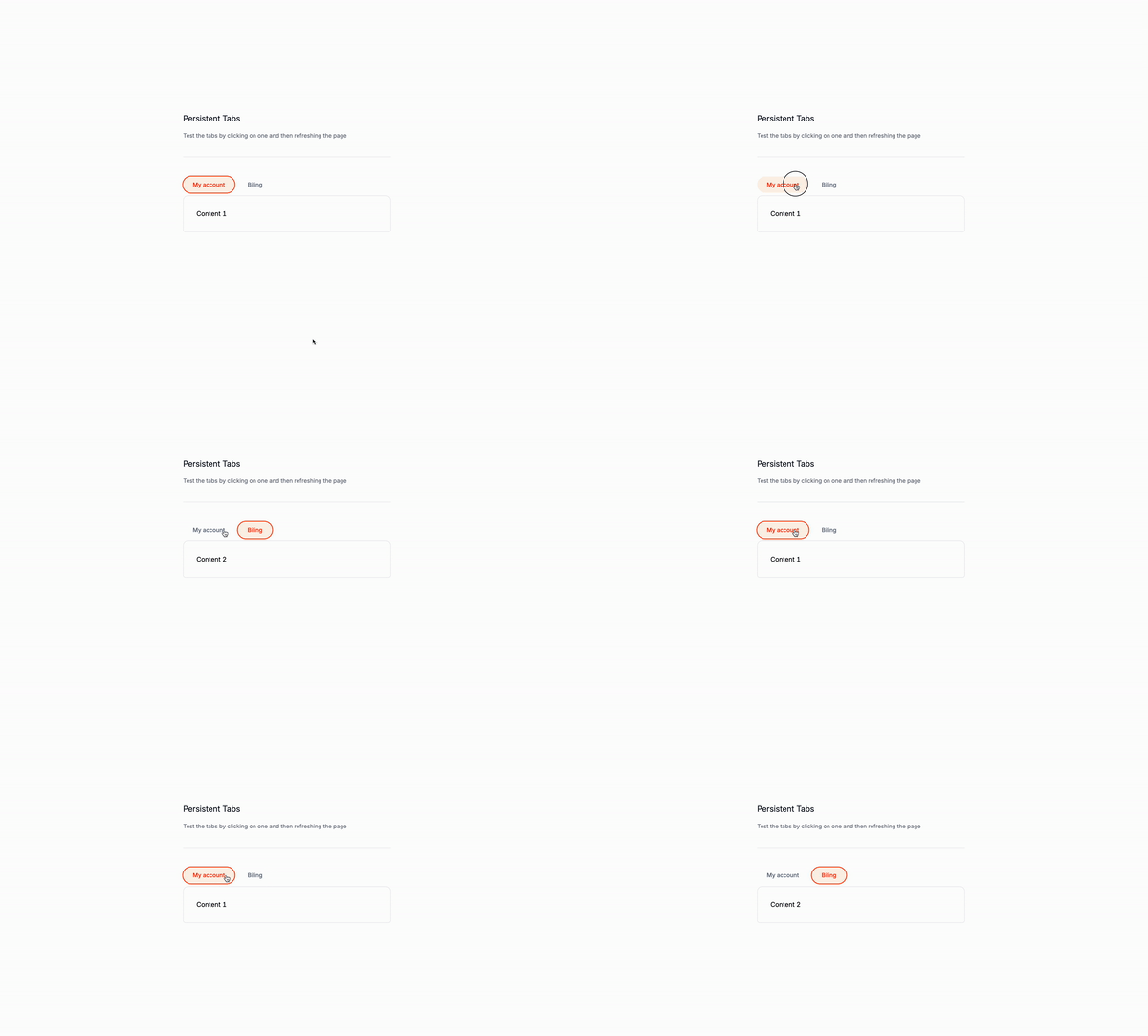
Monday again, another day of tutorials! Today, we’ll be creating a persistent tabs component instead of using Alpine JS like we did on the past tutorial, we will be using JavaScript and Tailwind CSS.
Why Persistent Tabs?
Persistent tabs bring multiple advantages to web applications:
- Enhanced User Experience: They retain the user’s last selected tab across page reloads or navigation, ensuring a seamless and consistent interface.
- State Retention: Users maintain their position or context even after refreshing the page or returning later.
- Increased Efficiency: Users save time and avoid frustration by not having to repeatedly select their preferred tab.
- Customized Experience: They enable a more personalized user interface by remembering individual preferences.
- Lowered Cognitive Load: Users don’t need to recall which tab they were on, which is especially helpful in complex applications with multiple sections.
Use Cases
Persistent tabs are beneficial in a variety of situations:
- Dashboard Applications: Keep the last viewed section of a comprehensive dashboard.
- E-commerce Platforms: Recall the last category a user was browSign in a product catalog.
- Content Management Systems: Track the last edited section in a multi-step content creation process.
- Social Media Platforms: Save the last viewed tab (e.g., posts, photos, about) on a user’s profile.
- Educational Platforms: Retain the last accessed module or lesson in an online course.
- Settings Pages: Remember the last settings category a user was editing.
- Analytics Tools: Preserve the last viewed data set or time range chosen by the user.
- Project Management Tools: Save the last project view (e.g., Kanban board, timeline, list view) selected by the user.
- Documentation Websites: Maintain the last viewed section of multi-page documentation.
- Multi-step Forms: Keep track of the last completed step if a user needs to return to the form later.
By integrating persistent tabs, you can significantly improve the usability and user-friendliness of your web application across these and many other scenarios.
Let’s write the markup
The wrapper
The wrapper is where we’ll add the snippet to persist the tab state. We’ll also add the id and class attributes to the wrapper.
id="tabsComponent": Assigns a unique ID to the wrapper. This ID will be used to target the wrapper in the JavaScript code.
<div id="tabsComponent">
<!-- Tabs go here -->
</div>The buttons container
The buttons are li elements without the need of classes on this example. We’ll add the role="presentation" attribute to the ul element to indicate that the element is a presentational element.
The buttons wrapper
role="presentation": Indicates that the element is a presentational element.
<ul role="tablist">
<!-- Tabs go here -->
</ul>The buttons
Attributes
role="tab": Indicates that the element is a tab.id="tab-1": Assigns a unique ID to the tab.aria-controls="panel-1": Associates the tab with its corresponding panel.
<button role="tab" id="tab-1" aria-controls="panel-1"> My account </button>The panels
The panels are section elements where the content of the tabs will be displayed.
Attributes
role="tabpanel": Indicates that the element is a tabpanel.id="panel-1": Assigns a unique ID to the panel.aria-labelledby="tab-1": Associates the panel with the corresponding tab.
<section role="tabpanel" id="panel-1" aria-labelledby="tab-1"> Content 1 </section>We will do the same with the other panel, only that the seconde panel will have it’s own attributes.
Note: Classes are removed for brevity and you can get the full code on the GitHub repository.
<div id="tabsComponent">
<!-- Tab List -->
<ul role="tablist">
<!-- Tab 1 -->
<li role="presentation">
<button role="tab" id="tab-1" aria-controls="panel-1"> My account </button>
</li>
<!-- Tab 2 -->
<li role="presentation">
<button role="tab" id="tab-2" aria-controls="panel-2"> Billing </button>
</li>
</ul>
<!-- Panels -->
<div>
<!-- Panel 1 -->
<section role="tabpanel" id="panel-1" aria-labelledby="tab-1"> Content 1 </section>
<!-- Panel 2 -->
<section role="tabpanel" id="panel-2" aria-labelledby="tab-2"> Content 2 </section>
</div>
</div>The script
The script is where we’ll define the logic for the tabs component.
The addEventListener
We’ll add the addEventListener function to the document object to listen for the DOMContentLoaded event.
const tabsComponent = document.getElementById("tabsComponent");: This line of code selects the wrapper element with the IDtabsComponent.const tabButtons = tabsComponent.querySelectorAll(".tab-button");: This line of code selects all the buttons inside the wrapper.const tabPanels = tabsComponent.querySelectorAll(".tab-panel");: This line of code selects all the panels inside the wrapper.
const tabsComponent = document.getElementById("tabsComponent");
const tabButtons = tabsComponent.querySelectorAll(".tab-button");
const tabPanels = tabsComponent.querySelectorAll(".tab-panel");The setActiveTab function
function setActiveTab(index): This function sets the active tab based on the index passed as an argument.tabButtons.forEach((button, i) => {: This line of code iterates over each button and sets thearia-selected,tabindex, andclassattributes based on the index passed as an argument.button.setAttribute("aria-selected", i === index);: This line of code sets thearia-selectedattribute totrueif the index matches the current index.button.setAttribute("tabindex", i === index ? "0" : "-1");: This line of code sets thetabindexattribute to0if the index matches the current index, and-1otherwise.button.classList.toggle("bg-orange-50", i === index);: This line of code toggles thebg-orange-50class on the button if the index matches the current index.button.classList.toggle("text-orange-600", i === index);: This line of code toggles thetext-orange-600class on the button if the index matches the current index.
tabButtons.forEach((button, i) => {
button.setAttribute("aria-selected", i === index);
button.setAttribute("tabindex", i === index ? "0" : "-1");
button.classList.toggle("bg-orange-50", i === index);
button.classList.toggle("text-orange-600", i === index);
});The tabPanels iteration
tabPanels.forEach((panel, i) => {: This line of code iterates over each panel and sets thedisplaystyle based on the index passed as an argument.panel.style.display = i === index ? "block" : "none";: This line of code sets thedisplaystyle toblockif the index matches the current index, andnoneotherwise.
tabPanels.forEach((panel, i) => {
panel.style.display = i === index ? "block" : "none";
});The localStorage
localStorage.setItem("activeTab", index.toString());: This line of code sets theactiveTabkey in the local storage to the index passed as an argument.
localStorage.setItem("activeTab", index.toString());The button click event listener
tabButtons.forEach((button, index) =>: This line of code iterates over each button and adds a click event listener to it.button.addEventListener("click", () => setActiveTab(index));: This line of code adds a click event listener to each button and calls thesetActiveTabfunction with the index of the button as an argument.
tabButtons.forEach((button, index) => {
button.addEventListener("click", () => setActiveTab(index));
});Setting the initial active tab
const storedActiveTab = parseInt(localStorage.getItem("activeTab")) || 0;: This line of code retrieves the value of theactiveTabkey in the local storage and parses it as an integer.setActiveTab(storedActiveTab);: This line of code calls thesetActiveTabfunction with the value of theactiveTabkey as an argument.
const storedActiveTab = parseInt(localStorage.getItem("activeTab")) || 0;
setActiveTab(storedActiveTab);The complete script
document.addEventListener("DOMContentLoaded", function () {
const tabsComponent = document.getElementById("tabsComponent");
const tabButtons = tabsComponent.querySelectorAll(".tab-button");
const tabPanels = tabsComponent.querySelectorAll(".tab-panel");
function setActiveTab(index) {
tabButtons.forEach((button, i) => {
button.setAttribute("aria-selected", i === index);
button.setAttribute("tabindex", i === index ? "0" : "-1");
button.classList.toggle("bg-orange-50", i === index);
button.classList.toggle("text-orange-600", i === index);
});
tabPanels.forEach((panel, i) => {
panel.style.display = i === index ? "block" : "none";
});
localStorage.setItem("activeTab", index.toString());
}
tabButtons.forEach((button, index) => {
button.addEventListener("click", () => setActiveTab(index));
});
// Set initial active tab
const storedActiveTab = parseInt(localStorage.getItem("activeTab")) || 0;
setActiveTab(storedActiveTab);
});Conclusion
In this tutorial, we learned how to create a persistent tabs component using JavaScript and Tailwind CSS, and how to use JavaScript to iterate over elements and set attributes based on the index of the element. We also learned how to use the localStorage API to store and retrieve data in the browser.
I hope you found this tutorial helpful and have a great day!
/Michael Andreuzza
One price.
Lifetime access.
-
34 Premium Astro Templates
-
All Future Templates Included
-
Unlimited Projects · Lifetime License
