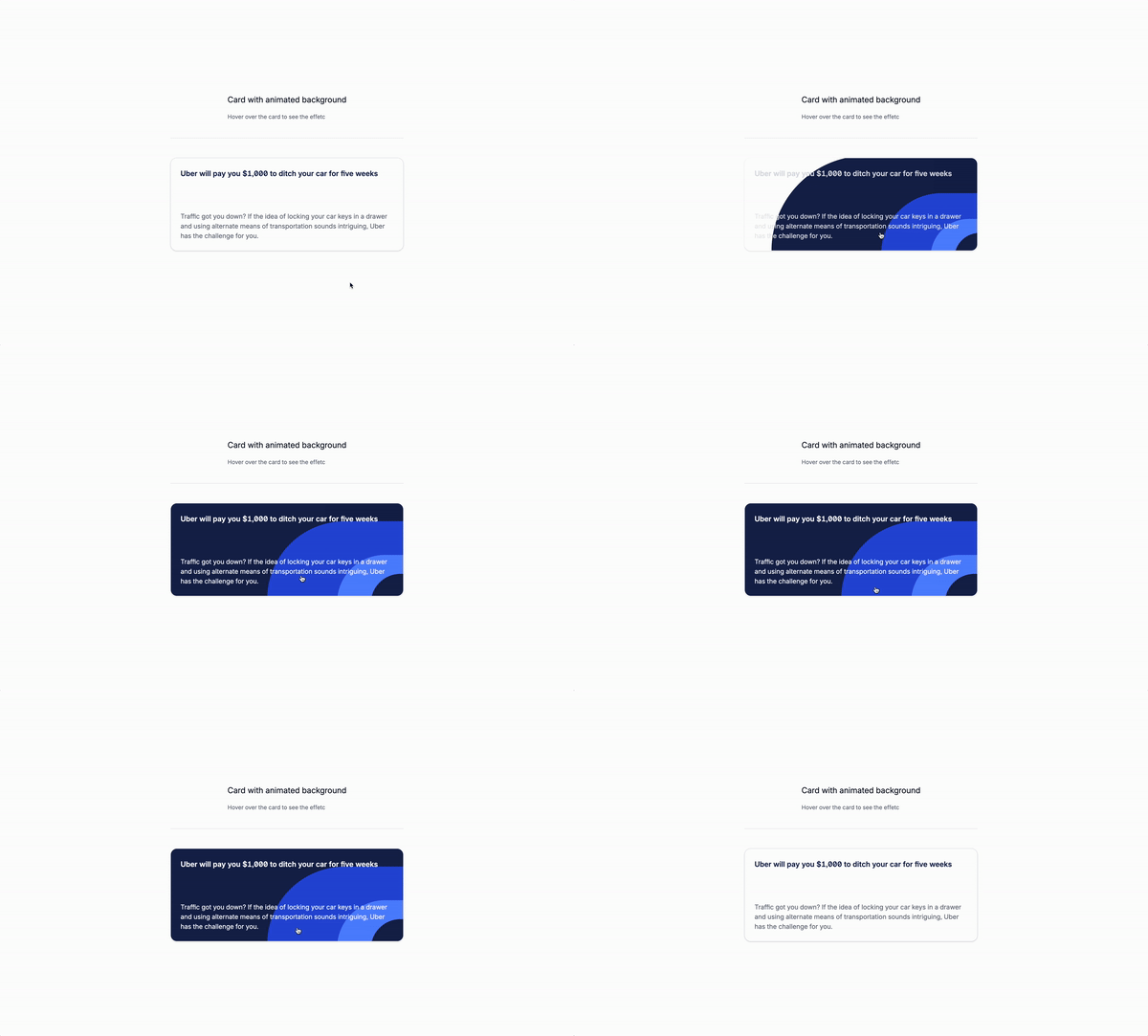
Today starts a new series with tutorials. We will be using only Tailwqind CSS to create components. Let’s start with a card with an animated background.
WHy animated background?
Animated backgrounds are a great way to add some visual interest to your website. They can be used to draw attention to specific elements or to create a sense of motion and movement, making your content more engaging and dynamic.
Let’s build the markup
Understanding the code:
The wrapper
Here is where we will put all the content of the card.
h-full: This sets the height of the container to 100%.w-full: This sets the width of the container to 100%.relative: This creates a positioned element that is positioned relative to its normal position.group: This creates a new group with the card.z-0: This sets the z-index of the card to 0.overflow-hidden: This hides any content that is outside the bounds of the container.
<div class="relative z-0 w-full h-full overflow-hidden group">
<!-- Card content goes here -->
</div>The background decorations
We will use the absolute positioning to position the background decorations on the card to create the illusion of depth and dimension. We will also give them different colors and sizes to create a unique and visually appealing effect.
First item:
h-[7em]: This sets the height of the background decorations to 7em.w-[20em]: This sets the width of the background decorations to 20em.absolute: This positions the element at the absolute position.left-full: This positions the element at the left side of the container.-bottom-12: This positions the element at the bottom of the container with a distance of 3.5em.group-hover:scale-[550%]: This scales the element up when the user hovers over it.z-[-1]: This sets the z-index of the element to -1.duration-700: This sets the duration of the animation to 700 milliseconds.easy-in-out: This sets the easing function to ease-in-out.
Adapt the for the other decorations as well to create a unique and visually appealing effect, you can play with this ones or create your own.
<div
class="h-[7em] w-[20em] bg-blue-950 absolute left-full rounded-full -bottom-12 group-hover:scale-[550%] z-[-1] duration-700 easy-in-out"
></div>
<div
class="h-[6em] w-[14em] bg-blue-700 absolute left-full rounded-full -bottom-12 group-hover:scale-[400%] z-[-1] duration-700 easy-in-out"
></div>
<div
class="h-[4.9em] w-[10.2em] bg-blue-500 absolute left-full rounded-full -bottom-12 group-hover:scale-[300%] z-[-1] duration-700 easy-in-out"
></div>
<div
class="h-[4.6em] w-[10em] bg-blue-950 absolute left-full rounded-full -bottom-12 group-hover:scale-[200%] z-[-1] duration-700 easy-in-out"
></div>The card content
We will use the z-20 and m-4 classes to position the card content.
z-20: This sets the z-index of the card content to 20.m-4: This sets the margin of the card content to 4 units.
<div class="z-20 m-4">
<div>
<!--- Card content goes here -->
</div>
</div>The full card
Here you can see the full card with the background decorations and the card content. You can play with the styles and add your own content.
<div class="relative z-0 w-full h-full overflow-hidden group">
<div
class="h-[7em] w-[20em] bg-blue-950 absolute left-full rounded-full -bottom-12 group-hover:scale-[550%] z-[-1] duration-700 easy-in-out"
></div>
<div
class="h-[6em] w-[14em] bg-blue-700 absolute left-full rounded-full -bottom-12 group-hover:scale-[400%] z-[-1] duration-700 easy-in-out"
></div>
<div
class="h-[4.9em] w-[10.2em] bg-blue-500 absolute left-full rounded-full -bottom-12 group-hover:scale-[300%] z-[-1] duration-700 easy-in-out"
></div>
<div
class="h-[4.6em] w-[10em] bg-blue-950 absolute left-full rounded-full -bottom-12 group-hover:scale-[200%] z-[-1] duration-700 easy-in-out"
></div>
<div class="z-20 m-4">
<div class="">
<p
class="text-lg font-medium text-blue-950 group-hover:text-white duration-300"
>
Uber will pay you $1,000 to ditch your car for five weeks
</p>
<p
class="mt-20 text-base text-base-500 group-hover:text-white duration-300 text-pretty"
>
Traffic got you down? If the idea of locking your car keys in a drawer
and using alternate means of transportation sounds intriguing, Uber has
the challenge for you.
</p>
</div>
</div>
</div>Conclusion
You can play with the styles and add your own content to make the card more unique and visually appealing. You can also adjust the animation duration and easing function to create a more dynamic and engaging experience, and experiment with position, different background colors and sizes to create a visually stunning effect.
Hope you liked the tutorial and learned something new.
/Michael Andreuzza
One price.
Lifetime access.
-
34 Premium Astro Templates
-
All Future Templates Included
-
Unlimited Projects · Lifetime License
