Pricing pages for 2026: Layouts, structure, and decision-making design
A curated look at pricing page layouts for 2026, focusing on structure, hierarchy, comparison systems, and visual patterns that help users decide without friction.
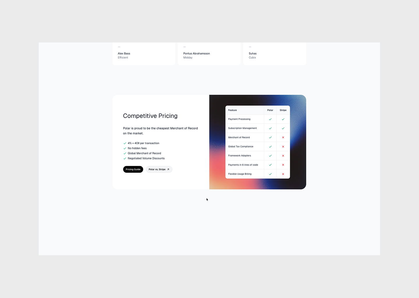
Published on December 22, 2025 by Michael Andreuzza · 2 min readThe pricing page is no longer a grid of boxes with a highlighted “Most popular” badge.
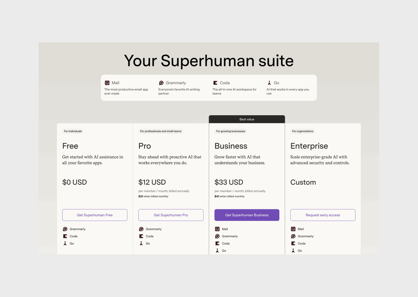
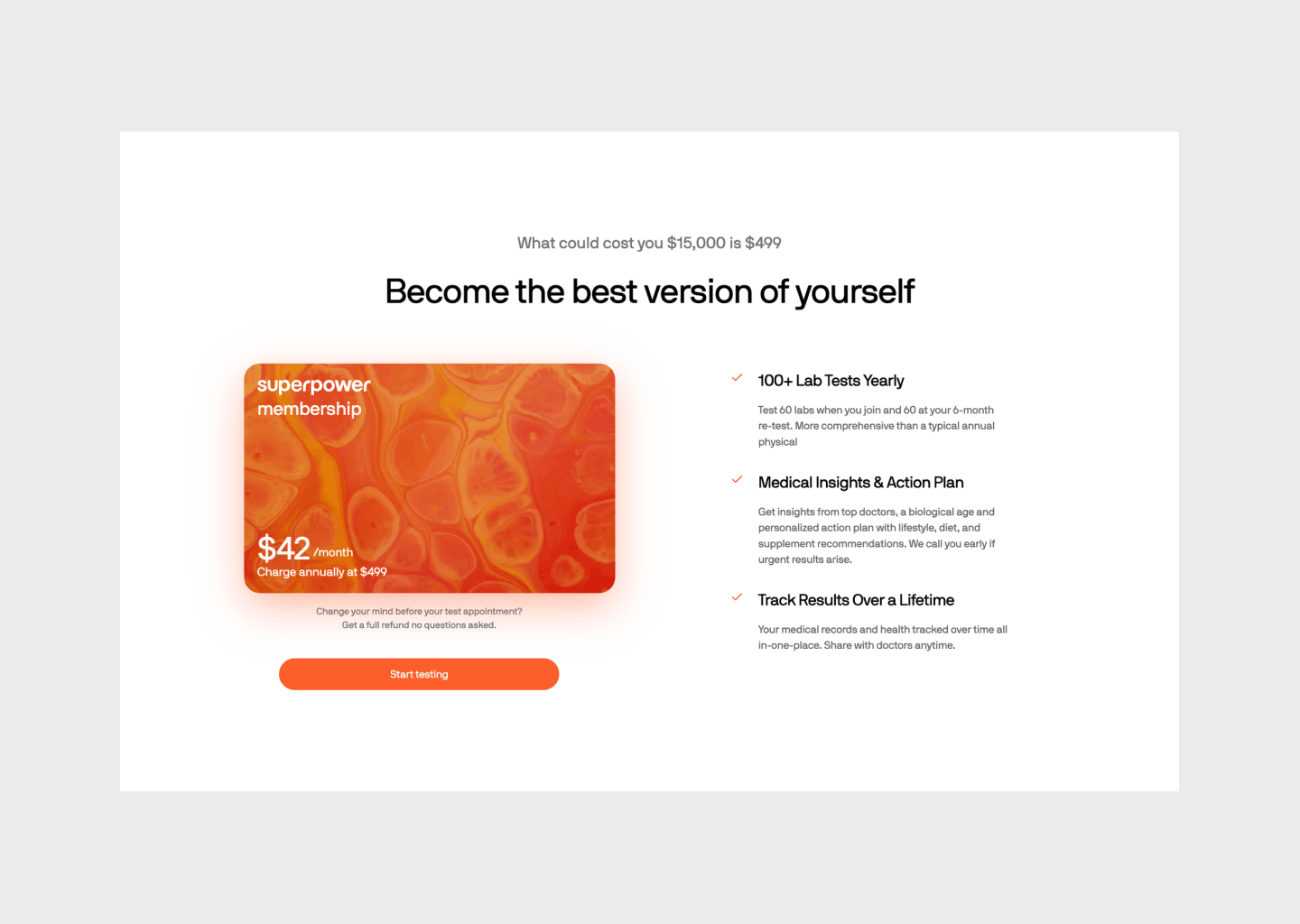
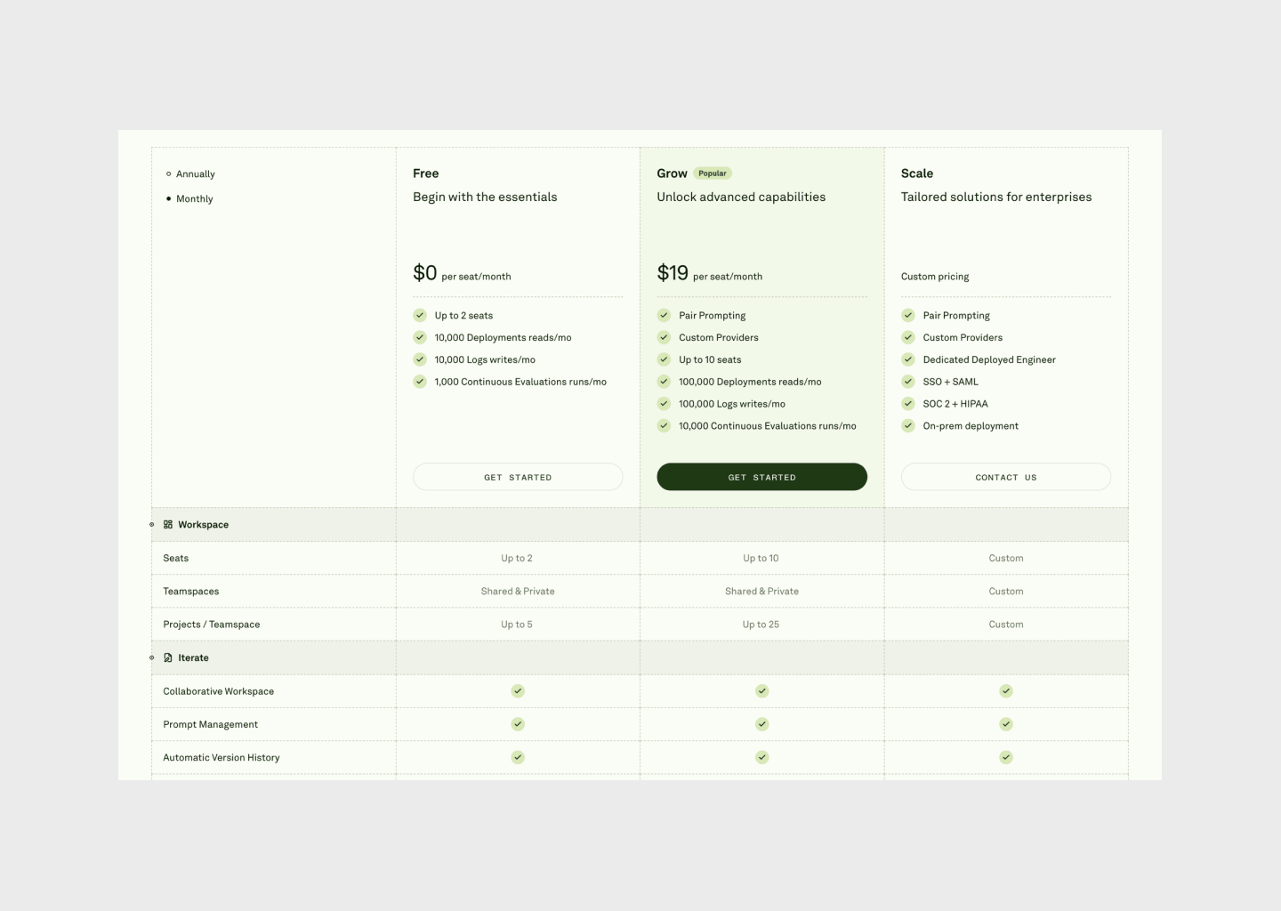
In 2026, pricing pages are becoming decision systems, carefully structured layouts where hierarchy, comparison, rhythm, and constraint do the real work. The shift isn’t about clever copy or psychological tricks. It’s about clarity: how fast users understand options, differences, and consequences.
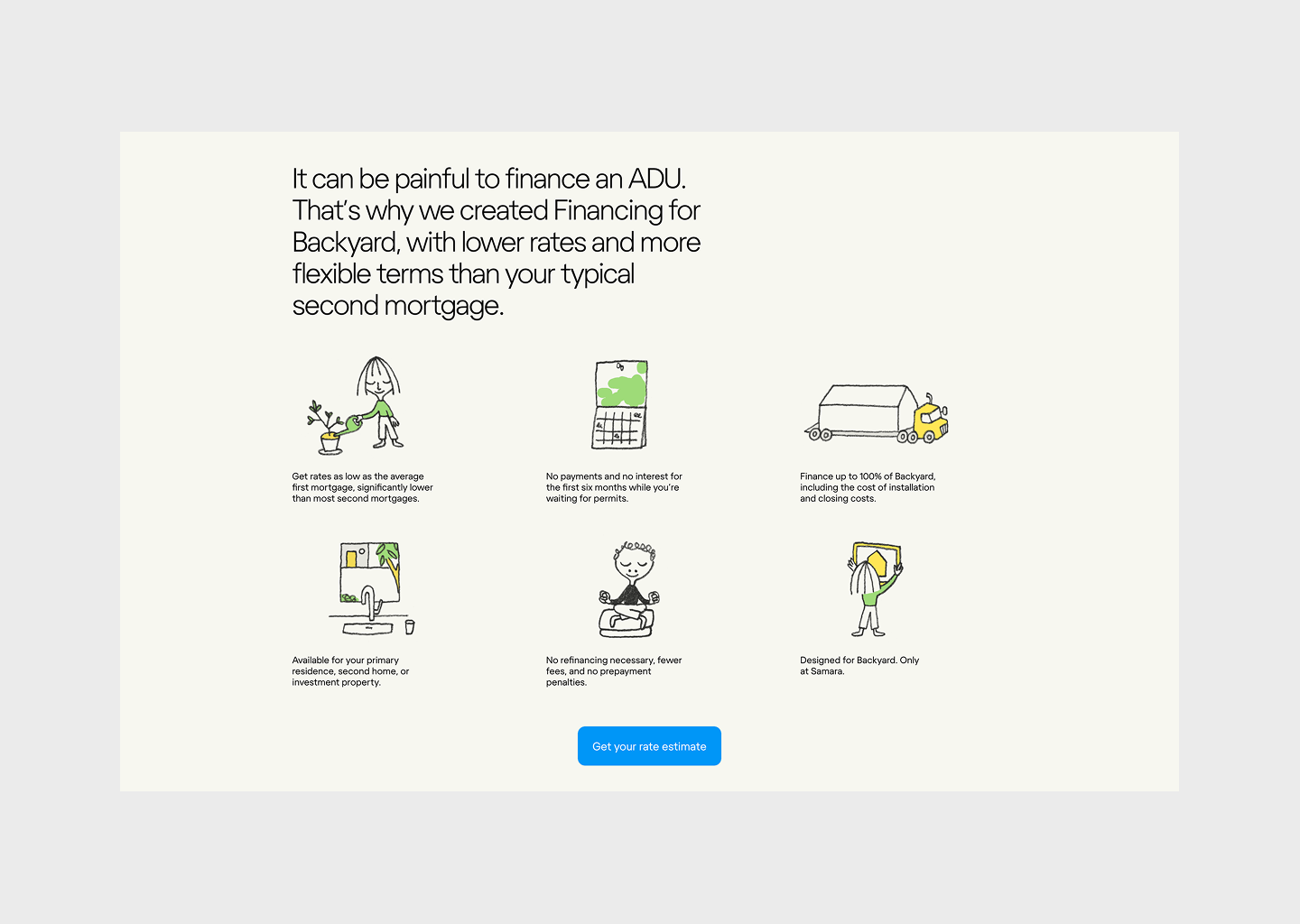
Designers are moving away from bloated tables, feature dumps, and false urgency. Instead, pricing pages are increasingly editorial, modular, and intentional, using spacing, alignment, grouping, and visual pacing to guide choices naturally.
The strongest pricing pages don’t try to persuade aggressively. They explain. They frame trade-offs. They respect the user’s ability to decide.
The examples featured in this article span different products, markets, and price points. Some are older, some more recent. What they share is not style, but structure, layouts that reduce hesitation and make pricing feel obvious rather than stressful.
This is a curated look at pricing page layouts defining 2026. Not dark patterns. Not A/B gimmicks.
Just clear systems, compositional ideas, and layout decisions worth studying, and stealing.
Visual references


Pricing pages in 2026 aren’t about persuasion
They work because they’re composed with intent: grids, hierarchy, grouping, and typography doing the heavy lifting instead of badges, urgency, or noise.
The real shift is treating pricing not as a sales section, but as a layout system, a deliberate composition that establishes trust, reduces cognitive load, and makes decisions feel safe.
The strongest pricing pages don’t chase trends or psychological hacks. They rely on structural clarity that ages well, and remains convincing long after the year in the headline has passed.
/Michael Andreuzza