Stunning hero sections for 2026: Layouts, patterns, and visual direction
Explore stunning hero sections for 2026, featuring bold layouts, modern composition patterns, typography-led designs, and visual directions shaping the next wave of web design.
Published on December 19, 2025 by Michael Andreuzza · 3 min readThe hero section is no longer just a headline, a button, and a stock screenshot.
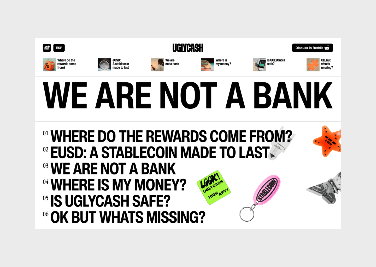
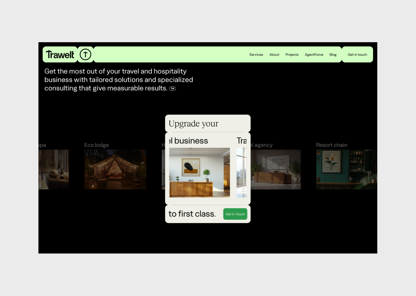
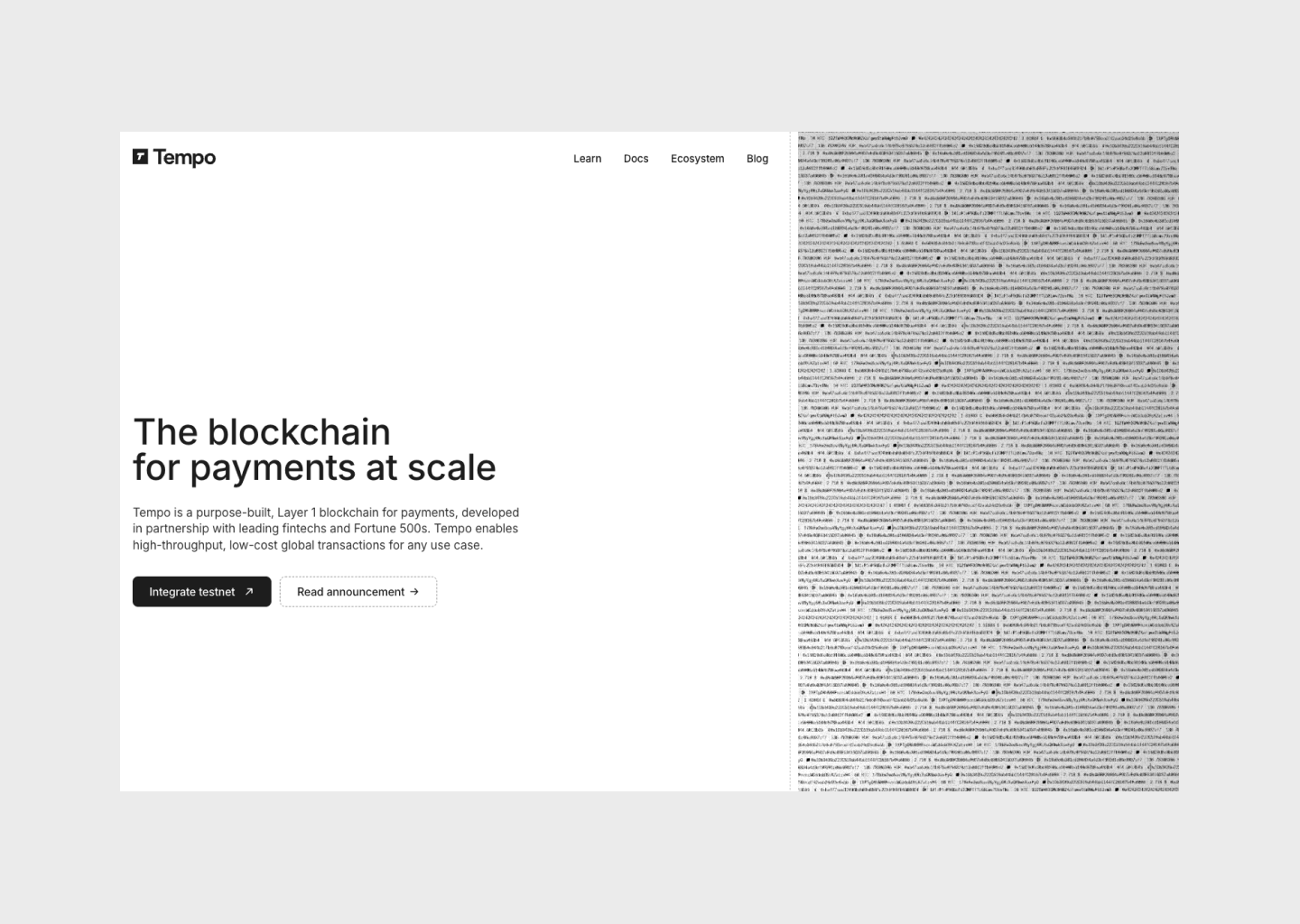
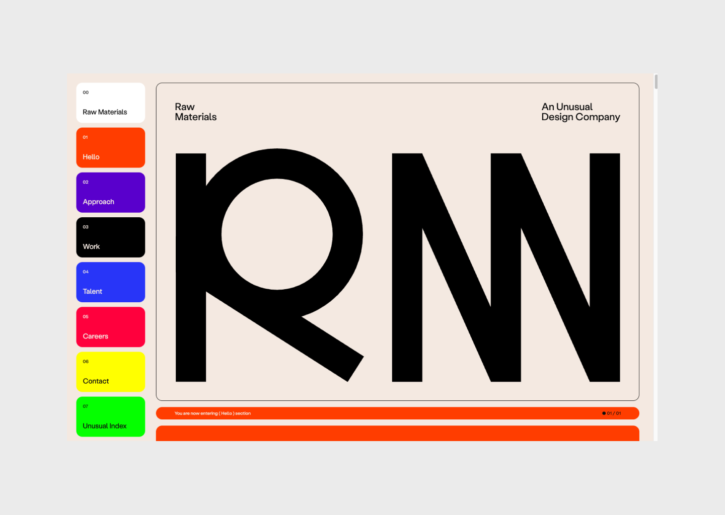
In 2026, hero sections are becoming layout systems, carefully composed spaces where typography, hierarchy, rhythm, and negative space do most of the talking. The shift isn’t about louder visuals or heavier motion. It’s about structure: how content is arranged, how it breathes, and how quickly it communicates intent.
Designers are moving away from safe, center-aligned templates and toward more expressive compositions — editorial grids, type-first heroes, asymmetry, stacked narratives, and cinematic framing. The result is work that feels considered, confident, and unmistakably modern.
The hero examples featured here don’t belong to a single year. Some were designed earlier, others more recently, but all of them reflect layout ideas and visual directions that feel aligned with where hero design is heading next.
This article is a curated look at the hero section layouts defining 2026. Not trends for the sake of trends, and not conversion hacks. Just clear design directions, layout patterns, and visual ideas worth studying — and stealing.
Visual references
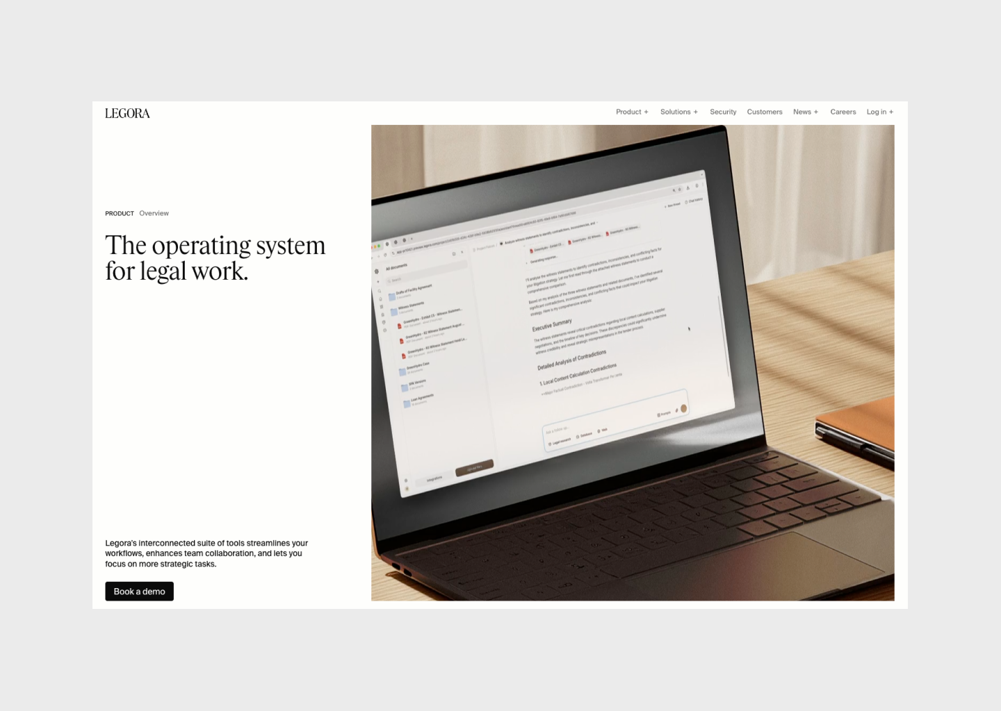
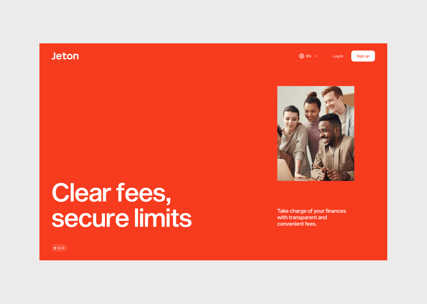
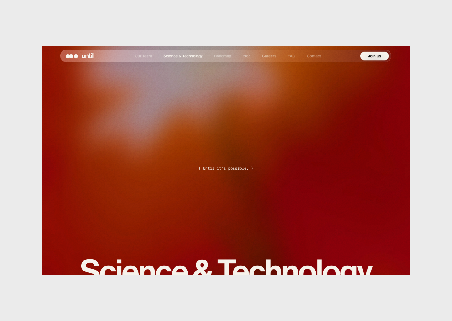
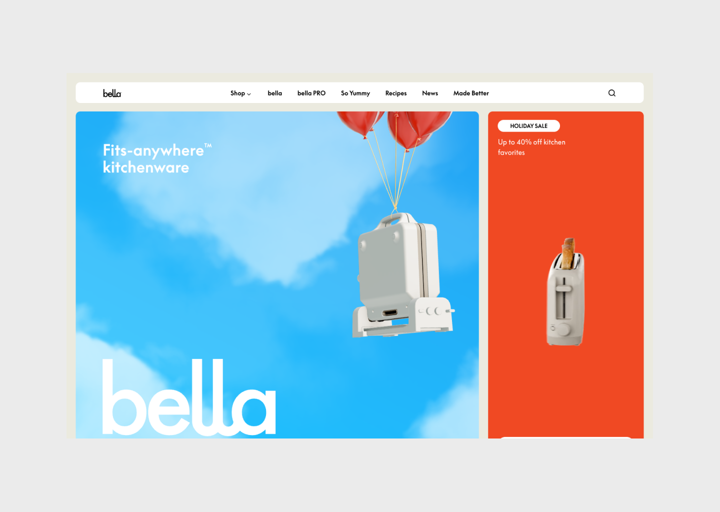
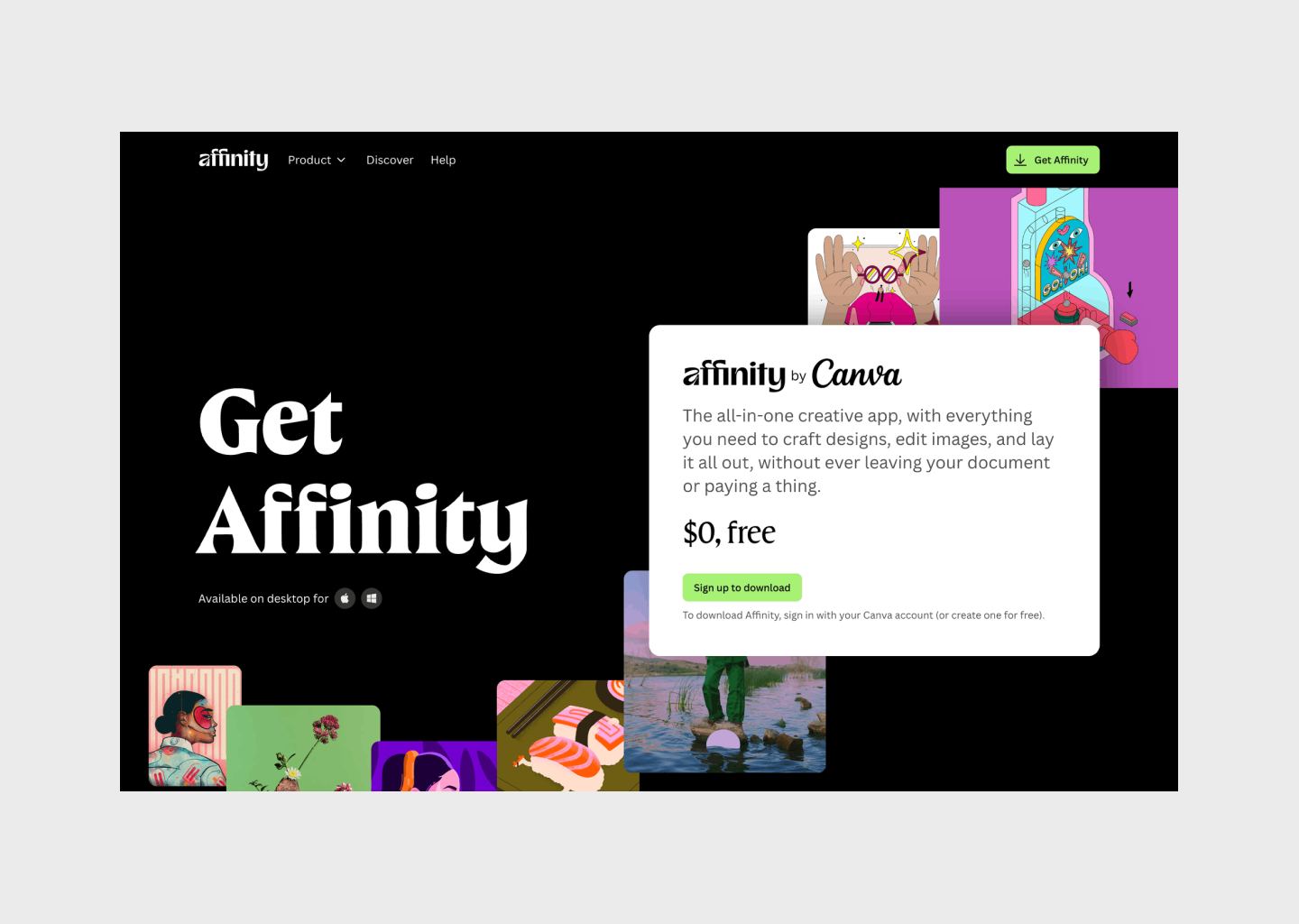
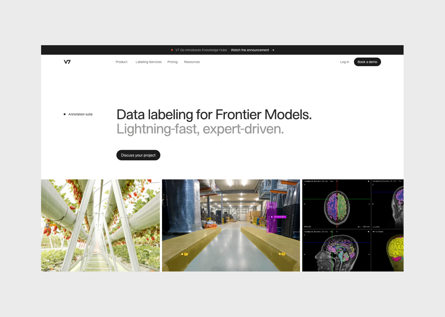
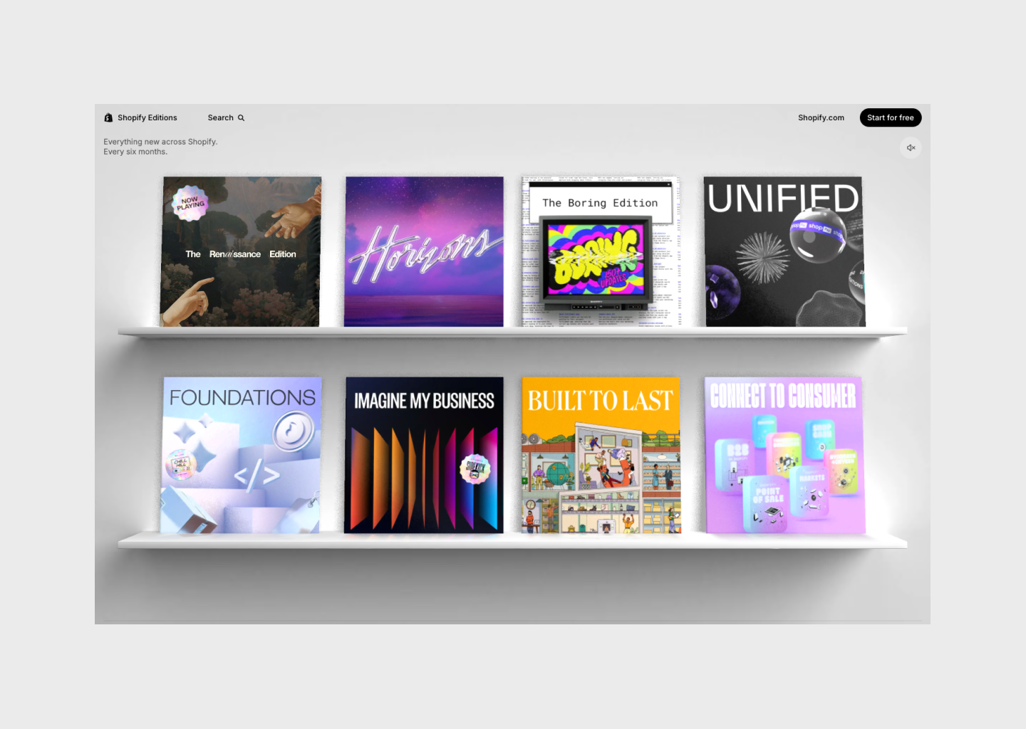
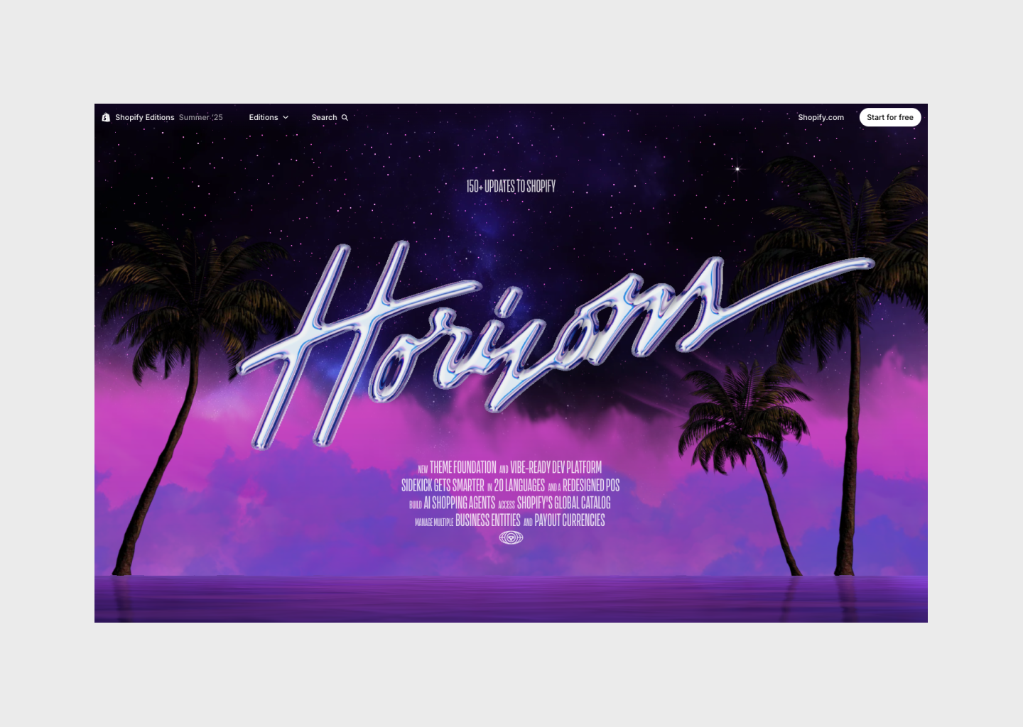

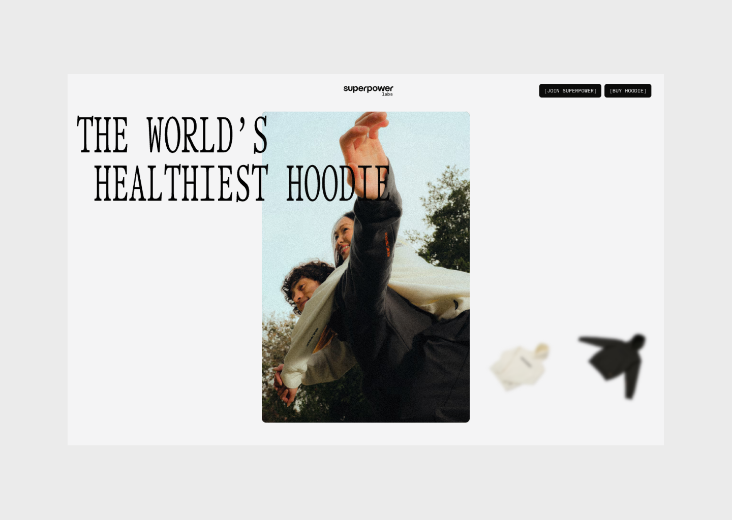
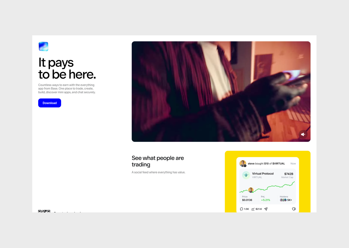
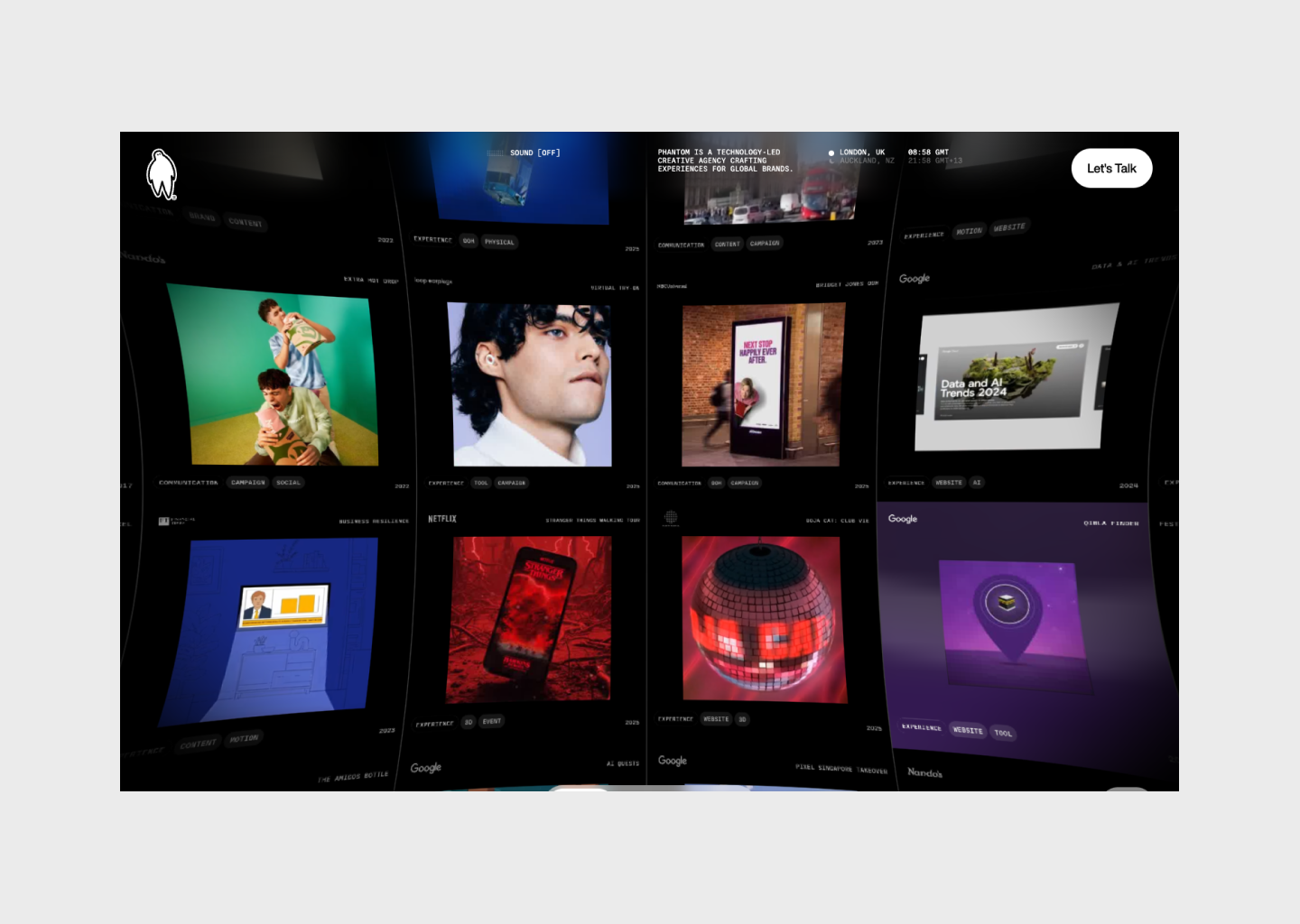
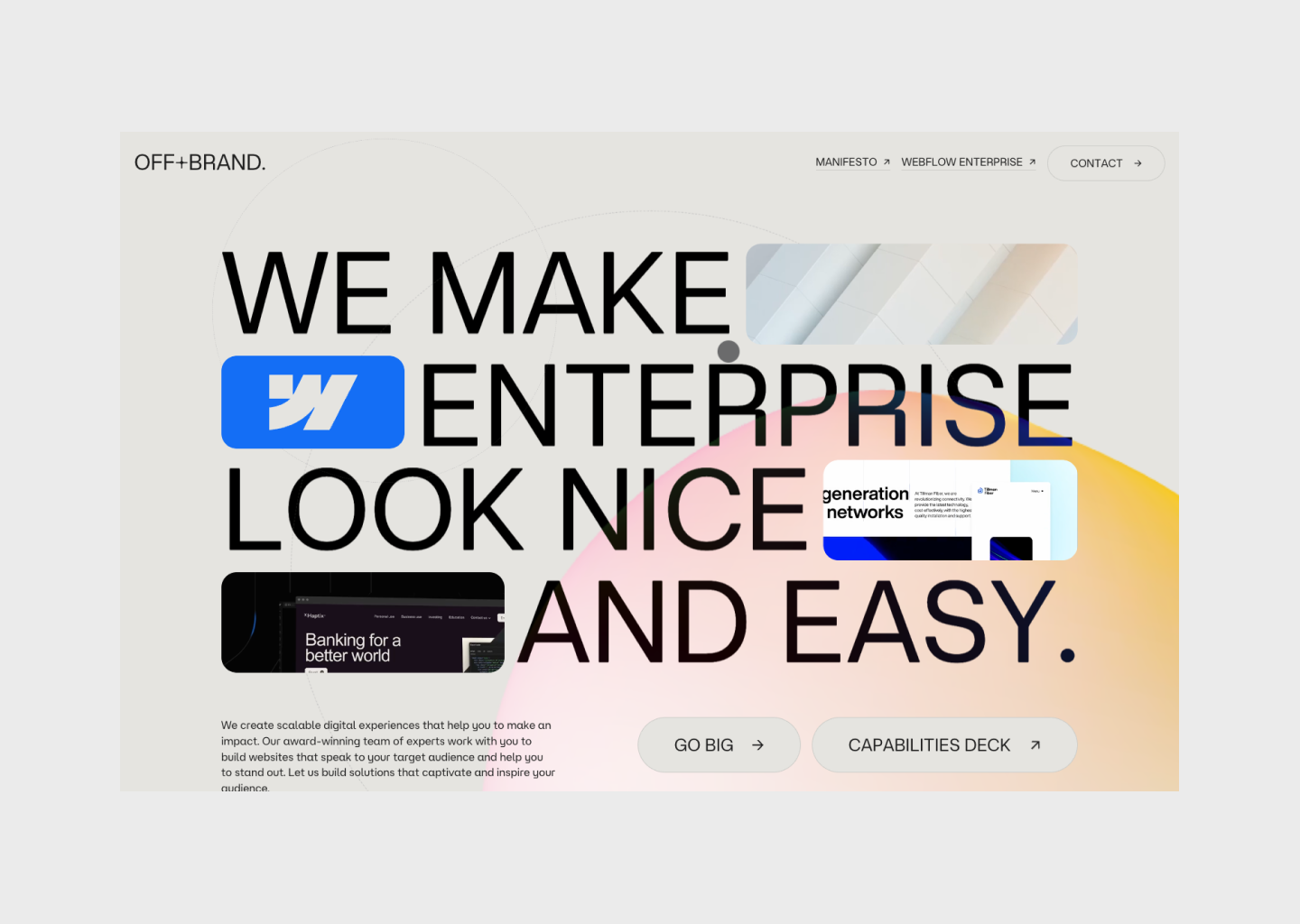
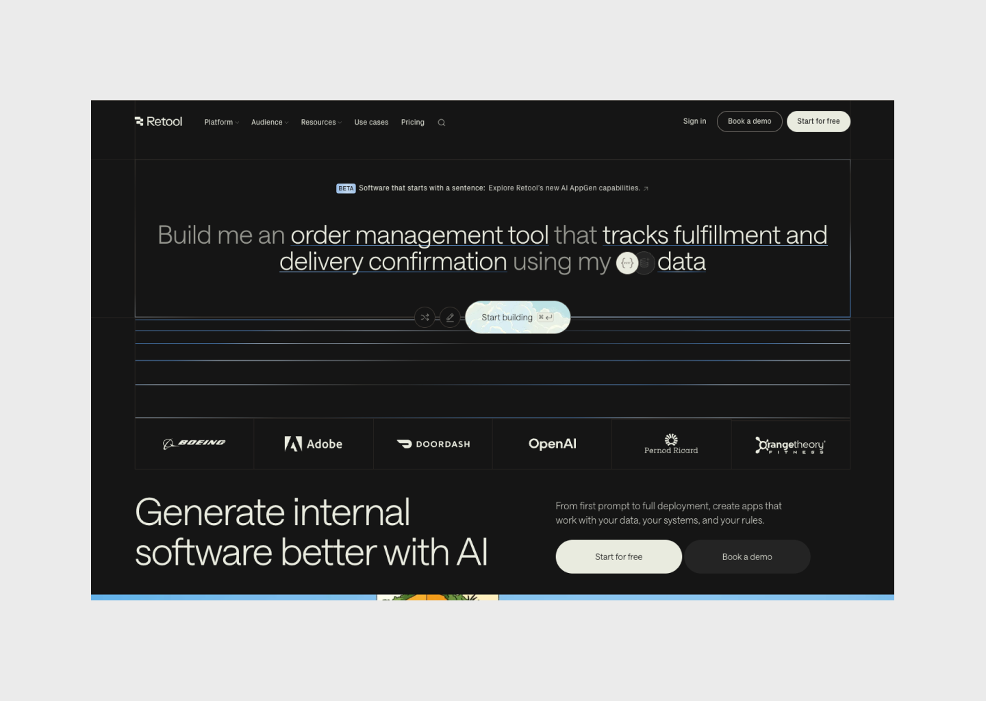
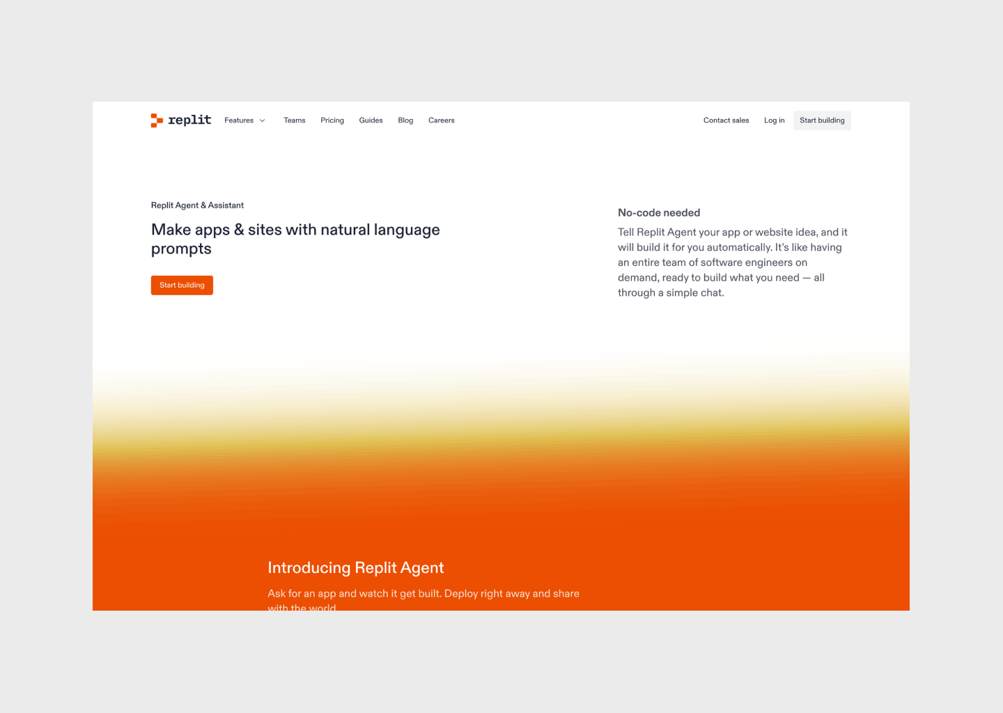
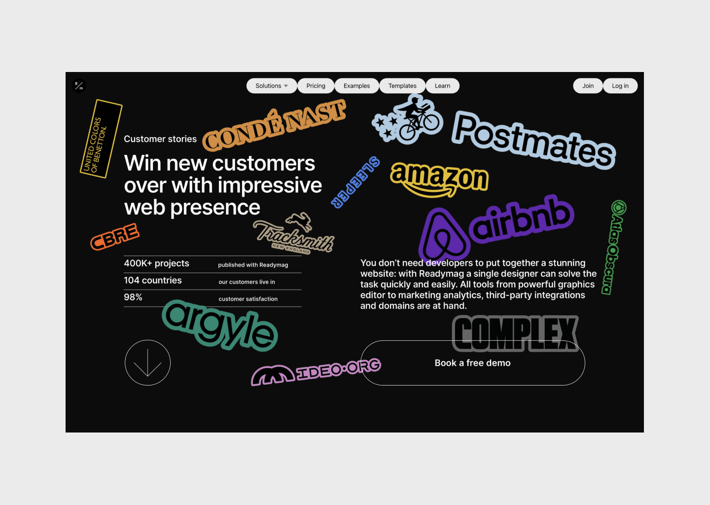
Hero sections in 2026 aren’t about novelty. They’re about structure.
The examples shown here work because they’re composed with intent, grids, hierarchy, and typography doing the heavy lifting instead of decoration or noise. They come from different years, different contexts, and different products, yet they share the same underlying principles. That’s why they still feel relevant.
The real shift is treating the hero not as a standalone block, but as a layout system, a deliberate composition that establishes rhythm, tone, and expectation from the very first screen.
The strongest hero sections don’t chase trends or timestamps. They rely on layout decisions that age well, and remain convincing long after the year in the headline has passed.
/Michael Andreuzza